|
|
“Data processing” in statistics is an important concept that ensures the integrity of research data as it considers important concerns such as security, confidentiality, and storage of research data. Each domain has information in the form of numbers. Any number of this type is called an observation. In general, the collection of all observations is called data. To process data, statisticians use various data management methods. In this article, we explain what data processing is and the different ways in which data processing can take place. What is Data Handaling?Data handling is, Handling the data in such a way that it becomes easier for people to understand and comprehend the given information. Kids have difficulty understanding and processing data. In most cases, these learners have gaps in their general mathematical understanding that may prevent them from understanding how to process data activities.
While learning data handling kids may struggle because of:
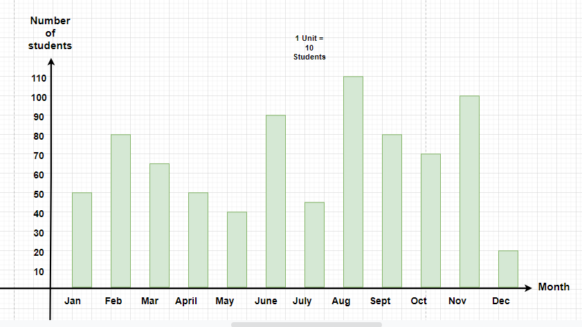
In this article, we will learn about various ways in which one can represent data so that kids may easily understand the same. Bar Graph RepresentationA bar graph, also known as a bar chart, is a visual representation of data using rectangular bars of varying lengths. Each bar represents a category, and the length of the bar corresponds to the value or frequency of that category. Bar graphs are excellent for comparing discrete data across different groups or categories. They typically have two axes: a horizontal axis (x-axis) showing the categories being compared, and a vertical axis (y-axis) representing the measured values. Bar graphs can be vertical (column charts) or horizontal, and are widely used due to their simplicity and effectiveness in displaying categorical data.
Scatter Plot RepresentationA scatter plot, also called a scatter diagram or scattergram, is a type of graph used to display the relationship between two continuous variables. It plots individual data points on a two-dimensional graph, where each point represents an observation with two values – one for each variable.
The x-axis typically represents the independent variable, while the y-axis represents the dependent variable. Scatter plots are particularly useful for identifying patterns, trends, correlations, or clusters within data sets. They can reveal whether there’s a positive, negative, or no correlation between variables, and can also highlight outliers or unusual data points. Scatter plots are commonly used in statistics, scientific research, and data analysis to visualize and interpret relationships between variables. Games to Teach Data Handling to KidsOne can ask kids to play various games related to data handling that helps them to learn the basic of data handling and improve their learning skills. various games related to same are:
Interesting Ways to Teach Data HandlingTypes of Graphic Representation in Data Processing: When dealing with data, there are various ways to visually represent information using diagrams. Data can be represented graphically in the following ways:
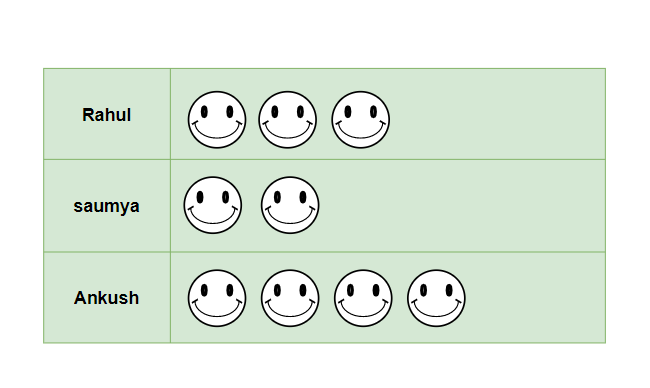
PictogramA type of graph called a pictogram, uses images, icons or symbols to represent data. It is the easiest way to represent information in statistics and data processing. Pictograms make data much easier to interpret, especially when a lot of information needs to be represented.
Pie ChartImagine plotting your data in a beautiful circular chart called a pie chart. This diagram has different sections, like slices of a pie, each of which represents a particular piece of information. Pie charts are great for showing profit and loss for a company, numbers in schools, marketing, sales, etc.
Line ChartA special type of chart is used in data processing called a line chart, which is very useful for showing how things change over time or under different circumstances. A line chart is created by connecting the points on the chart with a line. Each dot represents a specific data point.
Teaching Ideas/ActivitiesDemonstrate the importance of keeping the pictures/symbols the same size, cut out square pieces of paper or card in the following sizes 3cm x 3cm, 7cm x 7cm and 10cm x 10cm. You will need enough squares so that learners have one square each (some will have a 3 cm2, others a 7 cm2 and others a 10 cm2 square)
How to Teach Data HandlingTo teach data handling follow the bellow added steps: Collect and Organize Data
Create Visual Representations
Analyze Real-World Datasets
Use Technology
Hands-On Activities
Project-Based Learning
ConclusionInfographics are visual representations of information that combine text, images, charts, and graphs. They combine compelling data and statistics with visually appealing elements to make data more understandable and engaging. Infographics can explain concepts, make boring topics interesting, and tell a story. When tackling a seemingly boring subject, try applying these seven characteristics: simplicity, surprise, specificity, believability, emotion, storytelling, and precision. These elements can make even the most mundane commercials memorable. FAQsDefine Data Handling
Why is teaching Data Handling Important?
3).What are Advantages of Data Handling?
4).What are Uses of Data Handling?
|


Reffered: https://www.geeksforgeeks.org
| Mathematics |
| Related |
|---|
| |
| |
| |
| |
| |
Type: | Geek |
Category: | Coding |
Sub Category: | Tutorial |
Uploaded by: | Admin |
Views: | 27 |