Horje
Modifying Colors in a Seaborn Lineplot

In Seaborn, line plots are created using the lineplot function. By default, Seaborn assigns colors automatically based on the categorical variables in the data. Seaborn’s lineplot function is used to create line graphs, which are useful for visualizing trends over time or other continuous variables. The function is versatile and allows for extensive customization, including changing line colors.

But, we can customize these colors as per our visualization needs. In this article, we will know about how to change the colors in a Seaborn Lineplot.

Modifying Lineplot Colors in Seaborn

There are several ways to change the colors of a Seaborn line plot:

1. Using the palette parameter

This parameter accepts a variety of inputs, including:

  • Predefined palettes: Seaborn provides several built-in color palettes. To use one, simply pass its name as a string to the palette parameter.
  • Custom color lists: We can create a list of color names or hex codes and pass it to the palette parameter.
  • Creating custom palettes with sns.color_palette(): For more control, we can create a custom palette using sns.color_palette(). This function takes various arguments to generate color palettes based on colormaps, color lists, or specific color spaces.

2. Using the color Parameter

This parameter can be used to set a single color for all lines or to map colors to specific variables using a dictionary.

  • Setting a single color: To apply the same color to all lines, pass a color name or hex code to the color parameter.
  • Mapping colors to variables: If We have a categorical variable, We can map specific colors to its values using a dictionary.

3. Using the hue parameter

If the data has a categorical variable, we can use hue to assign different colors to lines based on the categories.

  • Assigning colors based on categories: When our data has a categorical variable, the hue parameter automatically assigns different colors to lines based on the distinct categories within that variable.

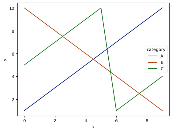
Seaborn will use its default color palette to assign colors to the different regions. We can further customize the colors using the palette parameter as explained earlier.

Example 1: Customizing Lineplot Colors with a Predefined Palette

Python
import seaborn as sns
import matplotlib.pyplot as plt
import pandas as pd

# Sample data
data = {
    'x': list(range(10)) * 3,
    'y': [1, 2, 3, 4, 5, 6, 7, 8, 9, 10, 10, 9, 8, 7, 6, 5, 4, 3, 2, 1, 5, 6, 7, 8, 9, 10, 1, 2, 3, 4],
    'category': ['A'] * 10 + ['B'] * 10 + ['C'] * 10
}
df = pd.DataFrame(data)

# Create the line plot with a predefined palette
sns.lineplot(x='x', y='y', hue='category', data=df, palette='dark')

plt.show()

# This code is contributed by Susobhan Akhuli

Output:

downloa

Customizing Lineplot Colors with a Predefined Palette

This example demonstrates how to use a predefined palette (‘dark’) to customize the colors of a lineplot with multiple lines representing different categories.

Example 2: Customizing Lineplot Colors with a Custom Color Palette

Python
import seaborn as sns
import matplotlib.pyplot as plt
import pandas as pd

# Sample data
data = {
    'x': list(range(10)) * 3,
    'y': [1, 2, 3, 4, 5, 6, 7, 8, 9, 10, 7, 9, 2, 6, 8, 2, 1, 9, 3, 5, 6, 7, 8, 9, 10, 1, 2, 3, 4, 7],
    'category': ['A'] * 10 + ['B'] * 10 + ['C'] * 10
}
df = pd.DataFrame(data)

# Create a custom color palette
custom_palette = sns.color_palette(["#FF6347", "#4682B4", "#32CD32"])

# Create the line plot with a custom color palette
sns.lineplot(x='x', y='y', hue='category', data=df, palette=custom_palette)

plt.show()

# This code is contributed by Susobhan Akhuli

Output:

downl

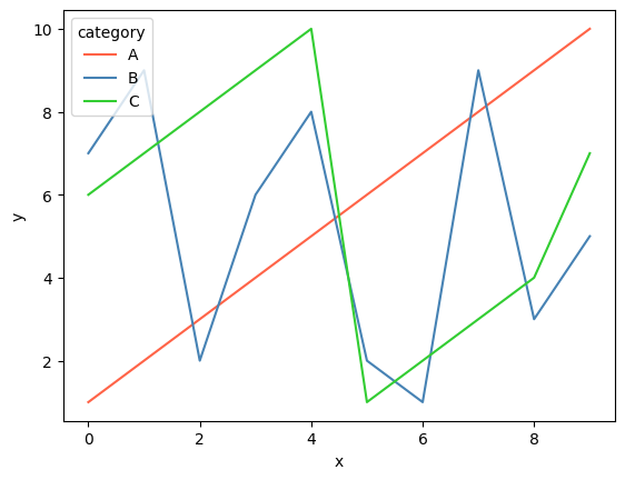
Customizing Lineplot Colors with a Custom Color Palette

This example demonstrates how to use a custom color palette to customize the colors of a lineplot with multiple lines representing different categories.

Conclusion

In conclusion, customizing colors in Seaborn line plots allows us to create more informative and visually appealing visualizations. Using this palette, color, and hue parameters, we can effectively tailor the colors to our specific visual requirements.


Reffered: https://www.geeksforgeeks.org


AI ML DS

Related
Large scale Machine Learning Large scale Machine Learning
Detecting outliers when fitting data with nonlinear regression Detecting outliers when fitting data with nonlinear regression
Integrating Numba with Tensorflow Integrating Numba with Tensorflow
Smart Home Energy Saving Analysis in R Smart Home Energy Saving Analysis in R
Data Science in Urban Planning Data Science in Urban Planning

Type:
Geek
Category:
Coding
Sub Category:
Tutorial
Uploaded by:
Admin
Views:
25