
|
|
Matplotlib, a comprehensive Python library for creating static, animated, and interactive visualizations, provides extensive control over the appearance of plots, including the frequency of datetime tick labels. This article will delve into the techniques for customizing the datetime tick label frequency in Matplotlib plots, ensuring that your visualizations are both informative and visually appealing. Table of Content
Understanding Datetime Tick LabelsDatetime tick labels are essential components of time series plots, as they provide context to the data being visualized. By default, Matplotlib automatically generates these labels based on the data range. However, in many cases, the default frequency may not be suitable for the specific needs of the plot. This is where customizing the datetime tick label frequency comes into play. Basic Plotting with Datetime DataLet’s start by creating a basic plot with datetime data. We’ll use Pandas to generate a date range and some random data points. Output: Basic Plotting with Datetime Data Changing the Datetime Tick Label Frequency : Practical ExamplesExample 1: Changing Tick Frequency Using matplotlib.datesMatplotlib provides the matplotlib.dates module, which includes several locators and formatters to handle datetime data efficiently. Example: Monthly Ticks Output: 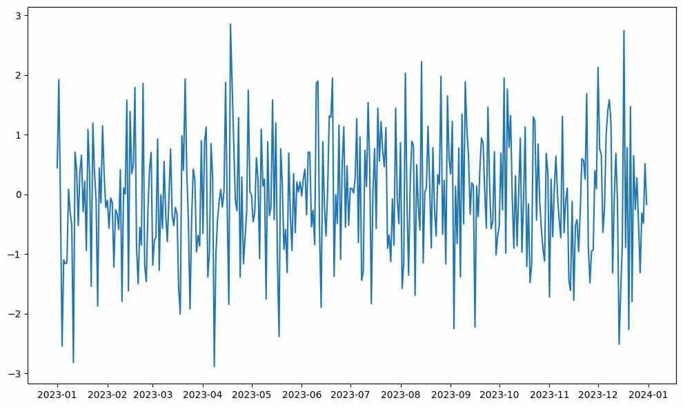 Changing Tick Frequency Using matplotlib.dates Example 2: Figure-Level Tick Frequency AdjustmentIf you want to set the tick frequency for the entire figure, you can use the plt.xticks() and plt.yticks() functions. Output:  Figure-Level Tick Frequency Adjustment Example 3: Axis-Level Tick Frequency AdjustmentFor more granular control, you can adjust the tick frequency at the axis level using the set_xticks() and set_yticks() methods. Output:  Axis-Level Tick Frequency Adjustment Customizing Datetime Tick Label Frequency: Practical ExamplesExample 1: Formatting Date LabelsYou can customize the format of the date labels using the DateFormatter class from matplotlib.dates. Output:  Formatting Date Labels Example : 2 Rotating and Aligning Date LabelsDate tick labels often overlap, making them difficult to read. You can rotate and align them using the autofmt_xdate() method. Output: 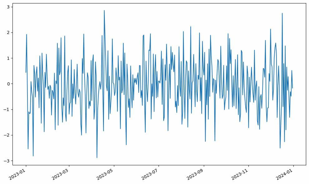 ConclusionAdjusting the datetime tick label frequency in Matplotlib is a crucial step in creating clear and informative visualizations. By using the tools provided by the matplotlib.dates module, you can customize your plots to display date information in a way that best suits your data and audience. In this article, we covered:
|
Reffered: https://www.geeksforgeeks.org
| AI ML DS |
Type: | Geek |
Category: | Coding |
Sub Category: | Tutorial |
Uploaded by: | Admin |
Views: | 22 |