Horje
How to Make a Mosaic Plot in Matplotlib

Mosaic plots are a powerful tool for visualizing categorical data in a concise and informative manner. In this article, we will delve into the world of mosaic plots and explore how to create them using the popular Python data visualization library, Matplotlib.

Introduction to Mosaic Plots

A mosaic plot is a graphical representation of data from a contingency table. It displays the proportions of data in different categories by dividing a rectangle into smaller rectangles. Each smaller rectangle represents a cell in the contingency table, with its area proportional to the cell’s value.

Mosaic plots are particularly useful for visualizing the relationship between two or more categorical variables. They provide a clear and concise way to understand the distribution and interaction of categories.

Creating Basic Mosaic Plots : Practical Implementation

Setting Up the Environment: Before we can create mosaic plots, we need to set up our Python environment. We will use the following libraries:

  • Matplotlib: A plotting library for creating static, animated, and interactive visualizations in Python.
  • Statsmodels: A library that provides classes and functions for the estimation of many different statistical models.

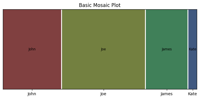
To install these libraries, you can use the following pip commands:

pip install matplotlib
pip install statsmodels

Example 1: Basic Mosaic Plot

Python
import matplotlib.pyplot as plt
from statsmodels.graphics.mosaicplot import mosaic

plt.rcParams["figure.figsize"] = [7.00, 3.50]
plt.rcParams["figure.autolayout"] = True

# Dictionary for mosaic plot data
data = {'John': 7, 'Joe': 10, 'James': 5, 'Kate': 1}

# Create mosaic plot
mosaic(data, title='Basic Mosaic Plot')
plt.show()

Output:

basic_plot

Basic Mosaic Plot

In this example, we create a simple mosaic plot from a dictionary of data. The mosaic function from the statsmodels.graphics.mosaicplot module is used to create the plot, and plt.show() is used to display it.

Example 2: Customizing Mosaic Plot

Mosaic plots can be customized in various ways to make them more informative and visually appealing. Here are some common customizations:

  • Adding labels
  • Changing colors
  • Adjusting the layout
Python
import matplotlib.pyplot as plt
from statsmodels.graphics.mosaicplot import mosaic

plt.rcParams["figure.figsize"] = [10.00, 6.00]
plt.rcParams["figure.autolayout"] = True

# Data for mosaic plot
data = {'John': 7, 'Joe': 10, 'James': 5, 'Kate': 1}

# Customizing the mosaic plot
props = lambda key: {'color': 'skyblue' if key == 'John' else 'lightgreen'}

# Create mosaic plot with custom properties
mosaic(data, title='Customized Mosaic Plot', properties=props)
plt.show()

Output:

mosaic

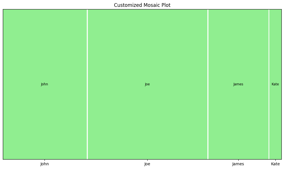
Customizing Mosaic Plot

In this example, we customize the colors of the rectangles based on the key values. The props lambda function is used to set the color property for each rectangle.

Example 3: Mosaic Plot from DataFrame

Python
import pandas as pd
import matplotlib.pyplot as plt
from statsmodels.graphics.mosaicplot import mosaic

data = {
    'gender': ['male', 'male', 'male', 'female', 'female', 'female'],
    'pet': ['cat', 'dog', 'dog', 'cat', 'dog', 'cat']
}
df = pd.DataFrame(data)

# Create mosaic plot from DataFrame
mosaic(df, ['pet', 'gender'])
plt.show()

Output:

mosaic

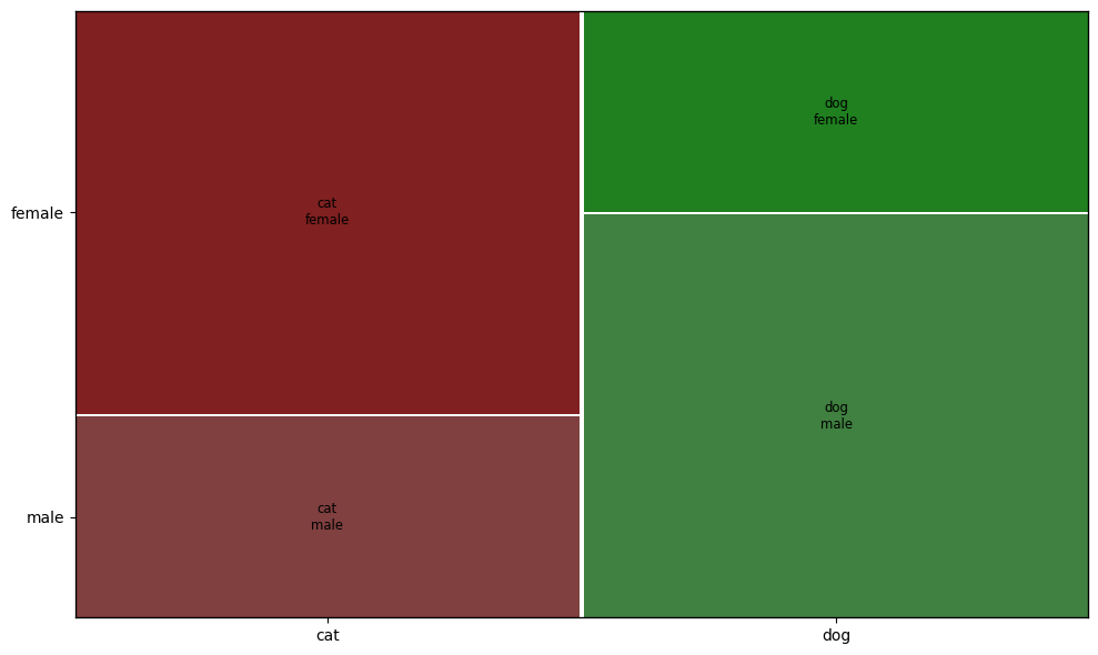
Mosaic Plot from DataFrame

In this example, we create a mosaic plot from a pandas DataFrame. The mosaic function can directly take a DataFrame and the list of columns to use for the plot.

Example 4: Mosaic Plot with Seaborn Dataset

Python
import seaborn as sns
import matplotlib.pyplot as plt
from statsmodels.graphics.mosaicplot import mosaic

tips = sns.load_dataset('tips')

# Create mosaic plot from tips dataset
mosaic(tips, ['sex', 'smoker', 'time'])
plt.show()

Output:

mosaic

In this example, we use the tips dataset from the Seaborn library to create a mosaic plot. The mosaic function is used to visualize the relationship between the sex, smoker, and time columns.

Best Practices for Advanced Customization

Matplotlib provides extensive customization options for mosaic plots. Here are a few examples:

  • Controlling Mosaic Creation: Matplotlib’s subplot_mosaic function allows for complex and semantic figure composition. It returns a dictionary keyed on the labels used to lay out the figure, making it easier to write plotting code.
  • Axes Spanning Multiple Rows/Columns: You can specify that an Axes should span several rows or columns using the subplot_mosaic function. This is particularly useful for creating non-uniform grids.
  • Using String Shorthand: Matplotlib provides a string shorthand for laying out Axes. This allows you to “draw” the Axes you want as “ASCII art,” making it easier to create complex layouts.

Conclusion

Mosaic plots are a versatile and powerful tool for visualizing categorical data. They provide a clear and concise way to understand the distribution and interaction of categories. In this article, we covered the basics of creating mosaic plots using Matplotlib and Statsmodels, along with some customization options and advanced examples.


Reffered: https://www.geeksforgeeks.org


AI ML DS

Related
Calculating Precision and Recall for Multiclass Classification Using Confusion Matrix Calculating Precision and Recall for Multiclass Classification Using Confusion Matrix
How to Set Dataframe Column Value as X-axis Labels in Python Pandas How to Set Dataframe Column Value as X-axis Labels in Python Pandas
How to fix "R neuralNet: non-conformable arguments How to fix "R neuralNet: non-conformable arguments
Pandas Full Form Pandas Full Form
Goal-based AI Agents Goal-based AI Agents

Type:
Geek
Category:
Coding
Sub Category:
Tutorial
Uploaded by:
Admin
Views:
18