|
Visualizing data is an important aspect of data analysis and exploration. Seaborn is a popular data visualization library which is built on top of matplotlib library. It offers a variety of powerful tools for creating insightful and visually appealing plots. When we want to create multiple datasets or categories, looping through Seaborn plots is an essential method because it efficiently generates and compares all the visualizations. In this article, we will learn how to implement seaborn plots in a loop with some examples.
Understanding the ProblemWhen working with datasets, it is often necessary to visualize multiple variables or features. A common issue encountered is that plots can overlap or appear on top of each other, making it difficult to interpret the data. This is particularly problematic when using Seaborn countplots in a loop, as the plots can become jumbled and hard to read.
Why Loop Through Seaborn Plots?- Automation: Looping allows you to automate the process of creating multiple plots, saving time and effort, especially when dealing with large datasets or numerous categories.
- Comparison: It enables side-by-side comparison of different aspects of your data, helping to identify patterns, trends, or outliers across various groups.
- Consistency: Ensures consistent formatting and styling across all plots, enhancing readability and presentation.
Creating Seaborn Plots in a Loop : Practical ExamplesExample 1 : Creating Histogram Plots in LoopStep 1: Import Required Libraries
First, we need to import the necessary libraries, Seaborn and Matplotlib, and generate some sample data.
Python
import seaborn as sns
import matplotlib.pyplot as plt
import numpy as np

# Set the style for the plots
sns.set(style="darkgrid")
Step 2: Prepare Data
Create example datasets. We’ll use NumPy to generate random data for simplicity.
Python
# Example datasets
datasets = {
    'Dataset A': np.random.normal(0, 1, 100),
    'Dataset B': np.random.normal(1, 1, 100),
    'Dataset C': np.random.normal(2, 1, 100)
}
Step 3: Loop Through Datasets and Create Plots
Now, we’ll loop through each dataset, create a new figure for each plot, and use Seaborn to generate the histogram.
Python
# Loop through datasets and create plots
for dataset_name, data in datasets.items():
    # Create a new figure for each dataset
    plt.figure(figsize=(8, 6))

    # Generate the histogram plot with KDE (Kernel Density Estimate)
    sns.histplot(data, kde=True)

    # Set the title and labels
    plt.title(f'Distribution of {dataset_name}')
    plt.xlabel('Values')
    plt.ylabel('Frequency')

    # Show the plot grid
    plt.grid(True)

    # Display the plot
    plt.show()
Output:
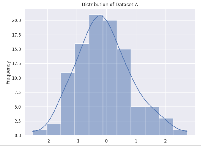 Creating Histogram Plots in Loop 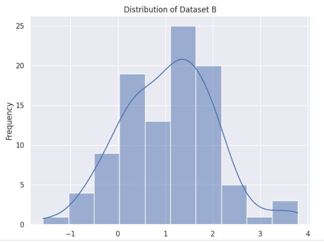 Creating Histogram Plots in Loop 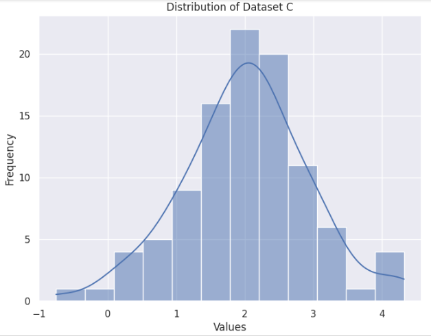 Creating Histogram Plots in Loop Example 2. Plotting Scatter Plots in a Loop
Python
import seaborn as sns
import matplotlib.pyplot as plt
import pandas as pd
import numpy as np

# Create example data
np.random.seed(42)
categories = ['Category A', 'Category B', 'Category C']
data = {
    'Category': np.random.choice(categories, 300),
    'X': np.random.rand(300),
    'Y': np.random.rand(300) * 10
}

# Convert data to a DataFrame
df = pd.DataFrame(data)

# Loop through categories and create scatter plots
for category in categories:
    # Filter data for the current category
    subset = df[df['Category'] == category]

    # Create a new figure
    plt.figure(figsize=(8, 6))

    # Generate the scatter plot
    sns.scatterplot(x='X', y='Y', data=subset)

    # Set the title and labels
    plt.title(f'Scatter Plot for {category}')
    plt.xlabel('X Values')
    plt.ylabel('Y Values')

    # Display the plot
    plt.show()
Output:
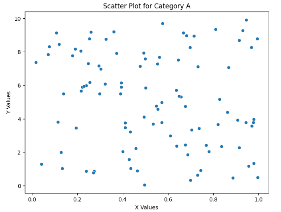 Scatter Plots in a Loop 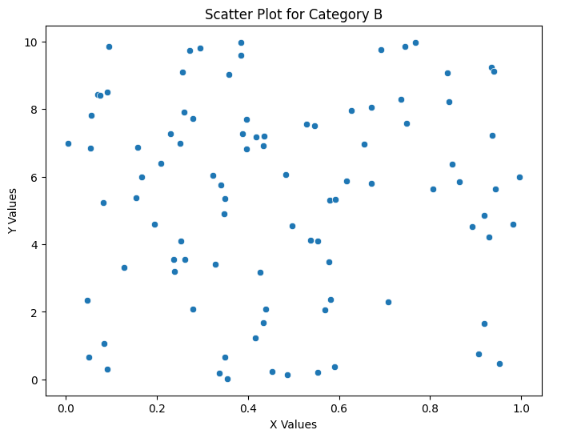 Scatter Plots in a Loop  Scatter Plots in a Loop Example 3: Line Plots in a Loop
Python
import seaborn as sns
import matplotlib.pyplot as plt
import pandas as pd
import numpy as np

# Create example time series data
dates = pd.date_range('2023-01-01', periods=100)
data = {
    'Date': np.tile(dates, 3),
    'Value': np.concatenate([
        np.cumsum(np.random.randn(100)),
        np.cumsum(np.random.randn(100)),
        np.cumsum(np.random.randn(100))
    ]),
    'Series': np.repeat(['Series A', 'Series B', 'Series C'], 100)
}

# Convert data to a DataFrame
df = pd.DataFrame(data)

# Loop through series and create line plots
series_list = df['Series'].unique()
for series in series_list:
    # Filter data for the current series
    subset = df[df['Series'] == series]

    # Create a new figure
    plt.figure(figsize=(10, 6))

    # Generate the line plot
    sns.lineplot(x='Date', y='Value', data=subset)

    # Set the title and labels
    plt.title(f'Line Plot for {series}')
    plt.xlabel('Date')
    plt.ylabel('Value')

    # Display the plot
    plt.show()
Output:
 Line Plots in a Loop  Line Plots in a Loop  Line Plots in a Loop Example 4: Pair Plots in a Loop
Python
import seaborn as sns
import matplotlib.pyplot as plt
import pandas as pd
import numpy as np

# Load example dataset
iris = sns.load_dataset('iris')

# Define subsets of features
feature_subsets = [
    ['sepal_length', 'sepal_width'],
    ['petal_length', 'petal_width']
]

# Loop through feature subsets and create pair plots
for subset in feature_subsets:
    # Create a new figure
    plt.figure(figsize=(8, 6))

    # Generate the pair plot
    sns.pairplot(iris, vars=subset, hue='species')

    # Set the title
    plt.suptitle(f'Pair Plot for Features: {", ".join(subset)}', y=1.02)

    # Display the plot
    plt.show()
Output:
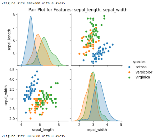 Pair Plots in a Loop 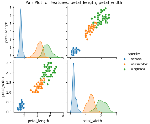 Pair Plots in a Loop ConclusionLooping through Seaborn plots enhances your ability to analyze and present data effectively. By automating plot generation and enabling comparative analysis, Seaborn empowers data scientists and analysts to derive deeper insights and make informed decisions based on visual data exploration. Whether for exploratory data analysis, research, or presentations, mastering the art of looping through Seaborn plots is a valuable skill in the field of data visualization and analysis.
|