Arrow
| Indicator
|
|---|
Places 2 arrows on the left and right hand sides of each slide
| Places 3 indicator lines at the bottom of each slide
|
The left arrow moves to the previous slide, while the right arrow moves to the next slide
| Denotes the position of the current slide being viewed relative to all the slides
|
HTML Codes of both arrow and indicator properties of the Carousel widget are provided in the official documentation of Ng Bootstrap, just like the codes of all its other widgets.
Features of the Arrows and Indicators
- Animates the slideshow: Allows to create custom animations for the slideshow, with customized time intervals in terms of milliseconds before the next slide is shown for better precision. This can be done using the animation and interval inputs to the carousel.
- Custom pauses: Slides can be customized to pause the transition while being focused on or being hovered on, giving the users more reading time. This can be done using the inputs: pauseOnFocus and pauseOnHover.
- Keyboard slideshow control: The slide movements in the slideshow can be controlled from the keyboard by setting the keyboard property to true.
- Custom first slide : The first slide to be displayed at the beginning of the slide show can be set using the activeId property. Then it overrides the default behavior of the slideshow of showing the slide which is at the first position, at the beginning of the slide show.
Steps to Implement Ng Bootstrap
Step 1: Create a new Angular project
Open Command Prompt or the terminal of an IDE like Visual Studio Code.
ng new <your-project-name>
Give your required selections to the follow-up questions and hit Enter.

Create a new Angular project
Step 2: Add ng-bootstrap CLI functionality
In the same workspace as the newly created Angular project, add ng-bootstrap by executing the following command:
ng add @ng-bootstrap/ng-bootstrap
Dependencies
"dependencies": {
    "@angular/animations": "^18.1.0",
    "@angular/common": "^18.1.0",
    "@angular/compiler": "^18.1.0",
    "@angular/core": "^18.1.0",
    "@angular/forms": "^18.1.0",
    "@angular/platform-browser": "^18.1.0",
    "@angular/platform-browser-dynamic": "^18.1.0",
    "@angular/platform-server": "^18.1.0",
    "@angular/router": "^18.1.0",
    "@angular/ssr": "^18.1.0",
    "@ng-bootstrap/ng-bootstrap": "^17.0.0",
    "@popperjs/core": "^2.11.8",
    "bootstrap": "^5.3.2",
    "express": "^4.18.2",
    "rxjs": "~7.8.0",
    "tslib": "^2.3.0",
    "zone.js": "~0.14.3"
}Folder Strucure

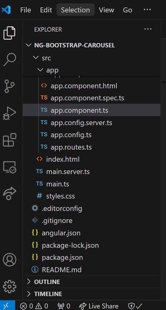
Folder Structure
Example: In this example we are creating a Carousel having Arrows and Indicators.
HTML
<!----index.html--->

<!doctype html>
<html lang="en">

<head>
    <meta charset="utf-8">
    <title>NgBootstrapCarousel</title>
    <base href="/">
    <meta name="viewport" content="width=device-width, initial-scale=1">
    <link rel="icon" type="image/x-icon" href="favicon.ico">
    <style>
        .carousel-item {
            height: 100vh;
            min-height: 300px;
        }

        .carousel-item img {
            height: 100%;
            width: 100%;
            object-fit: cover;
        }
    </style>
</head>

<body>
    <app-root></app-root>
</body>

</html>
//app.component.ts

import { Component, OnInit } from '@angular/core';
import { NgbCarouselConfig, NgbCarouselModule } from '@ng-bootstrap/ng-bootstrap';
import { CommonModule } from '@angular/common';


@Component({
    selector: 'app-root',
    standalone: true,
    imports: [CommonModule, NgbCarouselModule],
    providers: [NgbCarouselConfig],
    template: `
    <div *ngIf="images.length">
      <ngb-carousel [showNavigationArrows]="showNavigationArrows"
        [showNavigationIndicators]="showNavigationIndicators">
        <ng-template ngbSlide *ngFor="let image of images">
          <div class="picsum-img-wrapper">
            <img [src]="image" alt="Random slide" />
          </div>
          <div class="carousel-caption">
            <h3>No mouse navigation</h3>
            <p>This carousel hides navigation arrows and indicators.</p>
          </div>
        </ng-template>
      </ngb-carousel>
    </div>
    <hr />
    <div class="btn-group" role="group" aria-label="Carousel toggle controls">
      <button type="button" (click)="toggleNavigationArrows()"
         class="btn btn-outline-secondary btn-sm">
        Toggle navigation arrows
      </button>
      <button type="button" (click)="toggleNavigationIndicators()"
        class="btn btn-outline-secondary btn-sm">
        Toggle navigation indicators
      </button>
    </div>
  `,
    styles: [`
    .carousel-item {
      height: 100vh;
      min-height: 300px;
    }
    .carousel-item img {
      height: 100%;
      width: 100%;
      object-fit: cover;
    }
  `]
})
export class AppComponent implements OnInit {
    showNavigationArrows = true;
    showNavigationIndicators = true;
    images = [1055, 194, 368].map((n) => `https://picsum.photos/id/${n}/900/500`);


    constructor(config: NgbCarouselConfig) {
        config.showNavigationArrows = true;
        config.showNavigationIndicators = true;
        console.log('Config initialized:', config);
    }


    ngOnInit() {
        console.log('Component initialized');
        console.log('Images:', this.images);
    }


    toggleNavigationArrows() {
        this.showNavigationArrows = !this.showNavigationArrows;
        console.log('Toggled navigation arrows:', this.showNavigationArrows);
    }


    toggleNavigationIndicators() {
        this.showNavigationIndicators = !this.showNavigationIndicators;
        console.log('Toggled navigation indicators:', this.showNavigationIndicators);
    }
}
After navigating to your project folder, run
ng serve --open
This runs your code on the system’s default browser window
Output
Now the navigation arrows and navigation indicators of the carousel can be toggled, by clicking the respective buttons below the carousel.
On clicking the “Toggle Navigation Arrows” button, the arrows on the left and right hand sides in the carousel disappear. On re-clicking the button, the arrows again appear.
On clicking the “Toggle Navigation Indicators” button, the 3 indicators denoting which slide is currently selected at the bottom of the carousel disappear. On re-clicking the indicators again appear.


