
|
|
Scatter plots are a fundamental tool in data visualization, providing a clear way to display the relationship between two variables. Enhancing these plots with lines, such as trend lines or lines of best fit, can offer additional insights. This article will guide you through the process of drawing a line inside a scatter plot, using Python’s popular data visualization libraries: Matplotlib and Seaborn. Table of Content IntroductionScatter plots are used to observe and show relationships between two numeric variables. By plotting data points on two axes, we can quickly identify patterns, correlations, or anomalies. Adding lines to scatter plots can help us further understand these patterns, whether we are looking to show trends, fit models, or mark thresholds. PrerequisitesTo follow this guide, you should have a basic understanding of Python programming and have Python installed on your system. Additionally, you’ll need to install the following libraries if you haven’t already:
You can install these libraries using pip: 3. Creating a Scatter PlotLet’s start by creating a simple scatter plot using Matplotlib and Seaborn. 3.1. Generating Sample DataWe’ll generate some sample data using NumPy: 3.2. Plotting with MatplotlibNow, let’s create a scatter plot with Matplotlib: 3.3. Plotting with SeabornSimilarly, we can create a scatter plot with Seaborn:  4. Adding a Line to the Scatter PlotAdding a line inside a scatter plot can be done for various purposes, such as fitting a regression line, adding a reference line, or indicating thresholds. 4.1. Adding a Line of Best FitA common use case is to add a line of best fit, which helps visualize the relationship between the variables. 1. With MatplotlibTo add a line of best fit using Matplotlib, we can use NumPy to calculate the line: 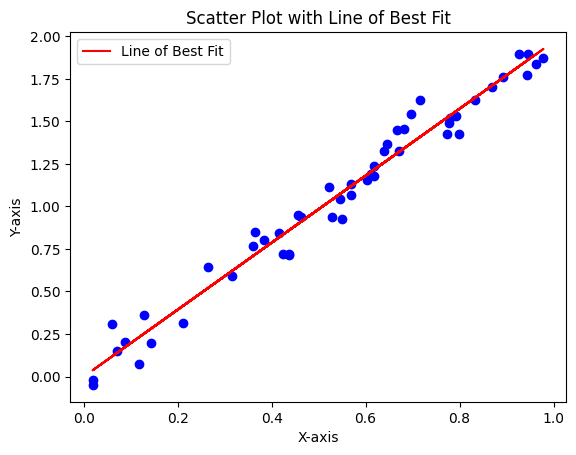 2. With SeabornSeaborn simplifies this process with its regplot function:  4.2. Adding Custom LinesYou might also want to add custom lines, such as horizontal or vertical lines, or lines with specific slopes and intercepts. 1. Horizontal and Vertical LinesAdding horizontal and vertical lines with Matplotlib:  2. Custom Slope and InterceptAdding a custom line with a specified slope and intercept:  ConclusionDrawing lines inside scatter plots enhances their utility by highlighting trends, making comparisons, and adding context. Whether you’re using Matplotlib or Seaborn, adding lines is a straightforward process that can significantly improve the clarity and interpretability of your data visualizations. Colab Link: https://colab.research.google.com/drive/1wkBaenqBMWK4F8gkxA3mL3EilGEOErQp#scrollTo=oKSyYUFAytLj |
Reffered: https://www.geeksforgeeks.org
| AI ML DS |
Type: | Geek |
Category: | Coding |
Sub Category: | Tutorial |
Uploaded by: | Admin |
Views: | 26 |