|
Seaborn has long been a popular library for data visualization in Python, known for its ease of use and beautiful default styles. However, with the release of Seaborn version 0.12, a new interface called the Seaborn objects system was introduced. This new system, inspired by the Grammar of Graphics, provides a more flexible and modular approach to creating visualizations. In this article, we will delve into the Seaborn objects system, exploring its features, benefits, and how to use it effectively.
What is the Seaborn Objects System?The Seaborn Objects System is a new part of Seaborn that was added in version 0.12.0. It offers a more flexible and clear way to create plots compared to the old Seaborn methods. By using a style called declarative syntax, the Seaborn Objects System lets users build plots in a way that is easy to understand and modify. This system makes it simple to combine different parts to create custom plots. Unlike the traditional Seaborn functions that require different methods for different types of plots, the objects system uses a unified approach. This system is based on the Grammar of Graphics with below features:
Key Features of the Seaborn Objects System:
- Modular Design: One of the standout features of the Seaborn objects system is its modularity. Instead of having separate functions for each type of plot, the objects system uses a single
Plot class to initialize the plotting process. Different graphical elements, or “marks,” can then be added to this plot using methods such as add(). This modular approach simplifies the creation of complex, multi-layered visualizations. - Consistent API: The objects system provides a consistent API for specifying and customizing plots. This consistency makes it easier to learn and use, as the same methods and parameters are used across different types of visualizations. For example, properties like color and size can be set directly or mapped to data variables using the same parameter names.
- Flexible Customization: The Seaborn objects system allows for extensive customization of plots. Users can set properties such as color, size, and edge width directly or map them to data variables. Additionally, the system supports a wide range of mark properties, enabling detailed control over the appearance of plots.
- Data Transformation: Before plotting, data can be transformed using various statistical methods. The objects system supports built-in transformations such as aggregations and smoothing, allowing for more sophisticated data analysis and visualization.
Getting Started with the Seaborn Objects SystemThe main function to create a plot in the Seaborn Objects System is sns.objects.Plot(). It creates a new plot figure.
Syntax:
# Create a new plot
plot = so.Plot()
1. Adding MarksMarks are the shapes that show our data, like points, lines, and bars. We can add marks to the axes to represent our data.
Syntax:
# Add a line mark to the plot
plot.add(so.Line(), x='x', y='y')
2. Adding Multiple LayersWe can add multiple layers to a plot by adding more marks. It allows us to create complex plots with different types of data representations.
Syntax:
# Add another mark, like points, to the same plot
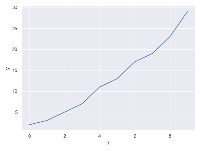
plot.add(so.Dot(), x='x', y='y') How to Use the Seaborn Objects System : Practical ExamplesExample 1: Creating Simple Plots- Import Seaborn’s objects module as so and Pandas as pd.
- Create a DataFrame data with two columns: ‘x’ (0 to 9) and ‘y’ (prime numbers).
- Create a plot with so.Plot(data).
- Add a line to the plot using so.Line(), mapping ‘x’ to ‘x’ and ‘y’ to ‘y’.
- Display the plot using plot.show().
Python
import seaborn.objects as so
import pandas as pd

# Sample data
data = pd.DataFrame({
    'x': range(10),
    'y': [2, 3, 5, 7, 11, 13, 17, 19, 23, 29]
})

# Create the plot using Seaborn Objects
plot = (
    so.Plot(data)
    .add(so.Line(), x='x', y='y')
)

# Render the plot
plot.show()
Output:
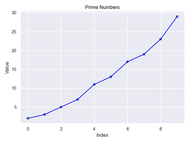
 Simple Plot Using Seaborn Object Example 2: Customization(Adding Marks)- Import libraries and create dataset.
- Create a plot with so.Plot(data).
- Add a blue line to the plot with so.Line(color=’blue’), mapping ‘x’ to ‘x’ and ‘y’ to ‘y’.
- Add dots to the plot using so.Dot(), mapping ‘x’ to ‘x’ and ‘y’ to ‘y’.
- Add labels for the x-axis, y-axis, and the title using .label(x=’Index’, y=’Value’, title=’Prime Numbers’).
- Display the plot using plot.show().
Python
import seaborn.objects as so
import pandas as pd

# Sample data
data = pd.DataFrame({
    'x': range(10),
    'y': [2, 3, 5, 7, 11, 13, 17, 19, 23, 29]
})

# Create and customize the plot
plot = (
    so.Plot(data)
    .add(so.Line(color='blue'), x='x', y='y')
    .add(so.Dot(), x='x', y='y')
    .label(x='Index', y='Value', title='Prime Numbers')
)

# Render the plot
plot.show()
Output:
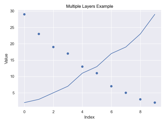
 Customized Plot using Seaborn Object Example 3: Adding Multiple Layers- Add a line to the plot with so.Line(), mapping ‘x’ to ‘x’ and ‘y1’ to ‘y’.
- Add dots to the plot with so.Dot(), mapping ‘x’ to ‘x’ and ‘y2’ to ‘y’.
- Add labels for the x-axis, y-axis, and the title using .label(x=’Index’, y=’Value’, title=’Multiple Layers Example’).
- Display the plot using plot.show().
Python
import seaborn.objects as so
import pandas as pd

# Sample data
data = pd.DataFrame({
    'x': range(10),
    'y1': [2, 3, 5, 7, 11, 13, 17, 19, 23, 29],
    'y2': [29, 23, 19, 17, 13, 11, 7, 5, 3, 2]
})

# Create the plot with multiple layers
plot = (
    so.Plot(data)
    .add(so.Line(), x='x', y='y1')
    .add(so.Dot(), x='x', y='y2')
    .label(x='Index', y='Value', title='Multiple Layers Example')
)

# Render the plot
plot.show()
Output:
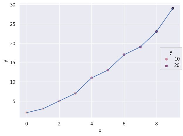
 Adding Multiple Layer Using Seaborn Object Example 4: Specifying and Mapping DataThe Seaborn objects system allows for intuitive data specification and mapping. Data variables can be assigned to plot properties such as x, y, color, and size. Here is an example:
Python
import seaborn.objects as so
import pandas as pd

data = pd.DataFrame({
    'x': range(10),
    'y': [2, 3, 5, 7, 11, 13, 17, 19, 23, 29]
})

# Create the plot
p = (
    so.Plot(data, x='x', y='y')
    .add(so.Line())
    .add(so.Dot(), color='y')
)
p.show()
Output:
 Specifying and Mapping Data Customizing Plot Properties With Seaborn Objects System- Figure-level functions are high-level interfaces that manage the overall layout and structure of the visualizations. They include functions like relplot, catplot, and lmplot.
- These functions create a figure and one or more subplots, handling facets and legends automatically.
In this example, relplot creates a scatter plot where the points are colored by the smoker variable, styled by the time variable, and sized by the size variable.
Python
import seaborn as sns
import matplotlib.pyplot as plt

# Load the tips dataset
tips = sns.load_dataset("tips")

# Create a relational plot
sns.relplot(x="total_bill", y="tip", data=tips, hue="smoker", style="time", size="size")
plt.show()
Output:
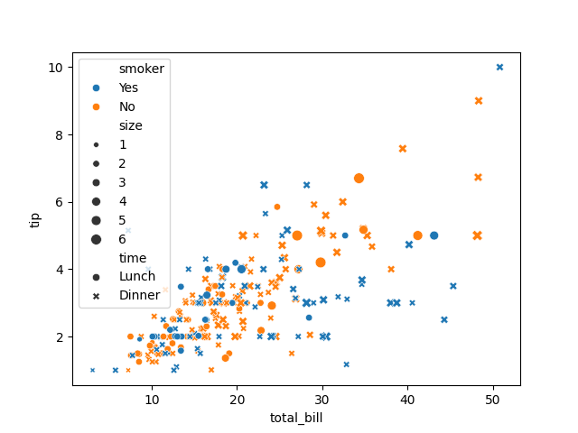
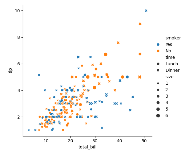 plotting Figure-Level Functions 2. Axes-Level Functions- Axes-level functions are lower-level functions that draw onto a single Matplotlib axes. They include functions like scatterplot, boxplot, and lineplot.
- These functions are more granular and allow for detailed customization of individual plots.
This example creates a scatter plot with similar customizations as the relplot example but does not handle facets or legends automatically.
Python
import seaborn as sns
import matplotlib.pyplot as plt

# Load the tips dataset
tips = sns.load_dataset("tips")

# Create a scatter plot
sns.scatterplot(x="total_bill", y="tip", data=tips, hue="smoker", style="time", size="size")
plt.show()
Output:
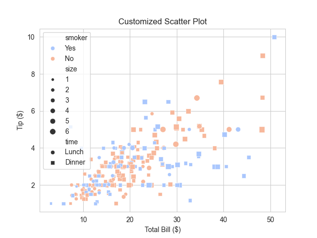
 Plotting Axes-Level Functions 3. Customizing Plot AestheticsThe Seaborn objects system provides extensive options for customizing plots. This includes changing colors, adding annotations, and modifying plot aesthetics.
In this example, the plot style is set to whitegrid, and the scatterplot function is used with a custom color palette and marker styles. The plot title and axis labels are also customized.
Python
import seaborn as sns
import matplotlib.pyplot as plt

# Load the tips dataset
tips = sns.load_dataset("tips")

# Set the style
sns.set_style("whitegrid")

# Create a customized scatter plot
sns.scatterplot(x="total_bill", y="tip", data=tips, hue="smoker", style="time", size="size", palette="coolwarm", markers=["o", "s"])
plt.title("Customized Scatter Plot")
plt.xlabel("Total Bill ($)")
plt.ylabel("Tip ($)")
plt.show()
Output:
 Customized Plot ConclusionThe Seaborn objects system represents a significant advancement in the field of data visualization in Python. Its modular and flexible design, consistent API, and powerful customization options make it a valuable tool for data scientists and analysts. By adopting the Grammar of Graphics approach, the Seaborn objects system allows for the creation of complex, multi-layered visualizations with ease.
|