|
Creating informative and visually appealing graphs is a crucial aspect of data visualization. In many cases, a single legend is insufficient to convey all the necessary information, especially when dealing with complex datasets. This article will guide you through the process of placing two different legends on the same graph using Python’s Matplotlib library. By the end of this tutorial, you will be able to enhance your graphs by providing clear and distinct legends for different data representations.
Prerequisites
Before we start, ensure you have the following prerequisites:
- Basic knowledge of Python programming.
- Installed Python environment (Python 3.6 or higher).
- Installed matplotlib library. You can install it using the following command:
pip install matplotlib Creating a Basic Plot Using MatplotlibLet’s start by creating a basic plot with two sets of data. We’ll use matplotlib for this purpose.
Python
import matplotlib.pyplot as plt
import numpy as np

# Generate sample data
x = np.linspace(0, 10, 100)
y1 = np.sin(x)
y2 = np.cos(x)

# Create a basic plot
plt.plot(x, y1, label='Sine Wave')
plt.plot(x, y2, label='Cosine Wave')
plt.title('Basic Plot with Sine and Cosine Waves')
plt.xlabel('X-axis')
plt.ylabel('Y-axis')
plt.show()
Output:
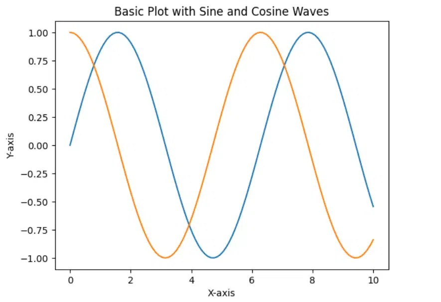 Created Plot This code generates a basic plot with sine and cosine waves.
Creating Legends On Same GraphWe create two separate legends:
- First Legend (Parameters)
- Second Legend (Algorithms)
1. Adding the First LegendTo add the first legend, use the legend() function. By default, matplotlib adds a single legend containing all the labeled elements.
Python
# Create a basic plot with the first legend
plt.plot(x, y1, label='Sine Wave')
plt.plot(x, y2, label='Cosine Wave')
plt.title('Plot with First Legend')
plt.xlabel('X-axis')
plt.ylabel('Y-axis')
plt.legend(loc='upper right')  # Positioning the legend
plt.show()
Output:
 Added first legend This code adds a legend for both the sine and cosine waves and positions it in the upper right corner.
2. Adding the Second LegendTo add a second legend, we need to use the ax.legend() method to create the first legend, and then manually add a second legend using the plt.gca().add_artist() method.
Python
# Create a basic plot
fig, ax = plt.subplots()
line1, = ax.plot(x, y1, label='Sine Wave')
line2, = ax.plot(x, y2, label='Cosine Wave')

# Add the first legend
first_legend = ax.legend(handles=[line1], loc='upper right')

# Add the second legend
second_legend = plt.legend(handles=[line2], loc='lower right')

# Manually add the first legend back to the plot
ax.add_artist(first_legend)

plt.title('Plot with Two Legends')
plt.xlabel('X-axis')
plt.ylabel('Y-axis')
plt.show()
Output:
 Added Second Legend This code adds two separate legends to the plot, each representing one of the waveforms.
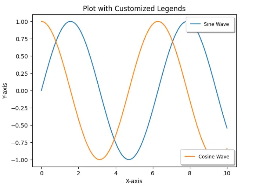
Customizing the Legends Same GraphYou can further customize the legends to enhance the visualization. For example, you can change the font size, background color, and border properties.
This code customizes the legends by adjusting the font size, adding a shadow, and modifying the border padding.
Python
# Create a basic plot
fig, ax = plt.subplots()
line1, = ax.plot(x, y1, label='Sine Wave')
line2, = ax.plot(x, y2, label='Cosine Wave')

# Add the first legend with customizations
first_legend = ax.legend(handles=[line1], loc='upper right', fontsize='small', frameon=True, shadow=True, borderpad=1)

# Add the second legend with customizations
second_legend = plt.legend(handles=[line2], loc='lower right', fontsize='small', frameon=True, shadow=True, borderpad=1)

# Manually add the first legend back to the plot
ax.add_artist(first_legend)

plt.title('Plot with Customized Legends')
plt.xlabel('X-axis')
plt.ylabel('Y-axis')
plt.show()
Output:
 Customized Plot Handling Legend OverlapIn some cases, the legends might overlap with the plot. To avoid this, you can adjust the position of the plot using ax.set_position():
Python
import matplotlib.pyplot as plt
import numpy as np

# Sample data
x = np.linspace(0, 10, 100)
y1 = np.sin(x)
y2 = np.cos(x)

fig, ax = plt.subplots()
ax.plot(x, y1, label='Sine')
ax.plot(x, y2, label='Cosine')

# Place legend outside the plot
ax.legend(loc='center left', bbox_to_anchor=(1, 0.5))

# Adjust the position of the plot to make room for the legend
# This setting moves the plot leftwards, reducing its width
ax.set_position([0.1, 0.1, 0.6, 0.8])  # [left, bottom, width, height]
plt.show()
Output:
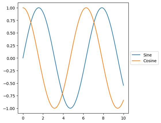 Handling Legend Overlap Best Practices for Multiple LegendsWhen working with multiple legends, it is essential to follow best practices to ensure clarity and readability:
- Positioning: Place legends in a way that minimizes overlap with the data and other graphical elements. Common positions include the upper right, upper left, or outside the plot area.
- Titles: Use distinct titles for each legend to clearly indicate the subset of data it corresponds to.
- Colors and Styles: Use consistent colors and line styles within each legend to maintain visual coherence.
- Legend Size: Ensure that the legends are large enough to be readable but not so large that they overwhelm the graph.
ConclusionAdding two different legends to the same graph can enhance the readability and interpretation of complex data visualizations. By following the steps outlined in this article, you can create a plot with two legends, customize them to suit your needs, and display or save the plot. With matplotlib, the process is straightforward and flexible, allowing you to produce clear and informative visualizations.
|