
|
|
Seaborn, a Python data visualization library built on top of Matplotlib, offers a variety of tools for creating informative and visually appealing plots. One of the most commonly used plots is the bar plot, which is particularly useful for comparing categorical data. However, when dealing with datasets that have a wide range of values, it can be challenging to effectively display the data without losing important details. This article will delve into the techniques for scaling Seaborn’s y-axis with a bar plot, ensuring that your visualizations accurately convey the underlying data. Table of Content Understanding the Need for ScalingBefore diving into the technical aspects of scaling, it is essential to understand why scaling is necessary. When working with datasets that have a large range of values, a standard linear scale can make it difficult to distinguish between smaller values. This is particularly problematic when the majority of the data points are clustered at the lower end of the scale, making it hard to visualize the differences between them. Before we dive into the how, let’s clarify why y-axis scaling is essential:
Methods for Scaling the y-axis
Scaling y-axis with a Bar Plot : Implementation with SeabornStep 1: Import necessary librariesStep 2:Creating a Simple Bar PlotLet’s create a simple bar plot to understand how to adjust the y-axis. Output: Plotting Simple Bar Plot Step 3: Scaling the y-axis1. Setting the y-axis limitsWe can set the minimum and maximum values of the y-axis using plt.ylim(). Output:  Set the y axis limit 2. Using a logarithmic scaleFor data that spans several orders of magnitude, a logarithmic scale can be useful. Output:  Using Logarithmic scale 3. Adjusting the number of ticksWe can customize the tick marks on the y-axis using plt.yticks(). Output:  Adjusting the number of ticks Step 4: Customizing the PlotWe used a pastel color palette, set y-axis limits, and added titles and labels to make the plot more informative. Output: 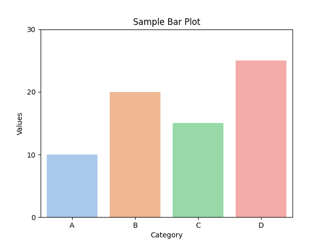 Customized plot ConclusionAdjusting the y-axis in a Seaborn bar plot is an easy but effective way to make your charts clearer and more useful. By setting the right limits, using a logarithmic scale when needed, and customizing the ticks and labels, we can make our data easier to understand and more attractive. Using these simple techniques, we can make the most of Seaborn to create great-looking and informative charts. |
Reffered: https://www.geeksforgeeks.org
| AI ML DS |
Type: | Geek |
Category: | Coding |
Sub Category: | Tutorial |
Uploaded by: | Admin |
Views: | 18 |