
|
|
Seaborn is a powerful Python library for data visualization built on top of Matplotlib. It provides a high-level interface for drawing attractive and informative statistical graphics. One of the key features of Seaborn is its ability to handle color palettes effectively, which can significantly enhance the readability and aesthetics of your plots. This article will guide you through various methods to change plot colors in Seaborn, focusing on different types of plots and color customization techniques. Table of Content
Introduction to Seaborn Color CustomizationSeaborn offers several ways to customize plot colors, including changing the palette, specifying individual colors, and using built-in themes. These customizations can enhance the clarity and aesthetics of your visualizations, making them more effective in communicating your data. Seaborn offers several built-in color palettes and allows for extensive customization. The primary methods to change colors in Seaborn plots include using the Changing the Color Palette In SeabornSeaborn provides a range of built-in color palettes that you can use to style your plots. You can set a color palette using the set_palette() function. Output: Changing the Color Palette In this example, the “husl” palette is applied to the boxplot. Seaborn supports several other palettes, including “deep”, “muted”, “bright”, “dark”, and more. Customizing Colors for Specific PlotsYou can also specify colors for individual plots directly using the color parameter or by setting the palette parameter for specific plots. 1. Changing Color for a Single PlotOutput:  Changing Color for a Single Plot 2. Using Palette for Categorical PlotsOutput: 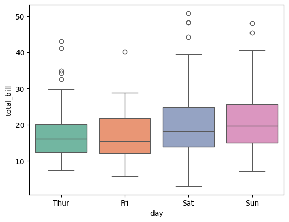 Using Palette for Categorical Plots 3. Changing the Color of a Single LineTo change the color of a single line in a Seaborn plot, you can use the Output:  Changing the Color of a Single Line In this example, the line color is set to red using the 4. Changing the Color of Multiple LinesWhen plotting multiple lines, you can use the Output: 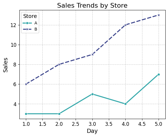 Changing the Color of Multiple Lines Customizing Colors with Hex Codes or RGB ValuesYou can also create custom color palettes by passing a list of colors in any valid Matplotlib format, including RGB tuples, hex color codes, or HTML color names. You can define custom colors using hex codes or RGB values for precise control over your plot’s appearance. Example: custom_palette = ["#090364", "#091e75", "#093885", "#085396", "#086da6", 1. Using Hex CodesThe code loads the ‘tips’ dataset and uses Seaborn to create a boxplot of ‘total_bill’ across ‘day’, applying a custom color palette defined by specific hex color codes. The plot is then displayed using Matplotlib. Output:  Using Hex Codes 2. Using RGB ValuesThe code loads the ‘tips’ dataset and creates a boxplot of ‘total_bill’ across ‘day’ using Seaborn, with a custom color palette defined by specific RGB values. The plot is then displayed using Matplotlib. Output: 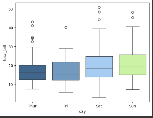 Using RGB Values Changing Colors in Specific Plot TypesDifferent plot types in Seaborn have specific parameters for color customization. Here are a few examples: 1. Scatter PlotOutput: 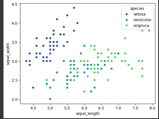 Scatter Plot 2. HeatmapOutput: 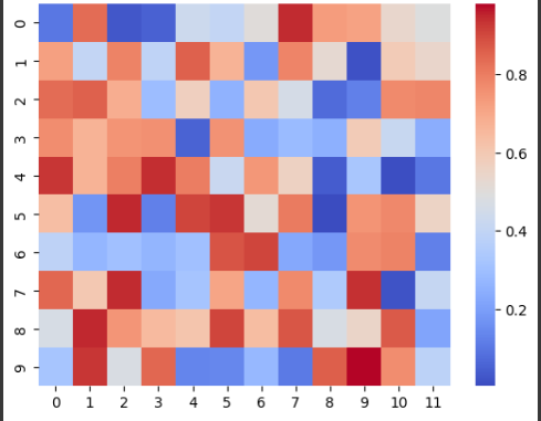 Heatmap ConclusionChanging plot colors in Seaborn is a versatile way to enhance the visual appeal and readability of your visualizations. Whether you’re using built-in palettes, custom colors, or adjusting specific plot types, Seaborn provides a straightforward and flexible approach to color customization. By following the methods outlined in this article, you can create visually striking plots that effectively communicate your data insights. |
Reffered: https://www.geeksforgeeks.org
| AI ML DS |
Type: | Geek |
Category: | Coding |
Sub Category: | Tutorial |
Uploaded by: | Admin |
Views: | 17 |