|
In mobile app development, animations and transitions play a major role in providing a simple and smooth user experience, making it visually appealing to the users, interacting with the app.
What is AnimatedSize in Flutter?In Flutter, the AnimatedSize widget is a powerful tool, that automatically animates the resizing of its child widget when its size changes. It provides a smooth and visually appealing transition, making it an ideal choice for scenarios that require contracting or expanding a widget based on user interactions or state changes in your app.
Using this widget one can do many things like animate dynamic content, responsive UI animations, gamification, interactive elements animations etc. Here’s the official documentation of the AnimatedSize class in Flutter.
Here are the several constraints and properties that come with the AnimatedSize widget in Flutter, that you can use to customize and fine-tune the animation behavior.
Constraint
| Description
|
|---|
duration
| This constraint specifies the duration of the size animation.
It accepts a Duration object and can set the duration of the animation in milliseconds. Longer Duration will result in Slow animation, while Shorter Duration makes the animation faster.
|
|---|
curve
| This constraint defines the rate of change during the animation (e.g., ease in, ease out, linear).
Flutter provides various pre-defined curve options like Curves. linear, Curves.easeIn, Curves.easeOut, Curves.easeInOut, etc. You can also create custom curves using the Cubic or Curve classes.
|
|---|
alignment
| The alignment constraint determines the alignment of the child widget within the AnimatedSize widget during the animation. It accepts an AlignmentGeometry value, which can be used to specify the alignment along the x and y axes.
This is particularly useful when you want to control the position of the child widget as it grows or shrinks during the animation.
|
|---|
reverseDuration
| This constraint allows you to specify a separate duration for the reverse animation, which occurs when the child widget shrinks in size.
By default, the reverseDuration is set to the same value as the duration, but you can override it to have a different animation duration for the contraction phase.
|
|---|
clipBehavior
| The clipBehavior constraint determines how the child widget should be clipped during the animation. It accepts a Clip value, which can be Clip.none (default), Clip.hardEdge, or Clip.antiAlias.
This constraint is useful when you want to control the clipping behavior of the child widget, especially when it extends beyond its parent’s boundaries during the animation.
|
|---|
vsync
| The vsync constraint is used to provide a TickerProvider for the animation controller.
In most cases, you can pass the TickerProviderStateMixin of your StatefulWidget to ensure smooth animations.
|
|---|
child
| This is a required constraint that specifies the child widget to be animated by the AnimatedSize widget.
You can pass any widget or widget tree as the child of AnimatedSize.
|
|---|
Example of AnimatedSize in FlutterWe will learn how to implement AnimatedSize in Flutter as mentioned below:
Step 0: Create New Flutter Project To create a new project in Android Studio please refer to How to Create/Start a New Flutter Project in Android Studio.
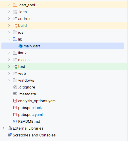
After Creating Project for AnimatedSize in Flutter, the Directory Structure will be as shown below:
 Step 1: Import required packages :import 'package:flutter/material.dart'; Step 2 : Main function void main() {
runApp(MyApp());
}The main function is the entry point of the Flutter app, calling runApp(MyApp()) to start the app.
Step 3 : Defining the My app
Dart
class MyApp extends StatelessWidget {
@override
Widget build(BuildContext context) {
return MaterialApp(
title: 'GeeksforGeeks Text Example',
theme: ThemeData(
primaryColor: Color(0xFF5CB85C), // GeeksforGeeks green color
),
home: MyHomePage(),
);
}
}
MyApp is a stateless widget that returns a MaterialApp with a title, theme, and home set to MyHomePage.
Step 4 : Define MyHomePage Stateful Widget
Dart
class MyHomePage extends StatefulWidget {
@override
_MyHomePageState createState() => _MyHomePageState();
}
class _MyHomePageState extends State<MyHomePage> {
bool _isExpanded = false;
Step 5 : Build Method of _MyHomePageState
Dart
@override
Widget build(BuildContext context) {
return Scaffold(
appBar: AppBar(
title: Text('GeeksforGeeks AnimatedSize'),
),
body: Center(
child: Column(
mainAxisAlignment: MainAxisAlignment.center,
children: [
AnimatedSize(
duration: Duration(milliseconds: 1000),
curve: Curves.elasticOut,
child: Container(
width: _isExpanded ? 300.0 : 100.0,
height: _isExpanded ? 100.0 : 50.0,
decoration: BoxDecoration(
color: Theme.of(context).primaryColor,
borderRadius: BorderRadius.circular(_isExpanded ? 20.0 : 10.0),
),
child: Center(
child: Text(
'GeeksforGeeks',
style: TextStyle(
color: Colors.white,
fontSize: _isExpanded ? 24.0 : 12.0,
fontWeight: FontWeight.bold,
),
),
),
),
),
SizedBox(height: 16.0),
ElevatedButton(
onPressed: () {
setState(() {
_isExpanded = !_isExpanded;
});
},
style: ElevatedButton.styleFrom(
backgroundColor: Theme.of(context).primaryColor,
),
child: Text(
_isExpanded ? 'Collapse' : 'Expand',
style: TextStyle(
color: Colors.white,
),
),
),
],
),
),
);
}
- The build method returns a Scaffold with an AppBar and a Center widget.
- The Center contains a Column with an AnimatedSize widget that animates a Container based on _isExpanded.
- An ElevatedButton toggles _isExpanded when pressed, causing the animation to play
Complete Code of the Example
main.dart
import 'package:flutter/material.dart';
void main() {
  runApp(MyApp());
}
class MyApp extends StatelessWidget {
@override
Widget build(BuildContext context) {
return MaterialApp(
title: 'GeeksforGeeks Text Example',
theme: ThemeData(
// GeeksforGeeks green color
primaryColor: Color(0xFF5CB85C),
),
home: MyHomePage(),
);
}
}
class MyHomePage extends StatefulWidget {
  @override
  _MyHomePageState createState() => _MyHomePageState();
}

class _MyHomePageState extends State<MyHomePage> {
  bool _isExpanded = false;
@override
Widget build(BuildContext context) {
return Scaffold(
appBar: AppBar(
title: Text('GeeksforGeeks AnimatedSize'),
),
body: Center(
child: Column(
mainAxisAlignment: MainAxisAlignment.center,
children: [
AnimatedSize(
duration: Duration(milliseconds: 1000),
curve: Curves.elasticOut,
alignment: _isExpanded ? Alignment.center : Alignment.topCenter,
reverseDuration: Duration(milliseconds: 500),
clipBehavior: Clip.antiAlias,
child: Container(
width: _isExpanded ? 300.0 : 100.0,
height: _isExpanded ? 100.0 : 50.0,
decoration: BoxDecoration(
color: Theme.of(context).primaryColor,
borderRadius: BorderRadius.circular(_isExpanded ? 20.0 : 10.0),
),
child: Center(
child: Text(
'GeeksforGeeks',
style: TextStyle(
color: Colors.white,
fontSize: _isExpanded ? 24.0 : 12.0,
fontWeight: FontWeight.bold,
),
),
),
),
),
SizedBox(height: 16.0),
ElevatedButton(
onPressed: () {
setState(() {
_isExpanded = !_isExpanded;
});
},
style: ElevatedButton.styleFrom(
backgroundColor: Theme.of(context).primaryColor,
),
child: Text(
_isExpanded ? 'Collapse' : 'Expand',
style: TextStyle(
color: Colors.white,
),
),
),
],
),
),
);
}
}
This code will create a Text Animation , expanding and collapsing the size when button clicked .
Output :
|
 AnimatedWidget Flutter
 SQLite in Flutter
 Application Localization in Flutter
 AssetBundle Flutter