|
Seaborn is a powerful Python library for creating informative and attractive statistical graphics. One of its many capabilities is creating point plots, which are useful for visualizing relationships between variables. Adding a legend to a Seaborn point plot can enhance its interpretability, helping viewers understand the data and the categories being represented. This article will guide you through the process of adding a legend to a Seaborn point plot.
Introduction to Seaborn Point PlotsA point plot displays points representing the mean (or other statistic) of a variable for each level of a categorical variable. This can be useful for comparing different categories and visualizing trends. Point plots are particularly useful for comparing different levels of one or more categorical variables.
Here’s a basic example of a Seaborn point plot:
Python
import seaborn as sns
import matplotlib.pyplot as plt

# Sample data
tips = sns.load_dataset("tips")

# Creating a basic point plot
sns.pointplot(x="day", y="total_bill", data=tips)
plt.show()
Output:
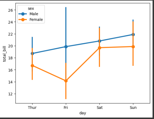
 Seaborn Point Plots Adding a Legend to a Seaborn Point PlotMethod 1: Using the hue ParameterThe simplest way to add a legend to a Seaborn point plot is by using the hue parameter. This parameter allows you to group data points by a categorical variable, and Seaborn will automatically generate a legend.
In this example: The hue=”sex” parameter differentiates between male and female using different colors.
Python
import seaborn as sns
import matplotlib.pyplot as plt

# Sample data
tips = sns.load_dataset("tips")

# Creating a point plot with hue
sns.pointplot(x="day", y="total_bill", hue="sex", data=tips)
plt.show()
Output:
 Adding a Legend to a Seaborn Point Plot Method 2: Manually Adding a LegendIf you need more control over the legend, you can manually add it using Matplotlib’s plt.legend() function. This is useful when you are plotting multiple datasets sequentially.
Python
import seaborn as sns
import matplotlib.pyplot as plt
import pandas as pd

df1 = pd.DataFrame({'date': pd.date_range(start='1/1/2020', periods=4), 'count': [35, 43, 12, 27]})
df2 = pd.DataFrame({'date': pd.date_range(start='1/1/2020', periods=4), 'count': [25, 33, 22, 17]})
df3 = pd.DataFrame({'date': pd.date_range(start='1/1/2020', periods=4), 'count': [45, 53, 32, 37]})

# Plotting multiple dataframes
plt.figure(figsize=(10, 6))
sns.pointplot(x='date', y='count', data=df1, color='blue', label='Dataset 1')
sns.pointplot(x='date', y='count', data=df2, color='green', label='Dataset 2')
sns.pointplot(x='date', y='count', data=df3, color='red', label='Dataset 3')

# Adding legend
plt.legend(title='Datasets')
plt.show()
Output:
 Adding Legend to Seaborn point plot In this example, we plot three datasets sequentially and use the label parameter to specify the legend entries. The plt.legend() function is then used to add the legend to the plot.
Method 3: Using FacetGridFor more complex plots, you can use Seaborn’s FacetGrid to create a grid of plots and add a legend. This is particularly useful when you have multiple subplots and want to add a single legend for all of them.
Python
import seaborn as sns
import matplotlib.pyplot as plt

data = sns.load_dataset("penguins")

# Creating a FacetGrid
g = sns.FacetGrid(data, col="species", hue="sex", height=4, aspect=1)
g.map(sns.pointplot, "island", "body_mass_g")
g.add_legend(title='Sex')
plt.show()
Output:
.webp) Adding Legend to Seaborn point plot In this example, FacetGrid is used to create a grid of point plots for each species of penguin, and a single legend is added using the add_legend() method.
Customizing the Legend for Seaborn Point PlotSeaborn automatically adds a legend when the hue parameter is used. However, you can customize the legend to improve its appearance and placement.
1. Changing Legend PositionYou can change the position of the legend using the plt.legend() function with the loc parameter. Here are some common positions:
- Upper right
- Upper left
- Lower left
- Lower right
- Right
- Center left
- Center right
- Lower center
- Upper center
- Center
Python
import seaborn as sns
import matplotlib.pyplot as plt

data = sns.load_dataset("penguins")

# Point plot with hue
sns.pointplot(data=data, x="island", y="body_mass_g", hue="sex")
plt.legend(loc='center left', title='Sex')
plt.show()
Output:
 Changing Legend Position In this example, the legend is positioned in the center left corner of the plot.
2. Placing Legend Outside the PlotTo place the legend outside the plot, you can use the bbox_to_anchor() argument.
Python
import seaborn as sns
import matplotlib.pyplot as plt

# Sample data
data = sns.load_dataset("penguins")

# Point plot with hue
sns.pointplot(data=data, x="island", y="body_mass_g", hue="sex")
plt.legend(bbox_to_anchor=(1.05, 1), loc='upper left', borderaxespad=0, title='Sex')
plt.show()
Output:
 Placing Legend Outside the Plot In this example, the legend is placed outside the plot on the top right corner.
Handling Multiple Legends in Seaborn point plotIf you have multiple plots or layers, you might need to manage multiple legends. This can be done by using the ax.legend method and controlling which legends are displayed.
Python
import seaborn as sns
import matplotlib.pyplot as plt

# Sample data
tips = sns.load_dataset("tips")

# Creating multiple point plots
sns.pointplot(x="day", y="total_bill", hue="sex", data=tips, markers=["o", "s"], linestyles=["-", "--"])
sns.pointplot(x="day", y="tip", hue="sex", data=tips, markers=["x", "^"], linestyles=[":", "-."])

# Customizing the legend
plt.legend(title='Legend', loc='upper left', bbox_to_anchor=(1, 1))
plt.show()
Output:
 In this example:
- Multiple point plots are created using different markers and line styles.
- The plt.legend method is used to create a single, consolidated legend.
ConclusionAdding a legend to a Seaborn point plot is a straightforward process that can be achieved using various methods depending on your specific needs. Whether you use the hue parameter for automatic legend generation, manually add a legend using Matplotlib, or employ FacetGrid for more complex plots, Seaborn provides flexible options to enhance the interpretability of your visualizations.
|
