|
Data visualization is crucial for clearly conveying insights derived from data. In R Programming Language ggplot2 is a widely used tool for crafting visually engaging and informative plots. While ggplot2 offers various ways to personalize plots, like adjusting colors and line styles, one feature that often goes unnoticed is the capability to assign distinct shapes to each data point.
Different Shapes for Every Point in ggplotIn ggplot2, shapes for points are specified using the shape aesthetic. ggplot2 supports a variety of shapes, identified by integers ranging from 0 to 25. Each shape can be mapped to a different factor level in your dataset, allowing you to display different shapes for each point.
- Aesthetic Mapping: The
shape aesthetic is used to map factor levels to different shapes. - Factor Variables: Shapes can be mapped to factor variables, which ensures each level of the factor gets a unique shape.
- Shape Codes: ggplot2 uses integer codes to specify different shapes (circles, squares, triangles).
Now we will discuss the step-by-step implementation of How to Use Different Shapes for Every Point in ggplot.
Step 1: Load Required LibrariesFirst, make sure you have ggplot2 installed and loaded:
R
Step 2: Create a basic scatter plotWe will create a basic scatter plot and then we Use Different Shapes for Every Point in ggplot.
R
basic_plot <- ggplot(iris, aes(x = Sepal.Length, y = Sepal.Width)) +
  geom_point()

print(basic_plot)
Output:
 Basic Scatter Plot - Use the ggplot() function to create a basic scatter plot using the iris dataset.
- Specify the variables Sepal.Length for the x-axis and Sepal.Width for the y-axis.
Step 3: Customize shapes based on speciesNow we will Customize shapes based on species of our dataset.
R
custom_shapes <- ggplot(iris, aes(x = Sepal.Length, y = Sepal.Width, shape = Species)) +
  geom_point(size = 3) +
  scale_shape_manual(values = c(1, 2, 3))  # Define custom shapes

print(custom_shapes)
Output:
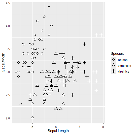 Customized Shapes Plot - Now, customize the shapes of the points based on the species of iris.
- Use the Species variable to differentiate the points and assign custom shapes to each species.
Advance CustomizationNow we will use Advance Customization to Use Different Shapes for Every Point in ggplot.
R
# Load required library
library(ggplot2)

# Create a scatter plot with custom shapes based on transmission type
advanced_plot <- ggplot(mtcars, aes(x = wt, y = mpg, shape = factor(am),
                                    color = factor(cyl))) +
  geom_point(size = 5) +
  scale_shape_manual(values = c(21, 22)) +
# Custom shapes for automatic (0) and manual (1) transmission
  scale_color_manual(values = c("blue", "green", "red")) +  # Custom colors for cylinders
  labs(title = "Fuel Efficiency vs. Weight by Transmission Type",
       x = "Weight (1000 lbs)",
       y = "Miles Per Gallon",
       color = "Cylinders",
       shape = "Transmission") +
  theme_minimal()

# Print the advanced plot
print(advanced_plot)
Output:
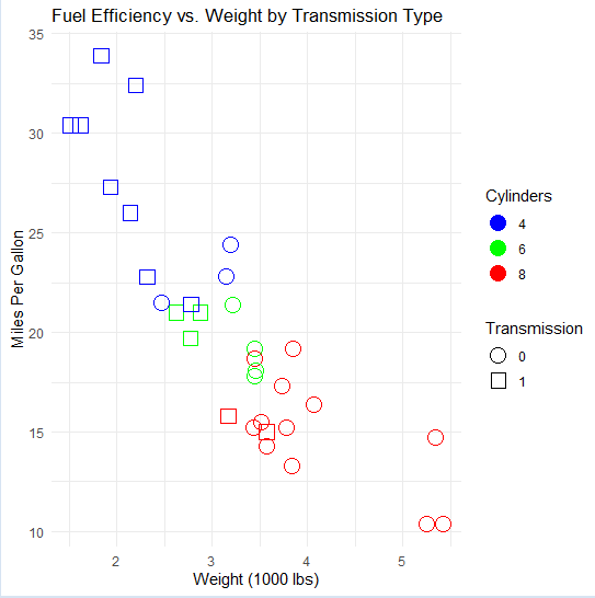 Advance Customization for using different shapes - We’re using the mtcars dataset.
- Plotting wt (weight) on the x-axis and mpg (miles per gallon) on the y-axis.
- Using the am variable (transmission type: automatic or manual) to differentiate points by shape.
- The cyl variable (number of cylinders) to differentiate points by color.
- Custom shapes and colors are specified using scale_shape_manual() and scale_color_manual() respectively.
- Additional labels and a title are added using labs().
- We’re applying a minimal theme using theme_minimal() for a clean and modern look.
ConclusionCreating visually appealing scatter plots with ggplot2 involves assigning different shapes to each data point based on a grouping variable. This customization improves plot interpretability, enabling more effective information conveyance. Experimenting with various shapes, sizes, and colors allows for the creation of visualizations that accurately represent data and communicate insights clearly. ggplot2’s flexibility offers endless possibilities for crafting informative and engaging plots.
|