|
Essential UI components that let users select between two options are checkboxes. By default, the browser controls how checkboxes appear, including the color of the check mark. However, you can style these components using CSS to blend in with the website. This requires maintaining the built-in check and its checked state with unique components.
These are the following approaches:
Using Pseudo-ElementsA common approach is to make a custom checkbox and its checked mark by hiding the normal checkbox and using the ::before and ::after pseudo-elements. This gives you complete control over how the checked and unchecked status look.
Example: This example shows the implementation of the above-explained approach.
HTML
<!DOCTYPE html>
<html>

<head>
    <title>Styled Checkbox</title>
    <link rel="stylesheet" href="style.css">
    <style>
        .heading {
            color: green;
            text-align: center;
        }

        .subheading {
            text-align: center;
        }

        .container {
            display: flex;
            flex-direction: column;
            align-items: center;
        }

        input[type="checkbox"] {
            width: 20px;
            height: 20px;
            appearance: none;
            -webkit-appearance: none;
            background-color: #e0e0e0;
            border: 1px solid #ccc;
            border-radius: 3px;
            cursor: pointer;
            position: relative;
        }

        input[type="checkbox"]:checked {
            background-color: #4CAF50;
            border: 1px solid #4CAF50;
        }

        input[type="checkbox"]:checked::after {
            content: "";
            position: absolute;
            left: 5px;
            top: 1px;
            width: 6px;
            height: 12px;
            border-width: 0 3px 3px 0;
            transform: rotate(45deg);
        }
    </style>
</head>

<body>
    <h2 class="heading">horje</h2>
    <h3 class="subheading">Change Checkbox color</h3>
    <div class=" container">
        <input type="checkbox" id="styled-checkbox">
        <label for="styled-checkbox">Option 1</label>
        <input type="checkbox" id="styled-checkbox">
        <label for="styled-checkbox">Option 2</label>
        <input type="checkbox" id="styled-checkbox">
        <label for="styled-checkbox">Option 3</label>
        <input type="checkbox" id="styled-checkbox">
        <label for="styled-checkbox">Option 4</label>
    </div>
</body>

</html>
Output:
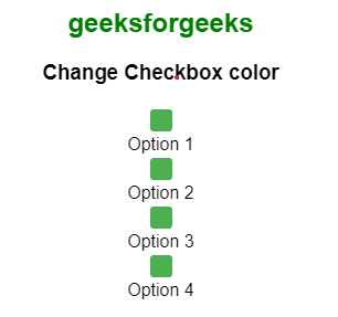 Using the CSS accent-color propertyUsing this property, you can choose a single color that will be applied to the backdrop of the checkbox and the checked mark, among other elements within a form control.
Example: The following demonstrates a Basic Custom Checkbox.
HTML
<!DOCTYPE html>
<html lang="en">

<head>
    <meta charset="UTF-8">
    <meta name="viewport" content="width=device-width,initial-scale=1.0">
    <title>Custom Checkbox</title>
</head>
<style>
    .container {
        display: flex;
        flex-direction: column;
        align-items: center;
    }

    .heading {
        color: green;
        text-align: center;
    }

    .subheading {
        text-align: center;
    }

    input[type="checkbox"] {
        accent-color: #4CAF50;
        /* Green color */
    }
</style>

<body>
    <h2 class="heading">GeeksforGeeks</h2>
    <h3 class="subheading">Change Checkbox color</h3>
    <div class="container">
        <label>
            <input type="checkbox" id="checkbox1">
            <span class="custom-checkbox"></span> Option 1
        </label>
        <label>
            <input type="checkbox" id="checkbox1">
            <span class="custom-checkbox"></span> Option 2
        </label>
        <label>
            <input type="checkbox" id="checkbox1">
            <span class="custom-checkbox"></span> Option 3
        </label>
        <label>
            <input type="checkbox" id="checkbox1">
            <span class="custom-checkbox"></span> Option 4
        </label>
    </div>
</body>

</html>
Output:

|
 What is Advanced CSS and What do you Need to Learn?
 How to Create Gradient Color of Progress Bar in CSS?
 The Ultimate Guide to CSS
 Primer CSS
 Blaze UI