
|
|
Funnel visualizations are a powerful tool in data visualization, commonly used to represent processes that involve sequential steps, such as sales conversions, website user journeys, and customer acquisition. By visualizing data in a funnel, it becomes easier to identify bottlenecks and optimize each stage of the process. This article explores various types of funnel visualizations, their applications, and best practices for their use. Table of Content Understanding Funnel VisualizationsA funnel visualization is a graphical representation used to illustrate a process that involves several sequential stages. This type of chart is designed to visually depict the flow and attrition of users, items, or any measurable entities through these stages. The chart is shaped like a funnel, with the widest part at the top representing the initial stage, which usually has the highest number of entries. As entities move through subsequent stages, the funnel narrows, indicating a decrease in the number of entities progressing to each next stage. Key Components
Applications of Funnel VisualizationsFunnel visualizations are versatile and applicable in various fields, including:
Types of Funnel VisualizationsDifferent types of funnel visualizations cater to specific needs and data structures. Below are some of the most common types used in data visualization: 1. Basic Funnel ChartA basic funnel chart is the simplest form of funnel visualization. It displays a single funnel with stages represented by horizontal bars, where each bar’s width is proportional to the quantity at that stage. Ideal for simple, linear processes with clearly defined stages, such as a sales funnel tracking potential customers from initial contact to final purchase. Types of Funnel Visualizations in Data Visualization Pseudocode implementation: It uses Matplotlib to create a basic horizontal bar chart representing different stages in a funnel, with bar widths proportional to stage values. import matplotlib.pyplot as plt Use-cases:
2. Stacked Funnel ChartA stacked funnel chart adds an extra layer of detail by dividing each stage into sub-categories. This helps to analyze the contribution of different segments within each stage. 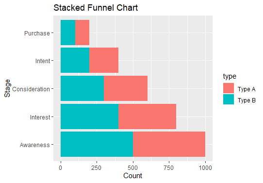 Types of Funnel Visualizations in Data Visualization Pseudocode Implementation: This code uses Matplotlib and pandas to create a stacked horizontal bar chart, showing sub-categories within each stage of the funnel. import pandas as pd Use-cases:
3. Horizontal Funnel ChartA horizontal funnel chart displays the stages of the funnel horizontally rather than vertically, aligning with the left-to-right reading pattern.  Types of Funnel Visualizations in Data Visualization Implementation: Using Plotly, this code creates a funnel chart with stages displayed horizontally, showing the proportion of items at each stage. import plotly.graph_objects as go Use-cases:
4. Multi-Funnel ChartA multi-funnel chart compares multiple funnels side by side, allowing for the analysis of different processes or segments within the same chart. Ideal for comparative analysis, such as comparing sales funnels for different products or user behaviors across different demographics.  Types of Funnel Visualizations in Data Visualization Implementation Example: This Plotly implementation creates multiple funnel charts side by side, allowing for comparative analysis across different funnels. import plotly.graph_objects as go Use-cases:
5. 3D Funnel ChartA 3D funnel chart adds depth to the traditional funnel visualization, making it visually appealing and easier to differentiate between stages. Useful for presentations where visual impact is important. However, be cautious as 3D effects can sometimes distort data perception.  3D Funnel Chart Pseaudocode Implementation: This code uses Plotly to create a 2D funnel chart with visual depth effects to mimic a 3D appearance for better presentation. import plotly.graph_objects as go Use-cases:
6. Interactive Funnel ChartAn interactive funnel chart allows users to interact with the visualization, such as hovering to see details, clicking to drill down, or filtering data dynamically. Ideal for dashboards and reports where users need to explore data in depth. Tools like D3.js, Plotly, and Tableau are commonly used to create interactive funnel charts.  Types of Funnel Visualizations in Data Visualization For this implementation, This Plotly implementation creates an interactive funnel chart, allowing users to hover over sections to see detailed information. import plotly.graph_objects as go Use-cases:
Best Practices for Funnel VisualizationsEnsure that the stages are clearly labeled and the chart is easy to understand at a glance.
ConclusionFunnel visualizations are a versatile and effective tool in data visualization, helping to illustrate the flow and conversion rates of processes. By understanding the different types of funnel visualizations and their appropriate use cases, you can choose the best visualization method to communicate your data insights effectively. Whether it’s a simple linear process or a complex multi-segment analysis, funnel charts can provide valuable insights into where improvements can be made in any sequential process. For more, Refer to: |
Reffered: https://www.geeksforgeeks.org
| AI ML DS |

Type: | Geek |
Category: | Coding |
Sub Category: | Tutorial |
Uploaded by: | Admin |
Views: | 16 |