|
Whitegrid in Seaborn Plot is the styling used to create plots with a white background and grid lines, enhancing the readability and structure of the visualizations. This style is particularly useful when you want a clean and organized appearance for your plots, with a clear delineation of data points against the grid.
In this article, we will explore various approaches to add seaborn whitegrid to Plot in Python.
Understanding Seaborn StylesSeaborn offers several predefined styles that you can use to enhance the appearance of your plots. Below are some some common Seaborn styles:
- darkgrid: A dark background with grid lines, suitable for emphasizing data points.
- whitegrid: A white background with grid lines, useful for clean and structured visualizations.
- dark: A dark background without grid lines, focusing attention on data elements.
- white: A clean white background without grid lines, suitable for minimalistic plots.
- ticks: A style with ticks on the axes, providing a classic look to the plots.
Add Seaborn whitegrid to PlotBelow are the possible approaches to add seaborn whitegrid to Plot in Python.
Method 1: Using sns.set_styleIn this approach, we are using sns.set_style(‘whitegrid’) to set the plot style to ‘whitegrid’ globally. This ensures that all subsequent plots will have a white background with grid lines. Then, we create the plot using sns.scatterplot.
Syntax:
sns.set_style(‘whitegrid’)
Python
import matplotlib.pyplot as plt
import seaborn as sns

tips = sns.load_dataset('tips')

# Set the style to whitegrid
sns.set_style('whitegrid')

# Create a plot
sns.scatterplot(data=tips, x='total_bill', y='tip')

plt.show()
Output:
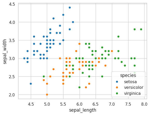
 Method 2: Using sns.axes_styleIn this approach, we use the sns.axes_style(‘whitegrid’) context manager to apply the ‘whitegrid’ style temporarily. We load the ‘iris’ dataset and create a scatter plot with sns.scatterplot, which displays a white background with grid lines only within the with block.
Syntax:
sns.axes_style(‘whitegrid’):
Example:
Python
import matplotlib.pyplot as plt
import seaborn as sns

iris = sns.load_dataset('iris')

# Temporarily set the style to whitegrid
with sns.axes_style('whitegrid'):
    # Create a plot
    sns.scatterplot(data=iris, x='sepal_length', y='sepal_width', hue='species')

plt.show()
Output:
 Method 3: Using plt.style.use with MatplotlibIn this approach, we are using plt.style.use(‘seaborn-whitegrid’) to apply the ‘seaborn-whitegrid’ style to the plot, which includes a white background with grid lines. Then, we create a scatter plot using Seaborn’s sns.scatterplot function, specifying ‘total_bill’ on the x-axis, ‘tip’ on the y-axis, and using ‘sex’ as a factor to differentiate data points with different colors.
Syntax:
plt.style.use(‘style_name’)
Example:
Python
import matplotlib.pyplot as plt
import seaborn as sns

tips = sns.load_dataset('tips')

# Use Matplotlib's style to set grid
plt.style.use('seaborn-whitegrid')

# Create a plot with 'sex' as a factor
sns.scatterplot(data=tips, x='total_bill', y='tip', hue='sex')

plt.show()
Output:
 Example 1: Applying ‘whitegrid’ Style to Violen Plot- Whitegrid styling can be applied to any of the plots in Seaborn to increase the visual apperance of data.
- In this example, the with sns.axes_style(“whitegrid”) context manager is used to temporarily set the ‘whitegrid’ style.
- This creates a violin plot of the ‘total_bill’ by ‘day’ from the tips dataset, and the gridlines help in better understanding the distribution of the data.
Python
import matplotlib.pyplot as plt
import seaborn as sns

with sns.axes_style("whitegrid"):
    plt.figure(figsize=(8, 6))
    sns.violinplot(x="day", y="total_bill", data=sns.load_dataset("tips"))
    plt.title("Violin Plot of Total Bill by Day")
    plt.show()
Output:
 Example 2: Applying ‘whitegrid’ Style to Multiple Subplots- The Seaborn ‘whitegrid’ style can be applied to the entire plot by using sns.set_style(‘whitegrid’).
- In this example, we create multiple subplots and use the ‘whitegrid’ style to make sure that each subplot has a white background with grid lines.
- The sns.histplot function is used to generate histograms with kernel density estimates on each subplot, and plt.tight_layout() is called to make sure the proper spacing between subplots.
Python
import matplotlib.pyplot as plt
import seaborn as sns
import numpy as np

np.random.seed(0)
data = np.random.randn(100, 4)

# setting the Seaborn style to 'whitegrid'
sns.set_style('whitegrid')

# createing subplots
fig, axes = plt.subplots(2, 2, figsize=(12, 10))

# plotting on each subplot
for i, ax in enumerate(axes.flat):
    sns.histplot(data[:, i], kde=True, ax=ax)
    ax.set_title(f'Subplot {i+1}')

plt.tight_layout()
plt.show()
Output:
 ConclusionIn conclusion, the ‘whitegrid’ style in Seaborn is a valuable tool for creating visually appealing plots with a clean and organized appearance. It enhances the readability of the data and provides a structured layout with grid lines, making it easier to interpret the information presented in the visualization.
|