|
Changing the color of the close button in Bootstrap 5 involves customizing the styles using CSS. The close button in Bootstrap 5 has a specific class .btn-close, and you can override its styles to achieve the desired color. In this article, we will see how we can do it.
Preview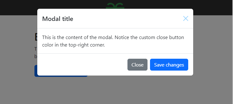 PrerequisitesApproach- Start by including Bootstrap 5 in your HTML document. This is achieved by linking to Bootstrap’s CSS file from a CDN (Content Delivery Network). This ensures that your webpage has access to Bootstrap’s predefined styles.
- Define a custom CSS class to modify the appearance of the close button. In the provided code, a class named .btn-close-custom is created to apply the desired color effect to the close button.
- Create the HTML structure for the webpage content, including any Bootstrap components you want to customize. In this example, a modal component is used, which includes a close button in the header section.
- Assign the custom CSS class .btn-close-custom to the close button element within the Bootstrap component. This ensures that the close button inherits the custom styling defined in the CSS, resulting in the desired color change.
Example: This example shows the implementation of the above-explained approach.
HTML
<!DOCTYPE html>
<html lang="en">
<head>
  <meta charset="UTF-8">
  <meta name="viewport" content=
     "width=device-width, initial-scale=1.0">
  <title>Custom Close Button Color in Bootstrap 5</title>
  <link rel="stylesheet" href=
 "https://cdn.jsdelivr.net/npm/[email protected]/dist/css/bootstrap.min.css"
        integrity=
"sha384-T3c6CoIi6uLrA9TneNEoa7RxnatzjcDSCmG1MXxSR1GAsXEV/Dwwykc2MPK8M2HN"
        crossorigin="anonymous">
  <script src=
 "https://cdn.jsdelivr.net/npm/[email protected]/dist/js/bootstrap.min.js"
          integrity=
"sha384-BBtl+eGJRgqQAUMxJ7pMwbEyER4l1g+O15P+16Ep7Q9Q+zqX6gSbd85u4mG4QzX+"
          crossorigin="anonymous">
    </script>
  <style>
       .navbar {
            display: flex;
            justify-content: space-between;
            align-items: center;
            background-color: #2e2e2e;
            padding: 10px 20px;
            color: #fff;
        }

        .navbar img {
            max-width: 200px;
            display: block;
            margin: 0 auto;
        }
        .btn-close-custom {
            filter: invert(0.5) sepia(1)
            saturate(5) hue-rotate(175deg);
        }
  </style>
</head>
<body>
    <nav class="navbar">
        <img src=
    "https://media.geeksforgeeks.org/gfg-gg-logo.svg"
            alt="Logo">
    </nav>
    <div class="container mt-5">
        <h1>Bootstrap 5 Custom Close Button</h1>
        <p>This is an example of a Bootstrap 5 modal with a
            custom colored close button.</p>

        <!-- Button trigger modal -->
        <button type="button"
                class="btn btn-primary"
                data-bs-toggle="modal"
                data-bs-target="#exampleModal">
            Launch demo modal
        </button>

        <!-- Modal -->
        <div class="modal fade"
             id="exampleModal" tabindex="-1"
            aria-labelledby="exampleModalLabel"
             aria-hidden="true">
          <div class="modal-dialog">
            <div class="modal-content">
                <div class="modal-header">
                    <h5 class="modal-title"
                        id="exampleModalLabel">
                        Modal title
                    </h5>
                    <button type="button"
                            class="btn-close btn-close-custom"
                        data-bs-dismiss="modal"
                            aria-label="Close">
                    </button>
                </div>
                <div class="modal-body">
                    This is the content of the modal.
                    Notice the custom close button
                    color in the top-right corner.
                </div>
                <div class="modal-footer">
                    <button type="button" class="btn btn-secondary"
                        data-bs-dismiss="modal">Close
                    </button>
                    <button type="button" class="btn btn-primary">
                        Save changes
                    </button>
                </div>
            </div>
          </div>
        </div>
    </div>
</body>
</html>
Output:
|
.png)