|
Smooth scrolling is a popular web design technique because it helps users navigate through any section of the webpage without disturbing the current flow. It enhances user experience and provides a more visually appealing interface CSS.
Preview Image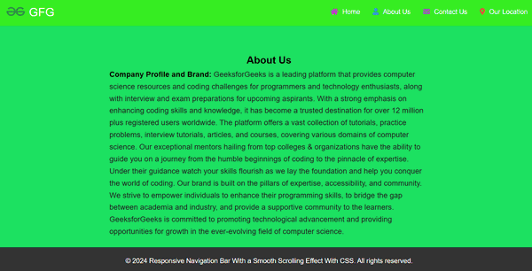 Preview Approach- First, setting up a simple HTML document with the necessary elements, including sections or divs for different content areas.
- Then apply basic CSS styling to your HTML elements to define their appearance, such as colors, fonts, and layout.
- After that use the CSS to add a smooth scrolling behavior to our webpage, to achive this functionality use the CSS property “scroll-behavior: smooth”.
- And for identify the sections of your webpage that you want navigate, create some anchor tags(<a>) and put the corresponding IDs to these sections.
- Add some JavaScript, to handel the “onClick()” event of the hamburger button.
Example: The example code below shows how to create a smooth scrolling effect with CSS
HTML
<!DOCTYPE html>
<html lang="en">
<head>
<meta charset="UTF-8">
<meta name="viewport"
content="width=device-width, initial-scale=1.0">
<title>Responsive Navigation Bar With Dropdown</title>
<link rel="stylesheet" href=
"https://cdnjs.cloudflare.com/ajax/libs/font-awesome/5.15.4/css/all.min.css">
<link rel="stylesheet" href="style.css">
</head>
<body>
<header class="header">
<a href="/" class="brand-logo-a-tag">
<img src=
"https://media.geeksforgeeks.org/gfg-gg-logo.svg"
alt="Brand logo">
<span class="brand-logo-name">
GFG
</span>
</a>
<nav class="navbar">
<ul class="navbar-lists"
id="myTopnav">
<li>
<i class="fas fa-home"></i>
<a class="navbar-link home-link"
href="#">
Home
</a>
</li>
<li>
<i class="fas fa-user"></i>
<a class="navbar-link about-link"
href="#about-us-section">
About Us
</a>
</li>
<li>
<i class="fas fa-envelope"></i>
<a class="navbar-link contact-link"
href="#contact">
Contact Us
</a>
</li>
<li>
<i class="fas fa-map-marker-alt"></i>
<a class="navbar-link location-link"
href="#location">
Our Location
</a>
</li>
</ul>
<a href="javascript:void(0);"
class="icon"
onclick="myFunction()">
<i class="fa fa-bars"></i>
</a>
</nav>
</header>
<main>
<section id="about-us-section">
<div class="about-us-container">
<h2 class="aboutus-heading">
About Us
</h2>
<p>
<strong class="subheading">
Company Profile and Brand:
</strong>
GeeksforGeeks is a leading platform
that provides computer science resources
and coding challenges for programmers
and technology enthusiasts, along with
interview and exam preparations for
upcoming aspirants. With a strong emphasis
on enhancing coding skills and knowledge,
it has become a trusted destination for
over 12 million plus registered users worldwide.
</p>
</div>
</section>
</main>
<section id="contact" class="contact">
<h2 class="contact-us-main-heading">
Contact Us
</h2>
<form id="contactForm" action="#" method="POST">
<label for="name">Name</label>
<input type="text" id="name"
name="name"
placeholder="Enter your name"
required>
<label for="email">Email</label>
<input type="email" id="email"
name="email"
placeholder="Enter your email"
required>
<label for="message">Message</label>
<textarea id="message" name="message"
placeholder="Enter your message"
rows="5" required>
</textarea>
<button type="submit">Submit</button>
</form>
</section>
<section id="location" class="location">
<h2 class="location-heading">Location</h2>
<iframe
src="https://www.google.com/maps/embed?pb=!1m14!1m8!1m3!1d7012.320565577237!2d77.39895!3d28.504825!3m2!1i1024!2i768!4f13.1!3m3!1m2!1s0x390ce626851f7009%3A0x621185133cfd1ad1!2sGeeksforGeeks%20%7C%20Coding%20Classes%20%7C%20Noida!5e0!3m2!1sen!2sin!4v1716230301241!5m2!1sen!2sin"
width="100%" height="450" style="border:0;" allowfullscreen="" loading="lazy"
referrerpolicy="no-referrer-when-downgrade"></iframe>
</section>
<footer>
<p>© 2024 Responsive Navigation Bar With a
Smooth Scrolling Effect With CSS.
All rights reserved.
</p>
</footer>
<script src="script.js"></script>
</body>
</html>
* {
    margin: 0;
    padding: 0;
    box-sizing: border-box;
}

html {
    scroll-behavior: smooth;
}

:root {
    --header-green-color: #36ed22;
    --aboutus-background-green-color: rgb(28, 225, 97);
    --heading-color: #000;
    --primary-color: #2162e3;
    --heading-a-tag-color: #fff;
    --heading-a-tag-hover-color: #212121;
    --all-h2-color: #000;
    --aboutus-strong-color: #000;
    --aboutus-p-tag-color: #201f1f;
    --aboutus-border-color: rgb(28, 225, 97);
    --body-bg-color: rgb(28, 225, 97);
}

body {
    font-family: Arial, sans-serif;
    background-color: var(--body-bg-color);
    line-height: 1.6;
    overflow-x: hidden;
}

.brand-logo-name {
    text-decoration: none;
    color: #fff;
    font-size: 1.75rem;
    padding: 5px;
}

a {
    text-decoration: none;
    color: var(--heading-a-tag-color);
    transition: color 0.3s ease;
}

a:hover {
    color: var(--heading-a-tag-hover-color);
}

.header {
    padding: 1.6rem 4.8rem;
    display: flex;
    justify-content: space-between;
    align-items: center;
    background-color: var(--header-green-color);
    box-shadow: 0px 0px 20px 0px rgba(132, 144, 255, 0.2);
    width: 100%;
    height: 10vh;
}

.header img {
    height: 30px;
    padding-top: 8px;
}

.navbar-lists {
    list-style-type: none;
    margin: 0;
    padding: 0;
    display: flex;
}

.navbar-lists li {
    margin-right: 20px;
}

.navbar-lists li:last-child {
    margin-right: 0;
}

.navbar-link {
    color: var(--heading-a-tag-color);
    padding: 10px;
    transition: background-color 0.3s;
}

.icon {
    display: none;
}

.navbar-lists li:nth-child(1) i {
    color: #d223db;
}

.navbar-lists li:nth-child(2) i {
    color: #3498db;
}

.navbar-lists li:nth-child(3) i {
    color: #9b59b6;
}

.navbar-lists li:nth-child(4) i {
    color: #e74c3c;
}

@media screen and (max-width: 768px) {
    .icon {
        display: flex;
        position: absolute;
        top: 20px;
        left: 20px;
        z-index: 999;
        color: #fff;
        font-size: 24px;
        cursor: pointer;
        flex-direction: row-reverse;
    }

    .navbar-lists {
        display: flex;
        position: fixed;
        top: 0;
        left: -100%;
        background-color: var(--header-green-color);
        width: 40%;
        height: 100%;
        flex-direction: column;
        align-items: flex-start;
        justify-content: flex-start;
        transition: left 0.3s ease;
        z-index: 998;
        padding-top: 40px;
    }

    .navbar-lists.responsive {
        left: 0;
    }

    .navbar-lists.responsive li {
        margin: 20px 0;
        width: 100%;
        text-align: center;
    }

    .navbar-link {
        padding: 15px;
        text-align: left;
        width: 100%;
    }

    .navbar-link i {
        display: none;
    }
}

#about-us-section {
    background: var(--aboutus-background-green-color);
    text-align: center;
    width: 100%;
    margin: 0 auto;
    margin-bottom: 3rem;
    padding-bottom: 20px;
    border: 3px solid var(--aboutus-border-color);
    border-radius: 5px;
}

.about-us-container {
    max-width: 800px;
    margin: 0 auto;
    padding: 0 20px;
}

h2 {
    color: var(--all-h2-color);
}

.subheading {
    color: var(--aboutus-strong-color);
}

.about-us-container p {
    font-size: 1.125rem;
    line-height: 1.6;
    color: var(--aboutus-p-tag-color);
    text-align: left;
}

.about-us-container p:first-of-type {
    margin-top: 0;
}

.about-us-container p:last-of-type {
    margin-bottom: 0;
}

.location-heading {
    font-size: 2rem;
}

@media screen and (max-width: 768px) {
    .aboutus-heading {
        font-size: 2rem;
    }

    .about-us-container p {
        font-size: 1rem;
    }
}

footer {
    background-color: #333;
    color: #fff;
    text-align: center;
    padding: 20px 0;
    position: fixed;
    bottom: 0;
    width: 100%;
}

section {
    padding: 60px 20px;
    text-align: center;
}

.contact {
    max-width: 800px;
    margin: 0 auto;
}

.contact-us-main-heading {
    font-size: 2.5em;
    margin-bottom: 20px;
    color: #3456d3;
}

.contact form {
    display: flex;
    flex-direction: column;
    align-items: center;
    gap: 15px;
    background-color: #f7fafc;
    padding: 40px 20px;
    border-radius: 8px;
    box-shadow: 0 4px 8px rgba(0, 0, 0, 0.1);
}

.contact form label {
    display: flex;
    align-items: center;
    font-weight: 600;
}

.contact form label i {
    margin-right: 10px;
}

.contact form input,
.contact form textarea {
    width: 80%;
    padding: 12px;
    border: 1px solid #ccc;
    border-radius: 5px;
    font-size: 1em;
    transition: border-color 0.3s;
}

.contact form input:focus,
.contact form textarea:focus {
    border-color: #38b2ac;
    outline: none;
}

.contact form button {
    padding: 12px 20px;
    background-color: #38b2ac;
    color: white;
    border: none;
    border-radius: 5px;
    cursor: pointer;
    font-size: 1.1em;
    transition: background-color 0.3s, transform 0.2s;
}

.contact form button:hover {
    background-color: #319795;
    transform: translateY(-2px);
}
function myFunction() {
    var x = document.getElementById("myTopnav");
    if (x.classList.contains("responsive")) {
        x.classList.remove("responsive");
    } else {
        x.classList.add("responsive");
    }
}
document.getElementById('contactForm')
        .addEventListener('submit', function (event) {
    event.preventDefault();
    alert('Form submitted successfully!');
});
Output:
|
-(3).png)