|
Alert message boxes are commonly used in web development to notify users of important information or actions. In this article, we’ll explore how to create visually appealing and unique alert message boxes using CSS. We’ll design distinct styles for success, warning, and error alerts, ensuring each box stands out and effectively communicates its message.
Approach- Define a base CSS class
.alert to establish common styling properties for all alert message boxes. - Create individual CSS classes like
.success, .warning, .error, etc., each defining unique styles for different types of alerts. - Optionally, include icons within each alert box to visually represent the nature of the alert, enhancing user understanding.
- Apply the respective CSS classes to the HTML elements representing the alert message boxes to implement the defined styles effectively.
Example: Implementation to create the alert message boxes of each type.
HTML
<!DOCTYPE html>
<html lang="en">

<head>
    <meta charset="UTF-8">
    <meta name="viewport"
          content="width=device-width,
                   initial-scale=1.0">
    <title>Alert Message Boxes</title>
    <style>
        .alert {
            padding: 15px;
            margin-bottom: 20px;
            border-radius: 4px;
            font-size: 16px;
            font-weight: bold;
        }

        .success {
            color: #155724;
            background-color: #d4edda;
            border: 1px solid #c3e6cb;
        }

        .warning {
            color: #856404;
            background-color: #fff3cd;
            border: 1px solid #ffeeba;
        }

        .error {
            color: #721c24;
            background-color: #f8d7da;
            border: 1px solid #f5c6cb;
        }

        .info {
            color: #0c5460;
            background-color: #d1ecf1;
            border: 1px solid #bee5eb;
        }

        .primary {
            color: #004085;
            background-color: #cce5ff;
            border: 1px solid #b8daff;
        }

        .secondary {
            color: #383d41;
            background-color: #e2e3e5;
            border: 1px solid #d6d8db;
        }

        .dark {
            color: #fff;
            background-color: #343a40;
            border: 1px solid #6c757d;
        }
    </style>
</head>

<body>

    <div class="alert success">
        Success: Your changes have been saved.
    </div>

    <div class="alert warning">
        Warning: This action cannot be undone.
    </div>

    <div class="alert error">
        Error: Please enter a valid email address.
    </div>

    <div class="alert info">
        Info: Your account has been updated.
    </div>

    <div class="alert primary">
        Primary: This is a primary alert.
    </div>

    <div class="alert secondary">
        Secondary: This is a secondary alert.
    </div>

    <div class="alert dark">
        Dark: This is a dark alert.
    </div>

</body>

</html>
Output:
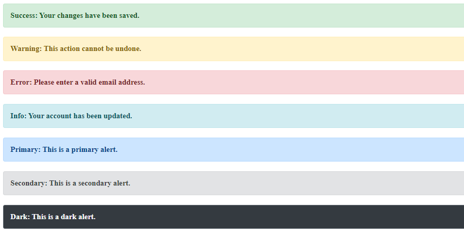 Output
|
.gif)
.png)