|
Bootstrap, a widely used customizing front-end framework, streamlines web development with its pre-built CSS and JavaScript components. Bootstrap 5 Checkbox enhances interactive forms and interfaces, offering customization options for styles, sizes, and validation, facilitating user selections.
There are several approaches to customize the Bootstrap 5 Checkbox which are as follows:
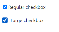
Changing the size of the CheckboxTo change the size of the checkbox in Bootstrap we can use scale property. The scale property is a CSS transform property that can be applied to the checkbox element to scale it up or down. By modifying the scale property, you can make the checkboxes larger or smaller without distorting their appearance.
Example: To demonstrate changing the size of a Bootstrap checkbox using the scale property.
HTML
<!DOCTYPE html>
<html>

<head>
    <!-- Include Bootstrap CSS -->
    <link rel="stylesheet"
          href=
"https://cdn.jsdelivr.net/npm/[email protected]/dist/css/bootstrap.min.css" />
</head>
<style>
    .checkbox-lg .custom-check-input {
        top: 0.8rem;
        scale: 1.4;
        margin-right: 0.5rem;
    }

    .checkbox-lg .custom-check-label {
        padding-top: 13px;
    }
</style>

<body>
    <div class="custom-check">
        <input class="custom-check-input"
               type="checkbox"
               value=""
               id="checkbox-1"
               checked />
        <label class="custom-check-label"
               for="checkbox-1">Regular checkbox</label>
    </div>
    <div class="custom-check checkbox-lg">
        <input class="custom-check-input"
               type="checkbox"
               value=""
               id="checkbox-2"
               checked />
        <label class="custom-check-label"
               for="checkbox-2">Large checkbox</label>
    </div>
</body>

</html>
Output:
 Customising Bootstrap 5 Checkbox Changing the color of the CheckboxTo change the color of checkbox we can add the required styles by overriding the existing styles. Let us take a look over the example
Example: To demonstrate customizing the color of checked checkbox by using the class `form-check-input:checked`.
HTML
<!DOCTYPE html>
<html>
  <head>
    <!-- Include Bootstrap CSS -->
    <link
      href=
        "https://cdn.jsdelivr.net/npm/[email protected]/dist/css/bootstrap.min.css"
      rel="stylesheet"
    />
    <style>
      .custom-checkbox .form-check-input:checked {
        background-color: red;
        border-color: red;
      }
    </style>
  </head>
  <body>
    <div class="form-check custom-checkbox">
      <input class="form-check-input"
             type="checkbox"
             id="exampleCheckbox" />
      <label class="form-check-label"
             for="exampleCheckbox"
        >Custom Checkbox</label
      >
    </div>
  </body>
</html>
Output:
 Customising Bootstrap 5 Checkbox Changing the structure of the CheckboxWe can replace the default checkbox appearance with a custom icon or symbol to indicate the checked or unchecked state. This can be achieved by changing CSS pseudo-elements (::before or ::after) and background images or icon fonts. Let us take an example to understand,
Example: To demonstrate customizing the checkbox using the CSS psudo-elements.
HTML
<!DOCTYPE html>
<html>
  <head>
    <link
      href=
"https://cdn.jsdelivr.net/npm/[email protected]/dist/css/bootstrap.min.css"
      rel="stylesheet"
    />
    <link
      href=
"https://cdnjs.cloudflare.com/ajax/libs/font-awesome/5.15.4/css/all.min.css"
      rel="stylesheet"
    />
    <style>
      .custom-checkbox .form-check-input {
        display: none;
      }

      .custom-checkbox .form-check-label::before {
        content: "\f0c8";
        font-family: "Font Awesome 5 Free";
        display: inline-block;
        width: 20px;
        height: 20px;
        border: 1px solid #ccc;
        text-align: center;
        line-height: 20px;
        margin-right: 5px;
      }

      .custom-checkbox .form-check-input:checked
      + .form-check-label::before {
        background-color: blue;
        color: white;
      }
    </style>
  </head>
  <body>
    <div class="form-check custom-checkbox">
      <input class="form-check-input"
             type="checkbox"
             id="exampleCheckbox" />
      <label class="form-check-label"
             for="exampleCheckbox"
        >Custom Checkbox</label
      >
    </div>
  </body>
</html>
Output:
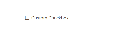 Customising Bootstrap 5 Checkbox
|
.png)