|
Volume, variety, and velocity (3 V’s) of data has been generating rapidly and posing significant challenges for organizations to seek and extract actionable insights. Here, Big Data Visualization offers the means to transform massive and complex datasets into comprehensible and insightful visual representations.
By leveraging advanced techniques and tools, Big Data Visualization enables decision-makers to navigate through the vast sea of information, uncovering patterns, trends, and correlations that might otherwise remain hidden.

This article explores the importance of Big Data Visualization, the types of visualizations suited for handling large datasets, prominent tools and frameworks available, key considerations, and best practices for effective visualization.
What is Big Data Visualization?
Big Data Visualization refers to the techniques and tools used to graphically represent large and complex datasets in a way that is easy to understand and interpret· Given the volume, variety, and velocity of big data, traditional visualization methods often fall short, requiring more sophisticated approaches to make sense of such vast amounts of information.
Big Data Visualization is characterized by its ability to handle:
- Volume: The sheer amount of data requires robust visualization tools that can summarize and present data effectively without losing critical information.
- Variety: Data comes in various formats (structured, unstructured, semi-structured) from diverse sources· Effective visualizations must accommodate this diversity.
- Velocity: Data streams in at high speeds, especially from sources like social media and IoT devices· Real-time visualization is often necessary to keep pace with the influx.
Importance of Big Data Visualization
1. Enhanced Decision-Making
Big data visualization provides a clear and immediate understanding of data, enabling businesses and organizations to make informed decisions quickly. Visual representations like graphs, charts, and maps allow stakeholders to grasp complex information at a glance, facilitating better strategic planning and problem-solving.
2. Improved Data Comprehension
Visualizing big data helps in identifying patterns, correlations, and outliers that might be missed in raw data. It aids in transforming raw numbers into meaningful insights, making it easier for analysts and non-technical users to understand the underlying trends and relationships.
3. Increased Engagement
Interactive visualizations can engage users more effectively than static reports. Dashboards and real-time visual data representations allow users to interact with the data, drilling down into specifics and exploring different scenarios, leading to deeper insights and more meaningful engagement with the information.
Types of Visualizations for Big Data
Big Data Visualization leverages advanced graphical techniques and specialized tools such as:
1. Heatmaps
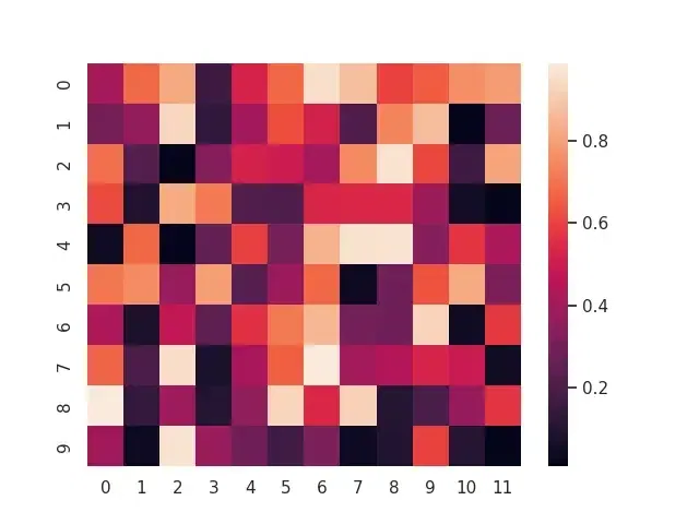
The heat map is a visualization of data that is displayed on the map or table and uses different specific features and variations of different colours to represent the data.
- Heat mapping is regarded as an essential tool that if used correctly can give us relief from analyzing never-ending data. Value diversity on an individual basis often looks like an anarchy.
- A heat map of values is much more friendly to view and analyze large and complex amounts of figures at a glance.
- Useful for showing the density of data points or the magnitude of activities across different regions or categories.
2. Network Diagrams
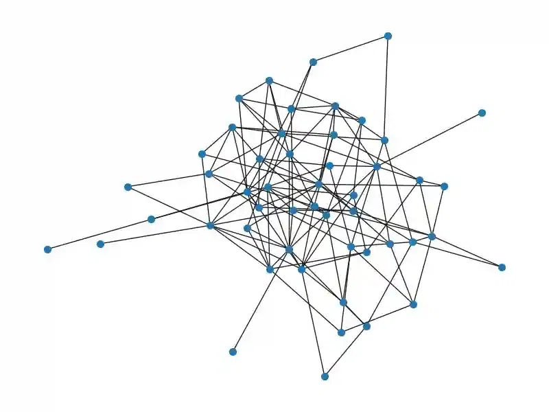
Network diagrams are particularly valuable for visualizing complex interconnections between entities, making them essential in fields such as social network analysis, internet infrastructure, and bioinformatics.
- These diagrams are composed of nodes (representing entities) and edges (representing relationships)·
- Ideal for visualizing relationships and interactions in data, such as social connections or data flows.
3. Geospatial Maps

Geospatial maps integrate geographical data with analytical data, providing a spatial dimension to the visualization. This type of visualization is crucial for any data with a geographic component, ranging from global economic trends to local event planning.
Integrating large-scale geographical data with traditional data sets to provide spatial analysis.
4. Tree Maps
Tree maps display hierarchical data as a set of nested rectangles, where each branch of the tree is given a rectangle, which is then tiled with smaller rectangles representing sub-branches. This method is useful for visualizing part-to-whole relationships within a dataset.
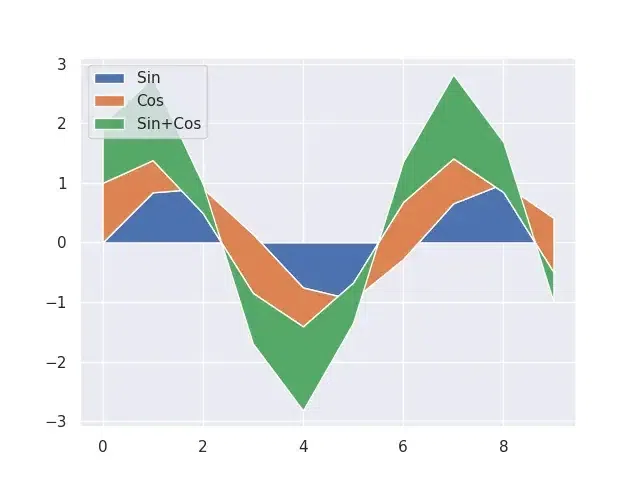
5. Stream Graphs
Stream graphs are a type of stacked area graph that is ideal for representing changes in data over time. They are often used to display volume fluctuations in streams of data and are particularly effective in showing the presence of patterns and trends across different categories.
6. Parallel Coordinates
Parallel Coordinates is used for plotting individual data elements across multiple dimensions. It is particularly useful for visualizing and analyzing multivariate data, allowing users to see correlations and patterns across several interconnected variables.
.webp) Parallel Coordinates In the image, parallel coordinates plot is a useful tool for visualizing the relationships between the features of the Iris flower dataset.
- It can help to identify which features are most important for distinguishing between the different species of Iris flowers.
- Each axis represents a different feature of the Iris flower, such as sepal length, sepal width, petal length, and petal width. Each data point in the dataset is represented by a line that traverses the axes, with the position of the line on each axis corresponding to the value of that feature for that data point.
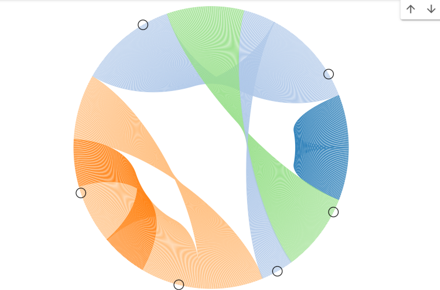
7. Chord Diagrams
Chord diagrams are used to show inter-relationships between data points in a circle. The arcs connect data points, and their thickness or color can indicate the weight or value of the relationship, useful for representing connectivity or flows within a system.
These diagrams help identify patterns, clusters, or trends within complex datasets, aiding in decision-making and analysis.
 Chord Diagrams Several powerful tools and frameworks facilitate Big Data Visualization:
- Tableau: Known for its powerful dashboards and ease of use, Tableau can handle large amounts of data and allows for deep customization·
- Qlik: Offers associative data indexing that lets users explore complex patterns and relationships across multiple data sources·
- Power BI: Integrates well with other Microsoft products and supports real-time dashboard updates·
- Apache Superset: An open-source tool that delivers enterprise-ready features for dashboarding and visualization·
- Splunk: Splunk is a commercial software used to search, monitor, and analyze machine-generated big data via a web-style interface· It is particularly favored for monitoring and analyzing network and security data·
- Visme: Visme has advanced options for embedding interactive graphs, diagrams and maps into static content. It contains just what one needs to illustrate figures, show graphs, and make schemes, as well as draft maps that will facilitate a visual representation of the data.
Applications of Big Data Visualization with Examples
1. Healthcare
- Example: Johns Hopkins University created a COVID-19 Dashboard using big data visualization to track the global spread of COVID-19 in real time. This dashboard displayed data on infection rates, mortality, recovery rates, and vaccination rollouts, enabling healthcare professionals and policymakers to make informed decisions and respond to the pandemic effectively.
2. Finance
- Example: JPMorgan Chase uses big data visualization to monitor market trends and detect fraudulent activities. Their visualization tools can analyze massive amounts of trading data in real-time, helping to identify unusual patterns or transactions that might indicate fraud. This enables the bank to take swift action to mitigate risks and protect their clients’ assets.
3. Retail
- Example: Walmart uses big data visualization to optimize its supply chain and improve sales strategies. By analyzing sales data, inventory levels, and customer preferences through interactive dashboards, Walmart can identify trends, forecast demand, and streamline its logistics to ensure products are available where and when they are needed.
4. Manufacturing
- Example: General Electric (GE) uses big data visualization in its Predix platform for predictive maintenance. By visualizing data from sensors on industrial equipment, GE can predict when machines are likely to fail and schedule maintenance before issues occur. This reduces downtime and maintenance costs while ensuring high-quality production processes.
5. Marketing
- Example: Coca-Cola uses big data visualization to analyze the performance of its marketing campaigns. By visualizing data from social media interactions, customer feedback, and sales figures, Coca-Cola can track engagement, measure the impact of advertising efforts, and segment audiences to tailor future marketing strategies more effectively.
6. Transportation and Logistics
- Example: UPS utilizes big data visualization through its ORION (On-Road Integrated Optimization and Navigation) system to optimize delivery routes. By analyzing data on traffic patterns, delivery locations, and vehicle performance, UPS can visualize and adjust routes in real-time to minimize fuel consumption, reduce delivery times, and enhance overall operational efficiency.
These examples illustrate the diverse and impactful applications of big data visualization across various industries, highlighting how visual analytics can drive better decision-making, enhance efficiency, and improve outcomes.
Choose the Right Visualization Type
Selecting an appropriate visualization method is crucial. The type of visualization should align with the nature of the data and the insights you want to communicate. For example, use:
- Heatmaps for patterns of activity or correlations.
- Network diagrams for relationships or flows between entities.
- Parallel coordinates for multidimensional datasets.
- Tree Maps for Hierarchical data and part-to-whole relationships.
- Stream Graphs for Visualizing changes over time among interconnected categories.
- Chord Diagrams for Illustrating inter-relationships between entities in a dataset.
- Geospatial Maps use for Integrating large-scale geographical data with traditional data sets to provide spatial analysis.
Best Practices for Visualizing Big Data
Big data visualization involves representing vast and complex datasets in ways that are accessible and insightful· To do this effectively, certain best practices need to be followed. These practices not only ensure clarity and usability of the visualizations but also enhance the understanding and actionable insights derived from big data. Some best practices tailored for big data visualization:
- Simplify and Aggregate: Big data sets can be overwhelming and noisy. Simplification via aggregation can help. Aggregate data to reduce complexity· Show trends or averages instead of individual data points. Use clustering to group similar data and reduce the number of elements displayed.
- Interactive Elements: Interactivity allows users to explore and manipulate big data in ways static visualizations cannot. Implement zoom and filter options to allow users to dive deeper into areas of interest. Dynamic querying where users can customize data or variables to be visualized. Drill down capabilities to move from high-level overviews to detailed analysis.
- Use Color Wisely: Color is a powerful tool but can also lead to confusion if misused. Use consistent color schemes across multiple visualizations to maintain clarity. Limit the number of colors used to avoid visual overload. Employ color blindness-friendly palettes to ensure accessibility.
- Contextualize the Data: Data without context can be misleading. Provide metadata that explains the data source, collection method, and any modifications made to the data. Use annotations and legends to guide interpretation· Incorporate comparative views to give perspective (e·g·, year-over-year changes, benchmarks).
Challenges in Big Data Visualization
Despite of Benefits Big Data Visualization have some common challenges:
- Data Quality: Ensuring data accuracy, completeness, and consistency is critical for effective visualization. Poor data quality can lead to misleading insights and erroneous decision-making.
- Scalability: Visualizing large datasets requires tools and techniques that can handle high volumes of data without compromising performance. Scalability is a significant challenge in big data visualization.
- Complexity: Big data often involves complex relationships and multiple dimensions. Creating visualizations that accurately represent this complexity without overwhelming the user is a delicate balance.
- Integration: Integrating data from various sources into a cohesive visualization can be challenging. Ensuring compatibility and seamless integration is crucial for comprehensive data analysis.
Conclusion
In conclusion, Big Data Visualization is an indispensable part of modern data analysis, providing the clarity needed to harness the potential of big data effectively. By choosing appropriate techniques and tools, organizations can enhance their ability to analyze, understand, and act on complex datasets in real-time.
|