
|
|
Google Sheets is a powerful tool for organizing and analyzing data. Creating charts and graphs in Google Sheets allows you to convey information more effectively, whether you’re tracking sales, monitoring trends, or presenting data to others. In this article, explore the steps to create various types of charts and graphs in Google Sheets. From simple line charts to dynamic bar graphs, you’ll learn how to transform raw data into compelling visual representations.
What is Chart in Google Sheets?In Google Sheets, a chart (sometimes also referred to as a graph) is a visual representation of your data. It takes the information stored in your spreadsheet and translates it into an image, making it easier to identify trends, patterns, and relationships between different data points. What is Graph in Google Sheets?In Google Sheets, the terms “chart” and “graph” are often used interchangeably. Both refer to a visual representation of your data. However, there can be subtle differences depending on the context. Here’s a breakdown:
Chart vs. Graph – What’s the difference?Usually in Google Sheets Charts and Graphs are used for visualizing the data but they may contain some differences which we will be talking about below:
Different types of Charts and How to Create them in Google SheetsLine ChartLine Chart shows trends over time and other contiguous categories. How to Create Line Chart in Google SheetFollow the steps to create a Line Chart: –
 Line Chart Area ChartArea Chart can be similar to the Line Chart but the area below the line is filled in. Area Chart can be used for showing the cumulative total of a value over time. How to Create Area Chart in Google SheetFollow the steps given below to create the Area Chart.
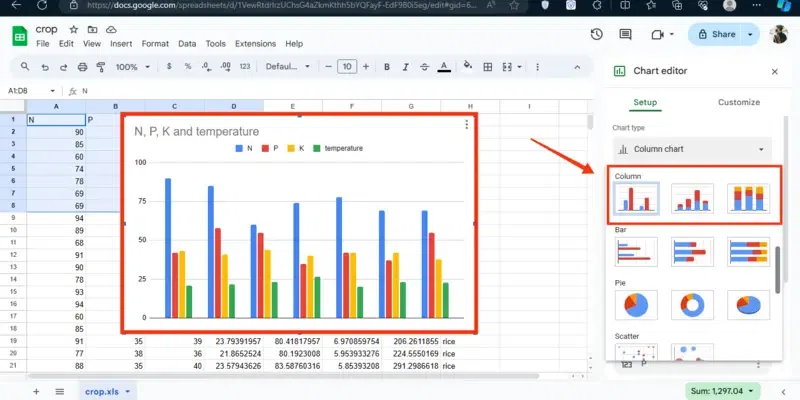
 Area Chart Column ChartColumn Chart works to display the data as vertical bars and can be useful in comparing the data between the categories. How to Create Column Chart in Google SheetFollow the steps given below to create the Column Chart: –
 Column Chart Bar ChartThese are similar to the Column Chart but as a horizontal bar with the data. Useful for comparing values across categories. How to Create Bar Chart in Google SheetFollow the steps given below to create the bar Chart:
 Bar Chart Pie ChartsPie Charts are used to represent the parts of a whole, these types of charts can be useful whenever we want to display the percentages or proportions within the datasets. How to Create Pie Chart in Google SheetFollow the steps given below to create the Pie Charts in Google Sheets:
 Pie Charts How to Make a Graph in Google SheetsStep 1: Open Google Sheets and Select a SheetOpen the Google spreadsheet and select a spreadsheet on which you can perform your task.  Open Google Sheets >> Select a Sheet Step 2: Select Data and Click on “Insert”After opening the sheet select the data that you want to create a chart and click on the “Insert” tab from the toolbar. 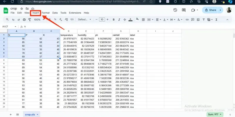 Select Data >> Click “Insert” Tab Step 3: Select ChartSelect the Chart button from the menu appeared after clicking on the Insert menu, this action will convert your data into the form of charts.  Select “Chart” Button Step 4: Setup Chart and Select Chart TypeOnce your data is converted into the chart you can setup your chart type by clicking on the “Chart Type”.  Click on Chart Type Step 5: Choose Your Desired ChartIn the Chart Type section, a several number of charts will be present you can choose your desired chart to be displayed.  Choose Chart Type Step 6: Customize Your ChartWhen you are finished with choosing the chart type then after you can also customize your chart by customizing the Chart Style, Series, Legend, Vertical Axis.  Customize your Chart How to Create a Chart or Graph in Google Sheets on MobileStep 1: Open Google SheetsTo open the Google Sheet Mobile App, locate the app and give it a click.  Click on the Google Sheets Step 2: Select A SheetAfter opening the Google Sheets select a sheet in which you want to make the chart.  Select a Sheet Step 3: Select Data and Click on Insert IconOnce your sheet is opened then select the data you want to convert into a chart and click tap on the Insert Icon.  Select the Data >> Click on Insert Icon Step 4: Select ChartNow a menu will appear select “Chart” from the menu.  Select “Chart” button Step 5: Customize Chart >> Click on Tick iconNow you can also customize your chart by changing the chart type, color, titles, legend and so on.  Customize Chart >> Click on Tick Icon Step 6: Chart CreatedYou have now successfully created a chart of your data.  Chart Created ConclusionCharts are the best idea to display your data into a representable form so that your data can be recognized easily. Google Sheets provides you a best feature of converting the data into the chart. All you have to do is open Google Sheets and select the sheet in you want to create a chart. Then select the data and click on the “Insert” menu, from the Insert menu select Charts. After then you can customize your chart in the chart setup section. FAQs – Google Sheets Chart and Graph Tutorial
|
Reffered: https://www.geeksforgeeks.org
| Google Workspace |
Type: | Geek |
Category: | Coding |
Sub Category: | Tutorial |
Uploaded by: | Admin |
Views: | 15 |