|
A radial gradient is a graphical effect where colors transition in a circular or elliptical pattern. By default, the first color starts at the center and fades out to the edge of the element. Tailwind CSS makes it easy to implement radial gradients with its utility classes.
We can use the below approaches to achieve a Radial gradient in Tailwind CSS:
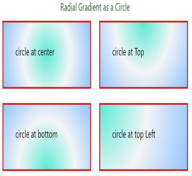
The Radial Gradient in Tailwind CSS as a CircleA radial gradient as a circle will create a circular pattern with a color that fades to another color towards the edge. The bg-[ ] utility in Tailwind CSS is used to set arbitrary background values, and the radial-gradient() function is utilized to create the gradient.
Example: Implementation of using radial gradient in Tailwind CSS as a circle.
HTML
<!DOCTYPE html>
<html lang="en">

<head>
    <meta charset="UTF-8" />
    <meta name="viewport"
          content="width=device-width,
                   initial-scale=1.0" />
    <title>Radial Gradient</title>
    <script src=
"https://cdn.tailwindcss.com"></script>
</head>

<body class="flex flex-col
             items-center">

    <h3 class="text-center
               text-2xl
               text-green-800">
      Radial Gradient as a Circle
      </h3>
    <div class="container grid grid-cols-2 gap-8 p-4">
        <div class="box border-4 border-red-600
                    bg-[radial-gradient(circle_at_center,
                    _var(--tw-gradient-stops))]
                    from-teal-300 via-gray-100
                    to-blue-300">
            <h3 class="mb-4 p-12 text-2xl">
              circle at center
            </h3>
        </div>
        <div class="box border-4 border-red-600
                    bg-[radial-gradient(circle_at_top,
                    _var(--tw-gradient-stops))]
                    from-teal-300 via-gray-100
                    to-blue-300">
            <h3 class="mb-4 p-12 text-2xl">
              circle at Top
              </h3>
        </div>
        <div
            class="box border-4 border-red-600
                   bg-[radial-gradient(circle_at_bottom,
                   _var(--tw-gradient-stops))]
                   from-teal-300 via-gray-100 to-blue-300">
            <h3 class="mb-4 p-12 text-2xl">
              circle at bottom
              </h3>
        </div>

        <div class="box border-4 border-red-600
                    bg-[radial-gradient(circle_at_top_left,
                    _var(--tw-gradient-stops))]
                    from-teal-300 via-gray-100
                    to-blue-300">
            <h3 class="mb-4 p-12 text-2xl">
              circle at top Left
              </h3>
        </div>
    </div>
</body>

</html>
Output:
 Output The Radial Gradient in Tailwind CSS as an EllipseA radial gradient as an ellipse creates an elliptical pattern where one color transitions to another color towards the edge. The bg-[ ] class is used for arbitrary background values, while the radial-gradient() function sets the gradient with specific parameters for shape and position. The _var(–tw-gradient-stops) dynamically sets color stops.
Example: Implementation of using radial gradient in Tailwind CSS as an Ellipse.
HTML
<!DOCTYPE html>
<html lang="en">

<head>
    <meta charset="UTF-8" />
    <meta name="viewport"
          content="width=device-width,
                   initial-scale=1.0" />
    <title>Radial Gradient</title>
    <script src=
"https://cdn.tailwindcss.com"></script>
</head>

<body class="flex flex-col
             items-center">

    <h3 class="text-center
               text-2xl
               text-green-800">
      Radial Gradient as an Ellipse
      </h3>
    <div class="container grid
                grid-cols-2 gap-8 p-4">
        <div
            class="box border-4 border-red-600
                   bg-[radial-gradient(ellipse_at_center,
                   _var(--tw-gradient-stops))]
                   from-teal-300 via-gray-100
                   to-blue-300">
            <h3 class="mb-4 p-12 text-2xl">
              Ellipse at center
            </h3>
        </div>
        <div class="box border-4 border-red-600
                    bg-[radial-gradient(ellipse_at_top,
                    _var(--tw-gradient-stops))]
                    from-teal-300 via-gray-100
                    to-blue-300">
            <h3 class="mb-4 p-12 text-2xl">
              Ellipse at Top
              </h3>
        </div>
        <div class="box border-4 border-red-600
                    bg-[radial-gradient(ellipse_at_bottom,
                    _var(--tw-gradient-stops))]
                    from-teal-300 via-gray-100
                    to-blue-300">
            <h3 class="mb-4 p-12 text-2xl">
              Ellipse at bottom
              </h3>
        </div>

        <div class="box border-4 border-red-600
                    bg-[radial-gradient(ellipse_at_top_left,
                    _var(--tw-gradient-stops))]
                    from-teal-300 via-gray-100
                    to-blue-300">
            <h3 class="mb-4 p-12 text-2xl">
              Ellipse at top Left
              </h3>
        </div>
    </div>
</body>

</html>
Output:
 Output Using Tailwind CSS, you can easily create stunning radial gradients either in circular or elliptical shapes. By using the bg-[ ] utility and radial-gradient() function, you can define custom gradients that enhance the visual appeal of your web elements.
|
.gif)