|
|
When we make graphs, we usually use straight lines and grids to show data points. This is called a “linear coordinate system.” But sometimes, using a different system called “non-linear coordinates” can help us understand the data better. What is a Non-Linear Coordinate system?Non-linear coordinates can alter the appearance of geometric shapes, which differs from the behavior of linear coordinates. Non-linear coordinate systems can distort shapes. For example, in polar coordinates, a rectangle can turn into an arc. In map projections, the shortest path between two points might not be a straight line. Non-Linear Coordinate system in ggplot2Now, we’ll learn about non-linear coordinates and how they’re used in ggplot2, a tool in R Programming Language for making graphs. With examples and clear explanations, we’ll see how non-linear transformations in ggplot2 can make our graphs more insightful and easier to understand. ggplot2 excels at plotting data using various coordinate systems. While the default is a rectangular plane with x and y axes, ggplot2 offers tools to explore your data in non-linear spaces. These transformations can significantly alter how data points are positioned and interpreted. ggplot(data = NULL, mapping = aes())Visualize data with inherent non-linearity: These systems allow you to represent relationships that aren’t well-suited for linear scales, such as exponential growth, logarithmic trends, or cyclical patterns.
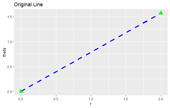
Once all shapes are described by their location, we move on to the next step: changing their location to fit the new coordinate system. It’s simple to move points because they stay the same no matter the coordinate system. However, lines and polygons are tougher because a straight line might not be straight anymore in the new system. To handle this, we assume that all changes in coordinates are smooth, meaning very short lines in the old system will still be very short and straight in the new one. With this assumption, we can transform lines and polygons by breaking them into small segments and transforming each segment separately. This process is called “munching.” Step 1: Define the original line with its two endpointsOutput: Non-Linear Coordinate system in ggplot2 Step 2: Divide the line into smaller segmentsOutput: 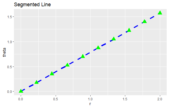 Non-Linear Coordinate system in ggplot2 In this step, we generated 19 points between the endpoints of the original line to create smaller line segments. Step 3: Adjust the position of each segment to fit into the new coordinate systemOutput: 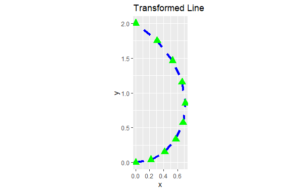 Non-Linear Coordinate system in ggplot2 Transformation using coord_polar()coord_polar() is an example of a non-linear transformation in ggplot2. It transforms the rectangular coordinate system into a circular one, where:
This transformation is particularly useful for creating
For example, let’s say we have data representing the time spent on various activities during a day. We can use polar coordinates to plot this data on a circular graph. In this case, each activity would be represented by a segment of the circle, and the length of the segment would show the amount of time spent on that activity.
Let’s create a pie chart using coord_polar() to visualize the distribution of categorical data. This code will produce a pie chart where each fruit slice corresponds to a category in the “fruits” column, and its size represents the corresponding count in the “counts” column. Output: 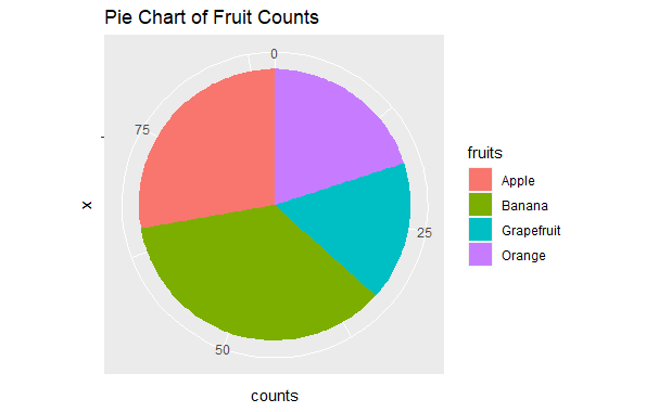 Non-Linear Coordinate system in ggplot2 Transformation using coord_trans()coord_trans() allows you to define custom functions that transform data points from the default rectangular system into a non-linear one. This function takes arguments for the x and y axes, where each argument can be:
This flexibility lets you tailor the visualization to your specific needs and data characteristics. Just like how you can set limits on a graph, you can also change how the data is shown in two ways: either by changing the scale or by changing the coordinate system. When you change the scale, it happens before any calculations are done on the data and doesn’t transform the shape of what you’re plotting. But when you change the coordinate system, it happens after the calculations are done and it can change the shape of what’s plotted. By using both methods together, you can adjust how the data looks for analysis, and then change it back to its original form for interpretation. Output: 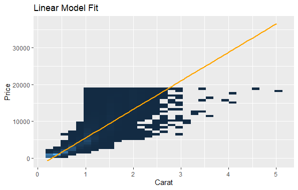 Non-Linear Coordinate system in ggplot2 In this plot, we’re fitting a linear model to the data without any transformation. Then, we will apply transformation to it. Now, we will transform both the x-axis and y-axis to logarithmic scales. Output: 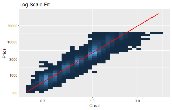 Non-Linear Coordinate system in ggplot2 We will apply a logarithmic transformation to both the x-axis and y-axis using scale_x_log10() and scale_y_log10(). This transformation will make it easier to visualize the data when there’s a wide range of values. We will fit a linear regression line with geom_smooth(method = “lm”). Transformation using coord_map()The Earth is a sphere, but most maps portray it as flat. This transformation, called a map projection, inevitably distorts shapes, distances, and areas depending on the chosen projection. coord_map() leverages the mapproj package to incorporate various map projections into your ggplot2 visualizations. coord_map() transforms your data points from geographic coordinates (latitude and longitude) onto a projected flat map. It offers:
When we look at maps, we often see a flat representation of a round Earth. But plotting raw latitude and longitude directly can be misleading because the Earth’s surface is curved. So, we need to project the data onto a flat surface. There are two main ways to do this in ggplot2:
Let’s first load world map data using map_data(“world”). ggplot() creates a basic plot of the world map using longitude and latitude coordinates. geom_path() draws the outlines of the countries on the map. scale_y_continuous() and scale_x_continuous() customize the y-axis and x-axis respectively, setting breaks and labels to control the appearance of the map. Then, we will do Map Projection with coord_map(), coord_map() is used to perform a formal map projection. This projection is suitable for general-purpose maps. Output: 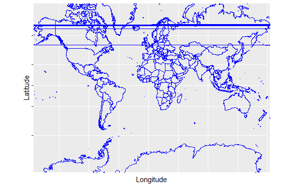 Non-Linear Coordinate system in ggplot2 We can also use the “ortho” argument in coord_map() to specify an orthographic projection. An orthographic projection displays the Earth as if viewed from a great distance, resulting in a globe-like appearance. This projection is suitable for visualizing the entire Earth from a global perspective. Output: 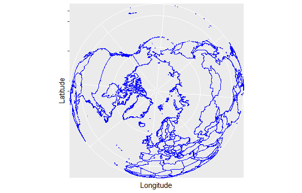 Non-Linear Coordinate system in ggplot2 Applications
|
Reffered: https://www.geeksforgeeks.org
| R Language |
Type: | Geek |
Category: | Coding |
Sub Category: | Tutorial |
Uploaded by: | Admin |
Views: | 12 |