|
Styling the options of an HTML <select> element can enhance the visual appearance and usability of dropdown menus, making them more appealing and user-friendly. Styling options can be used to highlight or differentiate certain options, improving readability and guiding user interaction.
Approach 1: Using CSS Styling
First, target the “select” element using the selector and apply styling to it. Set the width, background color, text color, and border properties to style the selected element. Then, target the option elements within the select element using the < select > option selector. We apply background color and text color to style the options.
Example: Illustration of styling the option of an HTML select element Using CSS Styling.
HTML
<!DOCTYPE html>
<html lang="en">
<head>
<meta charset="UTF-8">
<meta name="viewport"
content="width=device-width, initial-scale=1.0">
<title>Demo</title>
<link rel="stylesheet" href="style.css" />
</head>
<body>
<div>
<select>
<option>Option 1</option>
<option>Option 2</option>
<option>Option 3</option>
</select>
</div>
</body>
</html>
|
CSS
select {
width: 10rem;
background-color: #c3f0c6;
border: #b2eeac 2px solid;
}
select>option {
background-color: #b8e1ba;
}
|
Output:
 Output Approach 2: Using CSS Pseudo-Elements
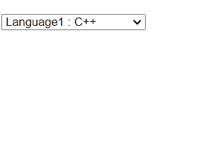
Style the options using the option selector, setting the font size and background color. Next, we use the option:before pseudo-element to insert content before each option. In this case, we’re adding a “>” symbol. We initially set display: none; for the pseudo-element to hide it by default. Upon hovering over an option (option:hover:before), we set display: inline; to show the “>” symbol.
Example: Illustration of styling the option of an HTML select element using CSS pseudo-elements.
HTML
<!DOCTYPE html>
<html lang="en">
<head>
<meta charset="UTF-8">
<meta name="viewport"
content="width=device-width, initial-scale=1.0">
<title>Pseudo Elements</title>
<link rel="stylesheet" href="style.css" />
</head>
<body>
<div>
<select id="ddlProducts" name="Programming Languages">
<option>Language1 : C++ </option>
<option>Language2 : Java </option>
<option>Language3 : Python </option>
<option>Language4 : JavaScript </option>
</select>
</div>
</body>
</html>
|
CSS
option {
font-size: 18px;
background-color: #ffffff;
}
option:before {
content: ">";
font-size: 20px;
display: none;
padding-right: 10px;
padding-left: 5px;
color: #fff;
}
option:hover:before {
display: inline;
}
|
Output:
 Output Approach 3: Using Custom Dropdown
The HTML structure consists of a container with two nested div elements. The first div with class “select-selected” represents the currently selected option, and the second div with class “select-items” contains the dropdown options. The JavaScript code handles the functionality of the custom dropdown. It toggles the visibility of the dropdown when the select box is clicked, sets the selected option when an option is clicked, and closes the dropdown when the user clicks outside of it.
Example: Illustration of styling the option of an HTML select element using a custom dropdown.
HTML
<!DOCTYPE html>
<html lang="en">
<head>
<meta charset="UTF-8" />
<meta name="viewport"
content="width=device-width, initial-scale=1.0" />
<title>Demo</title>
<link rel="stylesheet" href="style.css" />
</head>
<body>
<div class="custom-select">
<div class="select-selected">
Select an Option
</div>
<div class="select-items">
<div>Select Option 1</div>
<div>Select Option 2</div>
<div>Select Option 3</div>
</div>
</div>
<script src="script.js"></script>
</body>
</html>
|
CSS
.custom-select {
position: relative;
display: inline-block;
}
.select-selected {
background-color: #f7f7f7;
color: #333333;
padding: 5px 10px;
cursor: pointer;
}
.select-items {
position: absolute;
display: none;
background-color: #d88181;
box-shadow: 0 4px 8px rgba(0, 0, 0, 0.1);
border-radius: 4px;
z-index: 1;
width: 100%;
}
.select-items div {
padding: 10px;
cursor: pointer;
}
.select-items div:hover {
background-color: #c69c9c;
}
|
Javascript
let customSelects = document.querySelectorAll('.custom-select');
customSelects.forEach(function (select) {
let selectSelected = select.querySelector('.select-selected');
let selectItems = select.querySelector('.select-items');
let options = selectItems.querySelectorAll('div');
selectSelected.addEventListener('click', function () {
if (selectItems.style.display === 'block') {
selectItems.style.display = 'none';
} else {
selectItems.style.display = 'block';
}
});
options.forEach(function (option) {
option.addEventListener('click', function () {
selectSelected.textContent = option.textContent + " ????";
selectItems.style.display = 'none';
});
});
window.addEventListener('click', function (e) {
if (!select.contains(e.target)) {
selectItems.style.display = 'none';
}
});
});
|
Output:
 Output
|