|
|
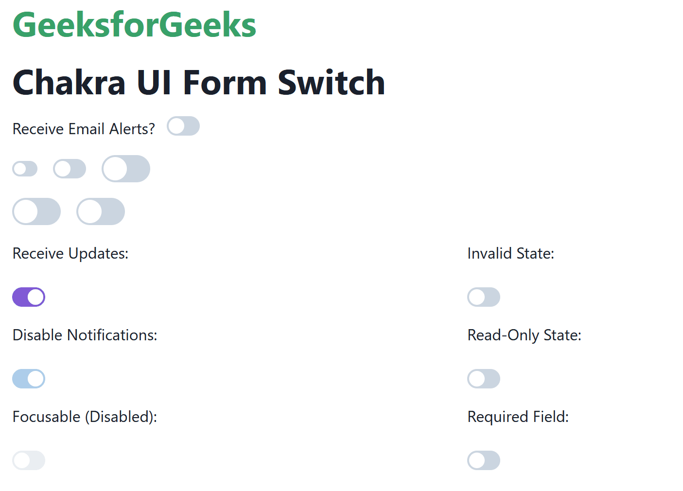
Chakra UI Form Switch is a component provided by Chakra UI for creating toggle switches in React applications. It is an alternative to checkboxes, allowing users to switch between enabled and disabled states. Using the props of the Chakra UI Form Switch we can customize its appearance by changing the state, behavior, sizes, appearance, etc. In this article, we will explore the practical implementation of the Chakra UI Form Switch component by demonstrating all the types of switches. Prerequisites:Approach:We have created different Chakra UI Form Switch components like a size-based, disabling switch, focused switch, invalid, read-only state, etc. Using this Chakra UI Form Switch component, we can embed it into the real-time application as an alternative to the traditional checkboxes. This increases the modern perspective of the application and enables the user to engage with the application. Steps to Create React Application And Installing Module:Step 1: Create a React application using the following command: npx create-react-app chakra
Step 2: After creating your project folder(i.e. chakra), move to it by using the following command: cd chakra
Step 3: After creating the React application, Install the required package using the following command: npm i @chakra-ui/react @emotion/react@^11 @emotion/styled@^11 framer-motion@^6
Project Structure:
The updated dependencies are in the package.json file. "dependencies": { Example: Below is the practical implementation of the Chakra UI Form Switch. Javascript
Step to run the application: Run the application using the following command: npm run start
Output: Now go to http://localhost:3000 in your browser:
|
Reffered: https://www.geeksforgeeks.org
| ReactJS |
.png)
Type: | Geek |
Category: | Coding |
Sub Category: | Tutorial |
Uploaded by: | Admin |
Views: | 12 |