
|
|
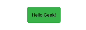
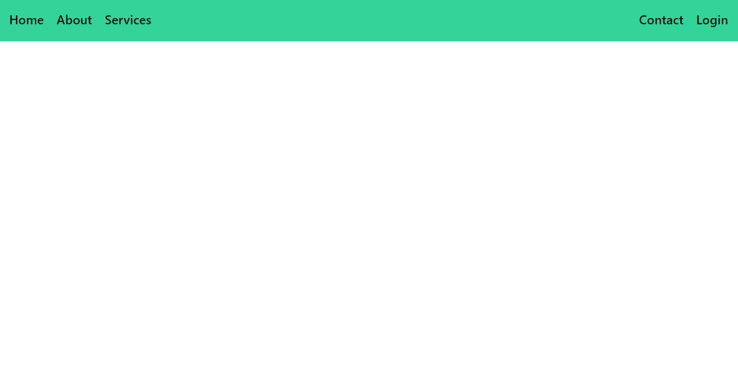
In Tailwind CSS, you can use the responsive utility classes to control the visibility of an element based on screen size. To make an element visible only on larger screens, you can use the hidden and block classes with responsive breakpoints. We can achieve the effect of visibility of an element only on larger screens in Tailwind CSS in many ways i.e., using Display Utility Classes and using Visibility Classes. Syntax:<element class="hidden lg:block"> Table of Content Using Display Utility ClassesTailwind CSS provides display utility classes that allow you to control the display property of elements based on screen size. The hidden class hides the element by default, and the lg:block class makes it visible as a block element starting from the large (lg) breakpoint with a minimum width of 1024px. Example: Illustration of making an element visible only on larger screens in Tailwind CSS using display utility class. Output: Using Visibility ClassesUse visibility classes to control the visibility of elements based on screen size. The invisible class hides the element by making it invisible but still occupies space in the layout. The lg:visible class overrides the visibility property and makes the element visible starting from the large (lg) breakpoint and larger screens. Example: Illustration of making an element visible only on larger screens in Tailwind CSS using visibility utility class. Output: |
Reffered: https://www.geeksforgeeks.org
| Tailwind CSS |
Type: | Geek |
Category: | Coding |
Sub Category: | Tutorial |
Uploaded by: | Admin |
Views: | 14 |