|
A Responsive Navigation Bar with collapsible elements is a crucial component of modern web design, allowing users to navigate seamlessly across various screen sizes. In this article, we’ll explore how to implement such a navigation bar using Tailwind CSS, a utility-first CSS framework that enables rapid development and easy customization.
Preview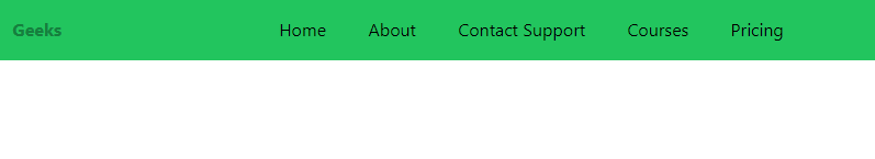
Approach- Set up HTML5 structure with necessary meta tags, linking Tailwind CSS, and Ionicons scripts.
- Create a header with a green background, flex container, and navigation links.
- Style navigation links using Tailwind CSS for a clean and responsive design.
- Add a toggle button with an Ionicon “menu” icon for mobile responsiveness.
- Implement a JavaScript function to toggle the menu’s visibility on button click.
- Utilize Tailwind CSS classes for responsiveness, ensuring the navigation bar adapts to different screen sizes.
Example: Illustration of the navigation bar with Collapses in Tailwind CSS.
HTML
<!doctype html>
<html>

<head>
    <meta charset="UTF-8">
    <meta name="viewport"
          content="width=device-width, initial-scale=1.0">
    <script src=
"https://cdn.tailwindcss.com">
      </script>
    <script src=
"https://unpkg.com/[email protected]/dist/ionicons.js">
      </script>
</head>

<body>
    <header class="bg-green-500 py-4">
        <nav class="flex justify-between
                    items-center w-[92%]  mx-auto">
            <div class="w-16 font-bold text-green-700">
                Geeks
            </div>
            <div class="nav-links duration-500 md:static
                        absolute md:min-h-fit min-h-[60vh]
                        left-0 top-[-100%] md:w-auto  w-full
                        flex items-center px-5">
                <ul class="flex md:flex-row flex-col
                           md:items-center md:gap-[4vw] gap-8">
                    <li>
                        <a class="hover:text-gray-500" href="#">Home</a>
                    </li>
                    <li>
                        <a class="hover:text-gray-500" href="#">About</a>
                    </li>
                    <li>
                        <a class="hover:text-gray-500" href="#">Contact Support</a>
                    </li>
                    <li>
                        <a class="hover:text-gray-500" href="#">Courses</a>
                    </li>
                    <li>
                        <a class="hover:text-gray-500" href="#">Pricing</a>
                    </li>
                </ul>
            </div>
            <div class="flex items-center gap-6">
                <ion-icon onclick="onToggleMenu(this)"
                          name="menu" class="text-3xl cursor-pointer
                                             md:hidden text-white">
                  </ion-icon>
            </div>
        </nav>
    </header>
    <script>
        const navLinks = document.querySelector('.nav-links')
        function onToggleMenu(e) {
            e.name = e.name === 'menu' ? 'close' : 'menu'
            navLinks.classList.toggle('top-[6%]')
        }
    </script>
</body>

</html>
Output:
|