|
In Tailwind CSS, applying margin and padding is achieved using utility classes like m-[size], p-[size], mx-[size], px-[size], my-[size], and py-[size]. Replace [size] with predefined size identifiers like 4, 8, px, etc., for margins and paddings in different directions.
Preview
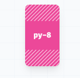 Padding  Margin Syntax
<div class="m-4 p-8">
      This element has a margin of 1rem and padding of 2rem.
</div>
Margin Classes
Tailwind CSS margin classes adds space around elements, helping control layout and spacing easily using intuitive utility classes. Values ranges from m-0 to m-64.
The below table illustrates the classes provide a quick way to adjust margin spacing in your Tailwind CSS projects.
| Class |
Description |
m-[size] |
Sets margin for all sides. |
mx-[size] |
Sets horizontal margin. |
my-[size] |
Sets vertical margin. |
mt-[size] |
Sets margin for the top. |
mb-[size] |
Sets margin for the bottom. |
ml-[size] |
Sets margin for the left. |
mr-[size] |
Sets margin for the right. |
Padding Classes
Tailwind CSS padding classes adds space within elements, helping in layout control with straightforward utility classes for padding adjustments. Values ranges from m-0 to m-64.
The below table illustrates the classes offer convenient ways to adjust padding spacing in your Tailwind CSS projects.
| Class |
Description |
p-[size] |
Sets padding for all sides. |
px-[size] |
Sets horizontal padding. |
py-[size] |
Sets vertical padding. |
pt-[size] |
Sets padding for the top. |
pb-[size] |
Sets padding for the bottom. |
pl-[size] |
Sets padding for the left. |
pr-[size] |
Sets padding for the right. |
Key Features
- Use responsive variants (
sm:, md:, lg:, xl:) to adjust the margin and padding based on different screen sizes.
- Tailwind’s utility-first approach ensures consistent spacing and padding throughout the project.
- Utilize numerical values for precise control over margin and padding sizes, allowing pixel-perfect adjustments.
|