|
|
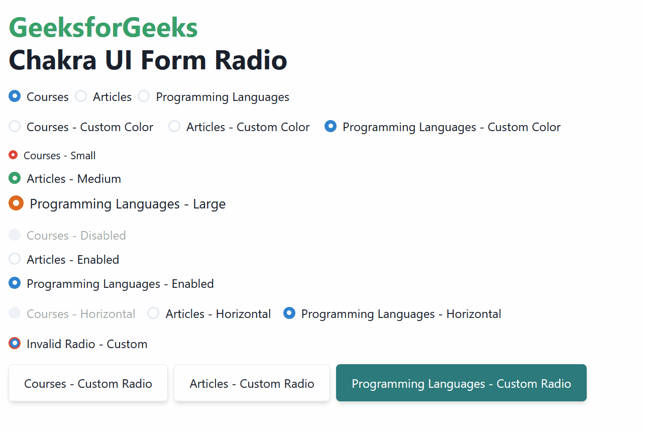
Chakra UI Form Radio is a component of the Chakra UI library, a React component library for building customizable user interfaces. It provides a set of components and utilities to easily create radio buttons in forms, offering features like customizable colors, sizes, disabled states, and even the ability to create custom-styled radio buttons. In this article, we will explore the practical implementation of the Chakra UI Form Radio component by demonstrating all the types of radios. Prerequisites:Approach:We have created different Chakra UI Form Radios which includes Color-based Radios, Checked-Unchecked Radions, Size-based, Horizontal alignment radios, Invalid Radios, and also the Custom Radio buttons. Chakra UI Form Radio component can be used as the input element for the user that can be embedded in the application to take the input in terms of choice from the user. Steps to Create React Application And Installing Module:Step 1: Create a React application using the following command: npx create-react-app chakra
Step 2: After creating your project folder(i.e. chakra), move to it by using the following command: cd chakra
Step 3: After creating the React application, Install the required package using the following command: npm i @chakra-ui/react @emotion/react@^11 @emotion/styled@^11 framer-motion@^6
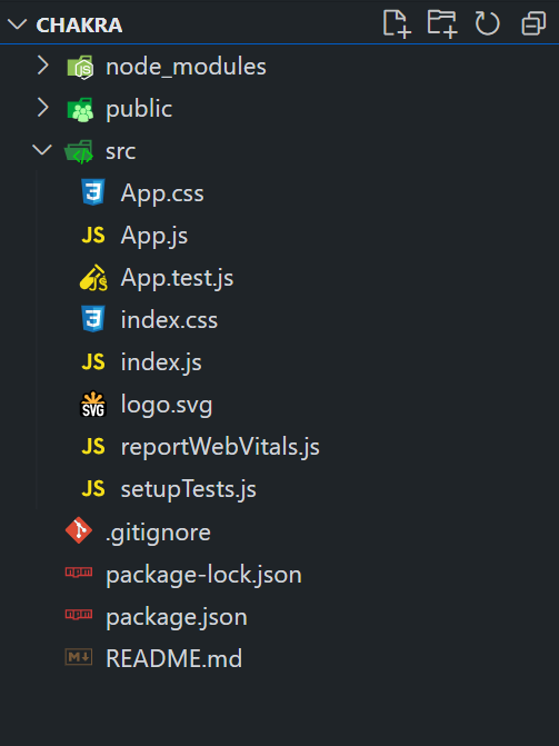
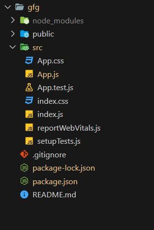
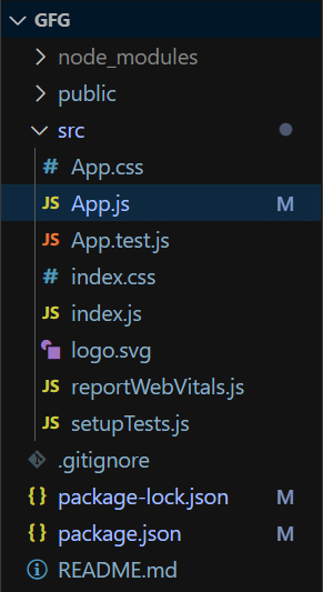
Project Structure:
The updated dependencies are in the package.json file. "dependencies": { Example: Below is the practical implementation of the Chakra UI Form Radio. Javascript
Step to run the application: Run the application using the following command: npm run start
Output: Now go to http://localhost:3000 in your browser: |
Reffered: https://www.geeksforgeeks.org
| ReactJS |
| Related |
|---|
 Chakra UI Media and icons Avatar
 |
 What is Redux Persist?
 |
 Purpose of useReducer hook in React
 |
 Chakra UI Data Display List
 |
 Chakra UI Overlay Modal
 |
Type: | Geek |
Category: | Coding |
Sub Category: | Tutorial |
Uploaded by: | Admin |
Views: | 12 |