|
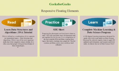
The Responsive Floating Elements are useful for adaptable layouts on different devices. It ensures a seamless user experience by adjusting the size and arrangement of cards based on the screen size. The float property is employed to arrange the cards horizontally, making them responsive on various devices.
Preview.jpg) Approach- Create the basic structure of the web page using different HTML elements like <h1>, <p>, <div>, <img>, and <h2> elements.
- Make a three-card layout with an image, title and description. The heading and paragraph have green text colour and are centred. Also, the content is organized using a container (
float-container) that has a maximum width of 1200px and is centered with auto margins. - The
float: left property is applied to the .float-item class. This property is used to make the elements align horizontally, allowing them to appear side by side. - Apply media queries for responsiveness, initially, each
.float-item takes up the full width of its container, but when the screen width is at least 600px, the width is adjusted to 48%, and on larger screens (900px or more), the width is further reduced to 31%, maintaining three items in a row
Example: Implemenatation to show responsive floating elements using CSS.
HTML
<!DOCTYPE html>
<html lang="en">

<head>
    <meta charset="UTF-8">
    <meta name="viewport" content="width=device-width,
                initial-scale=1.0">
    <style>
        body {
            background-color: rgb(237, 237, 180);
        }

        h1 {
            color: green;
            text-align: center;
        }

        p {
            font-size: 30px;
            text-align: center;
        }

        .float-container {
            width: 100%;
            max-width: 1200px;
            margin: 0 auto;
            overflow: hidden;
        }

        .float-item {
            float: left;
            width: 100%;
            margin: 0 10px;
            box-sizing: border-box;
            background-color: #d3c5c5;
            padding: 20px;
            margin-bottom: 20px;
            border-radius: 8px;
            text-align: center;
        }

        @media screen and (min-width: 600px) {
            .float-item {
                width: 48%;
            }
        }

        @media screen and (min-width: 900px) {
            .float-item {
                width: 31%;
                height: 400px;
            }
        }

        .card-img {
            max-width: 100%;
            height: auto;
            border-radius: 50%;
        }

        .card-title {
            font-size: 1.5rem;
            margin: 10px 0;
        }

        .card-paragraph {
            font-size: 1rem;
        }
    </style>
    <title>Responsive Floating Elements</title>
</head>

<body>
    <h1>GeeksforGeeks</h1>
    <p>Responsive Floating Elements</p>
    <div class="float-container">
        <div class="float-item">
            <!-- Box Card 1 -->
            <img class="card-img" src=
"https://media.geeksforgeeks.org/auth-dashboard-uploads/read.png"
                alt="Card Image">
            <h2 class="card-title">
                Learn Data Structures and Algorithms | DSA Tutorial
            </h2>
            <p class="card-paragraph">
                DSA is defined as a combination of
                two separate yet interrelated topics
                – Data Structure and Algorithms.
                DSA is one of the most important
                skills that every computer science
                student. It is often seen that people
                with good knowledge of these technologies.
            </p>
        </div>

        <div class="float-item">
            <!-- Box Card 2 -->
            <img class="card-img" src=
"https://media.geeksforgeeks.org/auth-dashboard-uploads/practice.png"
                alt="Card Image">
            <h2 class="card-title">SDE Sheet</h2>
            <p class="card-paragraph">
                Preparing for placements and dont
                know where to start ? GFG has used
                their years of experience and put
                together this list for you. It is
                a compilation of the most popular
                DSA problems ranging from topics
                like arrays, hashing, tree, graph
                etc. The list contains problems
                across easy, medium, hard difficulty.
            </p>
        </div>

        <div class="float-item">
            <!-- Box Card 3 -->
            <img class="card-img" src=
"https://media.geeksforgeeks.org/auth-dashboard-uploads/learn.png"
                alt="Card Image">
            <h2 class="card-title">
                Complete Machine Learning & Data
                Science Program
            </h2>
            <p class="card-paragraph">
                A 360-degree Learning experience designed
                for geeks who wish to get hands-on Data
                Science. Mentored by industry experts;
                learn to apply DS methods and techniques,
                and acquire analytical skills. So Master
                the Art of Data Science Now!
            </p>
        </div>
    </div>

</body>

</html>
Output:
|