|
|
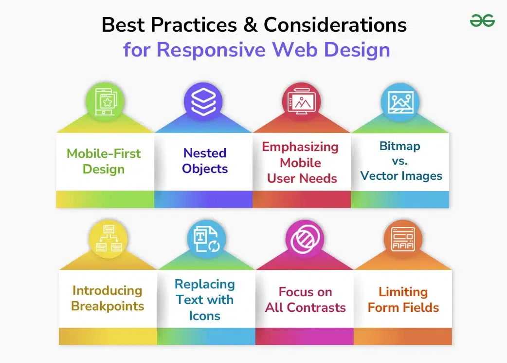
Responsive web design ensures that websites look great and function well on any device, whether it’s a smartphone, tablet, or desktop computer. It involves creating flexible layouts that adapt to different screen sizes and orientations, improving the user experience and accessibility. Below are some key features and best practices of responsive web design. What is Responsive Design?Responsive design is a way of creating websites so they look good and work well on any device, whether it’s a smartphone, tablet, or computer. It means the website layout automatically adjusts to fit different screen sizes and orientations, so users have a great experience no matter how they access the site. This involves using flexible grids, images, and CSS media queries to ensure everything scales and adapts perfectly. Responsive design helps make websites more user-friendly and accessible to everyone. Responsive Design Best Practices1. Eliminate Friction:Focus on the primary objectives of the user and remove any unnecessary elements that don’t aid in achieving these goals. For mobile users, simplifying the checkout process can reduce friction and improve the user experience. 2. Design for Thumbs:On mobile, place navigation and interactive elements where they are easy to reach with the thumb. This improves usability and ensures users can easily interact with the website. 3. Use Native Hardware:Leverage mobile device features like cameras and GPS for a better user experience. For example, allow credit card scanning to simplify form filling. 4. Make Layouts Fluid:Design layouts that adapt naturally to different screen sizes. Use percentage units and set minimum and maximum widths to ensure flexibility. 5. Don’t Forget Landscape Orientation:Consider how your design will look in both portrait and landscape orientations on mobile devices. Adjust layouts to maintain usability and accessibility. 6. Responsive Typography:Use responsive units like em to ensure text sizes adjust appropriately to different screen resolutions. This ensures readability across all devices. Considerations for Responsive DesignResponsive Design Considerations 1. Mobile-First DesignOne important approach to responsive design is mobile-first design. This means starting with the mobile version of a website and then scaling up to larger screens. By prioritizing mobile-friendliness, designers can ensure their websites are scalable and accessible to a larger audience. Key considerations include:
2. Nested ObjectsNested objects involve grouping related content, such as headlines, bodies, and images, inside a containing element. This approach allows designers to control the entire group of elements rather than each one individually, making layout adjustments more manageable. 3. Emphasizing Mobile User NeedsMobile users have different needs compared to desktop users. For instance, placing important interactive elements like search boxes within easy reach of the thumb improves usability. Designing with the mobile user in mind ensures a better overall experience. 4. Bitmap vs. Vector ImagesUnderstanding the difference between bitmap and vector images is crucial for responsive design. Bitmap images can become pixelated when stretched, while vector images maintain their quality. Use vector images for scalable designs that look sharp on any screen size. 5. Introducing BreakpointsBreakpoints are predefined points where the layout changes based on the screen size. For example, a wide layout might be divided into 12 columns on a desktop but reduced to 6 or 3 columns on a tablet or mobile device. Breakpoints help maintain a consistent and user-friendly layout across different devices. 6. Replacing Text with IconsIcons are visual elements that can represent content or actions more efficiently than text, especially on smaller screens. They reduce cognitive load and save space, making navigation easier. Ensure icons are clear and convey the intended action effectively. 7. Focus on All ContrastsProper contrast in design helps users distinguish important elements. Contrast can be achieved through color, font weight, size, and imagery. Ensuring good contrast improves readability and user experience, especially on smaller screens. 8. Limiting Form FieldsOn mobile screens, it’s essential to keep forms simple and easy to fill out. Limit the number of fields and use larger buttons and easy-to-find elements. Multi-step forms can be more user-friendly as they break down information into manageable sections. 9. Some more points for Responsible Design:Here are some best practices to follow while designing components for a responsive design:
ConclusionResponsive web design is essential for creating websites that provide a seamless experience on any device. By incorporating features like mobile-first design, nested objects, breakpoints, and responsive typography, designers can create flexible, user-friendly websites. Emphasizing user needs and optimizing for various devices ensures that your website remains accessible and effective in a rapidly changing digital landscape. Best Practices and Considerations for Responsive Web Design – FAQsWhat are the best responsive web designing techniques?
Which would be considered a responsive design best practice?
What are the guidelines for responsive web design?
What are the key principles of responsive web design?
|
Reffered: https://www.geeksforgeeks.org
| Design |
-(1).webp)
Type: | Geek |
Category: | Coding |
Sub Category: | Tutorial |
Uploaded by: | Admin |
Views: | 13 |