
|
|
Tailwind CSS is a utility-first CSS framework that offers a set of predefined utility classes to design interfaces directly in HTML. It is utilized for efficient and rapid development. Tailwind CSS Interview Questions and Answers In this article, we will provide over 50 Tailwind CSS interview questions and answers that are frequently asked in coding interviews. We cover all the important Tailwind concepts frequently asked in web development interviews, such as the utility-first approach, responsive design, customization, hover and focus states, typography, component styling, and optimization Tailwind CSS Interview Questions1. Why do we use Tailwind CSS?Tailwind CSS is used to design and style web pages fast and Responsive. Rapid Development, Highly Customizable, Reduced CSS File Size, Great Documentation, and Community Support are the main reasons for using Tailwind CSS. 2. Explain the concept of utility-first in Tailwind CSSTailwind CSS is a utility-first CSS framework which means we can use utility classes to build custom designs without writing CSS as in the traditional approach. This approach prioritizes simplicity, rapid development, and a modular way of applying styles. 3. How to integrate Tailwind CSS into the HTML file?We can easily integrate the tailwind CSS to the project via CDN links and by installing it from npm or yarn. 4. How to set up the Tailwind CSS in a project?There are two ways to use the Tailwind CSS we can install them on our server or we can use the CDN link as well. Method 1: Using Tailwind via CDN <link href=”https://unpkg.com/tailwindcss@^1.0/dist/tailwind.min.css” rel=”stylesheet”> Method 2: Install Tailwind via npm npm init -y Use the @tailwind directive to inject Tailwind’s base, components, and utility styles into your CSS file. @tailwind base; This is used to create a config file to customize the designs. It is an optional step. npx tailwindcss initThis command is used to compile style.css is the file that has to be compiled and output.css is the file on which it has to be compiled. If the file output.css is not created earlier then it will automatically be created. npx tailwindcss build styles.css -o output.css5. What are the benefits and its limitations of Tailwind CSS ?Tailwind CSS has many advantages includes, minimum lines of Code in CSS file, easily customizable for design a components, website responsive. Tailwind CSS offers many features, but it does have some limitations. The major drawbacks frequently observed are illustrated in the table below.
6. Is Tailwind CSS open-source (FREE to use)?Tailwind CSS is an open-source project, available for free usage and utility-first CSS framework that provides responsiveness. 7. How does Tailwind CSS differ from other CSS frameworks?Tailwind CSS offers various differences in the below table the key differences are defined.
8. What is Drop Shadow in Tailwind CSS ? Explain various utility classes.The Drop Shadow class is used in Tailwind CSS to apply a filter to the image for setting the shadow of the image. there are various utility classes applied including drop-shadow-sm, drop-shadow, drop-shadow-md, drop-shadow-lg, drop-shadow-xl, drop-shadow-2xl and drop-shadow-none. 9. What is the primary purpose of the container class in Tailwind CSS?In Tailwind CSS, a container offers responsive layout, it is used to fix the max-width of an element to match the min-width of the breakpoint. To center the container, we use mx-auto utility class. 10. How does Tailwind CSS handle flex direction in its utility classes?Tailwind CSS offers various flex directions including flex-row, flex-row-reverse, flex-col, and flex-col-reverse. To achieve the flex-direction properties, you have to include the flex class in your element before the flex-direction class. Syntax: <element class="flex flex-row"> Contents... </element>11. How to manage order property in Tailwind CSS utility classes?By using the `order` class in Tailwind CSS, we can arrange the flex and grid items according to our requirements. This class is utilized to display flex and grid items in an order different from their appearance in the DOM. The classes are order-1, order-2, order-3, order-4, order-5, order-6, order-7, order-8, order-9, order-10, order-11, order-12, order-first, order-last, order-none. Syntax: <element order- number | string >12. Can we change the base font-family in Tailwind config?Yes, we can change the base font-family in Tailwind config. To adjust the main font style in Tailwind CSS, you can modify it by making changes in the “theme” part of your configuration file (tailwind.config.js). Just open that file, find the theme section, and add or update the fontFamily setting. We can also Change the font-family in the Tailwind config with different techniques Changing base font-family, Adding a new font family, Removing font family. 13. Do Tailwind CSS 3 Classes Override Previous Classes?Tailwind CSS is designed to be a low-level utility-first framework, which means that classes are not automatically overridden by default. This make the styling process for form elements simple and allowing easy customization with utilities. 14. How to create a form with Tailwind CSS?Tailwind CSS, offers Tailwind forms as plugins that provide a foundational reset for form styles. Install TailwindCSS by writing the following command. We can also use utility classes to make a form with Tailwind CSS, use the easy-to-apply classes for backgrounds, borders, shadows, etc. Start by creating the form element and use the space-y-{n} class to add vertical spacing between the form controls.” 15. How to use CSS animations with Tailwind CSS?This Tailwind CSS class allows you to easily animate elements using CSS animations by providing a range of values and covering all necessary properties. Syntax: <element class="animate-{animation_name}">...</element>The table below shows the different utility classes with their description.
Output: 16. How to make text bold in Tailwind CSS?For achieving the bold text we can easily add utility class font-bold. 17. How to center both horizontally and vertically?We can easily add utility class self-center. 18. How to install Tailwind CSS custom forms?Use the given command to effortlessly install Tailwind CSS Custom Forms, enhancing form styling and customization in your project. npm install @tailwindcss/custom-forms - - save-dev19. How to download Tailwind CSS Typography?We can download Tailwind CSS Typography using the provided command for easy integration of pre-styled typography in your project. npm install @tailwindss/typography20. How to define horizontal spacing and vertical spacing between elements with Tailwind CSS?The horizontal and vertical spacing can easily achieved with Tailwind CSS with various utility classes including space-x-{n} for horizontal Spacing and space-y-{n} for vertical Spacing. Syntax:
Note: The utility classes mentioned above are applied to the child elements. 21. How to create a Card component using Tailwind CSS ?Tailwind CSS makes small utilities that come with clear choices, making it easy to directly add existing styles to your HTML code. The table below shows a descriptive glance to the various utilities that helps in making Card component.
22. Can we use both Tailwind CSS and Bootstrap 4 at the same time ?We can use both the CSS frameworks together but it may occur conflict and is not recommended. For example few classes will contradict with each other like “container”, “clearfix”, etc. 23. How to Center an Image using Tailwind CSS ?We can center an Image using Tailwind CSS with different ways.
24. How to resize the elements with Tailwind CSS?With the help of different resize tailwind utility classes we can easily resize element according to user requirements.
Syntax: <element class="pointer-{axis-boolean}">...</element>Note: It doesn’t affect inline elements or block elements with visible overflow. 25. Does Tailwind CSS provide overscroll behavior customization?Yes, Tailwing CSS provide several Overscroll Behavior classes these. The syntax provide is an example hoe other can be used in this way. Syntax: <element class="overscroll-auto">...</element>The below table illustrates the various Overscroll Behavior class with their description.
26. How can Tailwind CSS Typography be downloaded and integrated into a project?This Tailwind CSS class, an alternative to CSS font-family, accepts multiple font names in a single class, covering various properties and allowing fallback fonts for browser compatibility. Syntax: <element class="font-sans">...</element>Font family classes
27. Why are CSS classes missing in production when using Tailwind and Next.js ?When we use Tailwind and Next.js together, they can sometimes cause issues. One common issue is missing CSS classes in production, where some Tailwind classes are not included in the final CSS file, that leads to inconsistent website styles across environments. Possible Causes of Missing CSS Classes:
Fixing Missing CSS Classes
Learn more about CSS classes missing in production when using Tailwind and Next.js. 28. How can you use Tailwind CSS to position two elements to the left and right?You can position elements to the left and right in Tailwind CSS using either the flex or flow-root classes. The flow-root class efficiently clears floated content within a container, ensuring proper layout structure. Simultaneously, the position class enables precise control over the placement of positioned elements, offering flexibility in alignment. Note: The class flow-root is added in the upgraded version i.e. v2.0 or greater in Tailwind. If your version is not updated, you can easily substitute flow-root with clearfix in your code. 29. How to add new colors to tailwind-css and keep the originals ones ?You can effortlessly incorporate additional colors into Tailwind CSS while keep the original ones through customization configuration. Simply, configure your colors within the “colors” key found in the theme section of your tailwind.config.js file. 30. How to align form elements to center using Tailwind CSS ?For achieving aligniment form elements to center, Tailwind CSS uses justify-center and items-center property which is an alternative to the flex-property in CSS. Other flex properties like flex-col, justify-center, items-center are use for alignment purposes. Syntax: <div class="flex flex-col justify-center items-center"> 31. How to use Tailwind Forms Plugin with React Select ?For using Tailwind Forms Plugin with React Select a select component library, is employed for crafting Select Input controls in React with built-in multiselect and async support.
32. How to Achieve Pixel-Perfect Design with Tailwind CSS Coding?Tailwind CSS is a widely used CSS framework that makes it easy for developers to create accurate and seamless designs quickly and efficiently. There are two ways to achieve pixel-perfect designs with Tailwind CSS, one is by using specific values, and the other is by custom utilities.
Syntax: <div class="w-[250px]"> ... </div>
Syntax: @layer utilities { 33. How to create a fixed or sticky header with Tailwind CSS?To create a fixed or sticky header using Tailwind CSS, utilize the defined utility classes for fixed and sticky positions. Specify the desired position by applying the top-0 and inset-x-0 utility classes. Syntax:
Note: The parent element should have the relative position defined using the utility class `relative`. 34. How to use CSS Grid with Tailwind CSS?Tailwind CSS makes the concept of grid CSS Grid simple for creating complex grid structure. With the help of various utility classes defined in the tailwind CSS we can easily achieve the grid layout. The utility class .grid is used to create grid container. Syntax:
35. How can Tailwind CSS be utilized to implement box shadows effectively?This Tailwind CSS class makes it easy to control the box-shadow of an element by offering various options, similar to the CSS box-shadow properties. Syntax: <element class="shadow-{shadow-depth}">...</element> The below table illustrates various Box Shadow classes with their description.
36. How does Tailwind CSS handle opacity, and what features does it provide for controlling the opacity of elements?The Tailwind CSS opacity class provides many options to control element transparency. It covers all related properties and works similarly to the CSS opacity property, allowing values from 0 to 100 in increments of 5. Syntax: <element class="opacity-{number}">...</element>Output: 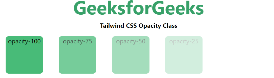 Output
|
| Class | Description |
|---|---|
| Flex Direction | Establishes the main axis of the flexible item. |
| Flex Wrap | Specifies whether flex items are forced into a single line or wrapped. |
| Flex | Sets the length of flexible items. |
| Flex Grow | Specifies how much the item will grow compared to other items in the container. |
| Flex Shrink | Specifies how much the item will shrink compared to other items in the container. |
Note: Use flex-grow and flex-shrink properties to the child elements.
38. How to style elements based on state (e.g., hover, focus) in Tailwind CSS?
The elements can be styled with variant utilities based on their state. The below is the syntax and table with description.
Syntax:
active:{property}
focus:{property}
hover: {property}
| Variant | Description |
|---|---|
| Hover | Used to style an element when the user hovers the mouse pointer over it. |
| Focus | Typically used to style an element when it has focus, triggered by clicks or tabs. |
| Active | Used to style elements when the user actively clicks or taps them. |
39. How to use responsive variants in Tailwind CSS?
Tailwind CSS provide different Default breakpoints these are illustrated in the table. With the help of these we can make website responsive. Also, we can customize breakpoints in Tailwind CSS and override the default breakpoints.
| Breakpoint | Description |
|---|---|
| sm | Used for screens with a width of at least 576px, like small laptops and tablets in portrait mode. |
| md | Used for screens with a width of at least 768px, such as tablets in landscape mode and larger laptops. |
| lg | Used for screens with a width of at least 992px, like large desktop monitors. |
| xl | Used for screens with a width of at least 1200px, such as extra-large desktop monitors. |
40. What is the purpose of the Tailwind CSS fill class?
This utility class contains various values in tailwind CSS in which all the properties are covered in class form. The utility class`fill-current` simplifies setting the fill color of an SVG to match the current text color, providing an effortless way to apply an element’s fill color by combining it with an existing text color utility.
Syntax:
<svg class="fill-current">...</svg>41. How to apply Cursor Effect with Tailwind CSS?
Tailwind CSS offers utility class that accepts lots of value in tailwind CSS. The below table illustrate different Cursor utility classes with their description.
Syntax:
<element class="cursor-{behaviour}">...</element>| Class | Description |
|---|---|
| cursor-auto | Default class where the browser sets the cursor. |
| cursor-default | Default cursor class. |
| cursor-pointer | Cursor is a pointer, indicating a link. |
| cursor-wait | Cursor indicates that the program is busy. |
| cursor-text | Cursor indicates selectable text. |
| cursor-move | Cursor indicates something to be moved. |
| cursor-help | Cursor indicates help. |
| cursor-not-allowed | Cursor indicates the requested action will not be executed. |
42. How to apply border collapse property to the elements with Tailwind CSS?
Tailwind CSS Border Collapse class is used to set the borders of the cell present inside the table and tells whether these cells will share a common border or not.
Syntax:
<element class="border-collapse">...</element>43. How to Apply Transform property to the elements with Tailwind CSS?
We can easily transform the elements using different Utility classes. Below is the description of transform utility class with the description.
Syntax:
<element class="transform-{trans-on}">...</element>| Class | Description |
|---|---|
| transform | Required class for performing any transformation. |
| transform-gpu | Utilizes GPU for smoother execution of transformations, enhancing performance compared to CPU. |
| transform-none | Deactivates the transformation effect, preventing any applied transformations. |
44. How to apply Rotate property to the elements with Tailwind CSS?
Tailwind CSS offers different CSS utility classes for rotate the elements clock-wise as well as anticlock-wise.
- Clockwise Rotation: For clockwise rotation we have utility classes rotate-0, rotate-1, rotate-2, rotate-3, rotate-6, rotate-12, rotate-45, rotate-90 and rotate-180.
- Anti-Clockwise Rotation: For anti-clockwise rotation we have utility classes -rotate-0, -rotate-1, -rotate-2, -rotate-3, -rotate-6, -rotate-12, -rotate-45, -rotate-90 and -rotate-180.
Syntax:
<element class="rotate-{degree}">...</element>Note: rotate-0 defines no rotation
45. How to apply Translate property to the elements with Tailwind CSS?
Tailwind CSS offers different CSS utility classes for translate the elements. This class is used to translating elements with transform.
The below table describe the different classes with their description.
| Class | Description |
|---|---|
| translate-x-{amount} | Holds the length of translation along the x-axis. |
| -translate-x-{amount} | Holds the length of translation along the reverse x-axis. |
| translate-y-{amount} | Holds the length of translation along the y-axis. |
| -translate-y-{amount} | Holds the length of translation along the reverse y-axis. |
Note: Values are depends the requirement, it can set as full percentage, or directly put the rem value.
46. Why and how the Transition Timing Function used in Tailwind CSS ?
The transition timing function class is used to specify the time an animation uses to change from one set of CSS transitions to another.
Syntax:
<element class="ease-{timing}">...</element>The table below explains various Transition timing function classes
| Class | Description |
|---|---|
| ease-linear | Animation maintains a consistent speed from start to end. |
| ease-in | Animation eases in, with a faster end. |
| ease-out | Animation eases out, with a faster start. |
| ease-in-out | Sets the class to its default value for easing. |
Example: The example illustrate how the Transition Timing Function used in Tailwind CSS.
<!DOCTYPE html>
<html lang="en">

<head>
    <meta charset="UTF-8">
    <meta name="viewport"
          content="width=device-width,
                   initial-scale=1.0">
    <title>Tailwind CSS Transition Timing Function Class</title>
    <link href=
"https://unpkg.com/tailwindcss@^1.0/dist/tailwind.min.css"
          rel="stylesheet">
</head>

<body class="text-center mx-4 space-y-2">
    <h1 class="text-green-600 text-5xl font-bold">
        GeeksforGeeks
    </h1>
    <b>Tailwind CSS Transition Timing Function Class</b>
    <div class="bg-green-200 m-8 grid grid-flow-col gap-4 p-5">
        <button
            class="transition duration-700 ease-in
                   bg-green-300 hover:bg-green-600
                   transform hover:-translate-y-1
                   hover:scale-110 rounded-lg p-4
                   border border-green-900">
            Hover me for ease-in
        </button>
        <button
            class="transition duration-700 ease-out
                   bg-green-300 hover:bg-green-600
                   transform hover:-translate-y-1
                   hover:scale-110 rounded-lg p-4
                   border border-green-900">
            Hover me for ease-out
        </button>
        <button
            class="transition duration-700 ease-in-out
                   bg-green-300 hover:bg-green-600 transform
                   hover:-translate-y-1 hover:scale-110
                   rounded-lg p-4 border border-green-900">
            Hover me for ease-in-out
        </button>
        <button
            class="transition duration-700 ease-linear
                   bg-green-300 hover:bg-green-600 transform
                   hover:-translate-y-1 hover:scale-110
                   rounded-lg p-4 border border-green-900">
            Hover me for ease-linear
        </button>
    </div>
</body>

</html>
Output:
47. Explain Letter Spacing in Tailwind CSS?
The Letter Spacing in Tailwind CSS is the alternative to the CSS letter-spacing property. This class is defined to control the spacing between text characters, adjusting the space between them in a text..
Syntax:
<element class="tracking-{size}">...</element>Table below illustrates the various letter spacing utility classes along with their description.
| Class | Description |
|---|---|
| tracking-tighter | Zero space between characters, letter spacing set to -0.05em. |
| tracking-tight | Little space between characters, letter spacing set to -0.025em. |
| tracking-normal | Current font’s default letter spacing, no extra space between characters (default value). |
| tracking-wide | A little more space between characters compared to normal, letter spacing set to 0.025em. |
| tracking-wider | A little more space between characters compared to wide, letter spacing set to 0.05em. |
| tracking-widest | A little more space between characters compared to wider, letter spacing set to 0.1em. |
48. How to change the Text Color with the Tailwind CSS utility classes?
Tailwind CSS offers various utility classes to change the Text Color. These are text-green-50, text-yellow-50, text-purple-50 any many more.
Syntax:
<element class="text-{color}">...</element>Note: The values of the text color can be change according to the project requirement from 50-900, the span should be 100, after the 100. Additionally, text-transparent class makes the text color will be transparent and text-current class makes the text color defined on the parent element color.
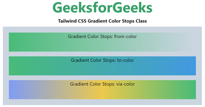
49. How to use Gradient Color Stops to the elements?
The Tailwind CSS Gradient Color Stops class accepts more than one value in tailwind CSS
Syntax:
<element class="gradient-color-stops">...</element>Note: The number start from 50, 100, 200, and so on up to 900.
Example: The below code explain well how Tailwind CSS Gradient Color Stops used.
<!DOCTYPE html>
<html lang="en">

<head>
    <meta charset="UTF-8">
    <meta name="viewport"
          content="width=device-width,
                   initial-scale=1.0">
    <title>Tailwind CSS Gradient Color Stops Class</title>
    <link href=
"https://unpkg.com/tailwindcss@^1.0/dist/tailwind.min.css"
          rel="stylesheet">
</head>

<body class="text-center mx-4 space-y-2">
    <h1 class="text-green-600 text-5xl font-bold">
        GeeksforGeeks
    </h1>
    <b>Tailwind CSS Gradient Color Stops Class</b>
    <div class="bg-gray-400 m-4 grid
                grid-flow-row gap-4 p-5">
        <div class="bg-gradient-to-r
                    from-green-500 h-16">
            Gradient Color Stops: from-color
        </div>
        <div class="bg-gradient-to-r
                    from-green-500 to-blue-500 h-16">
            Gradient Color Stops: to-color
        </div>
        <div class="bg-gradient-to-r from-indigo-400
                    via-yellow-500 to-green-500 h-16">
            Gradient Color Stops: via-color
        </div>
    </div>
</body>

</html>
Output:
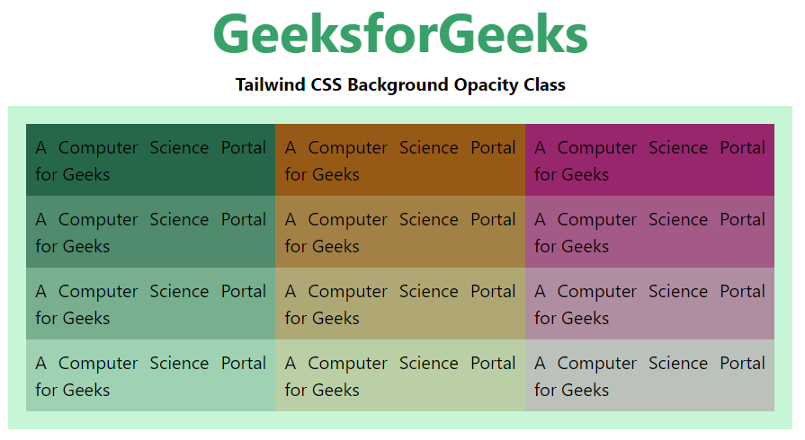
50. How to make element Background with Opacity in Tailwind CSS ?
Element can be full, semi or not visible by applying the opacity. It can easily be achieved using Tailwind CSS utility class.
Syntax:
<element class="bg-{opacity}">...</element>Note: The number of the opacity can be changeable from 0 to 100 with the span of 5.
<!DOCTYPE html>
<html lang="en">

<head>
    <meta charset="UTF-8">
    <meta name="viewport"
          content="width=device-width,
                   initial-scale=1.0">
    <title>Tailwind CSS Background Opacity Class</title>
    <link href=
"https://unpkg.com/tailwindcss@^1.0/dist/tailwind.min.css"
          rel="stylesheet">
</head>

<body class="text-center mx-4 space-y-2">
    <h1 class="text-green-600 text-5xl font-bold">
        GeeksforGeeks
    </h1>
    <b>Tailwind CSS Background Opacity Class</b>
    <div class="mx-14 bg-green-200 grid grid-rows-4
                grid-flow-col text-justify p-4">
        <p class="bg-green-800 bg-opacity-100 p-2">
            A Computer Science Portal for Geeks
        </p>
        <p class="bg-green-800 bg-opacity-75 p-2">
            A Computer Science Portal for Geeks
        </p>
        <p class="bg-green-800 bg-opacity-50 p-2">
            A Computer Science Portal for Geeks
        </p>
        <p class="bg-green-800 bg-opacity-25 p-2">
            A Computer Science Portal for Geeks
        </p>
        <p class="bg-yellow-800 bg-opacity-100 p-2">
            A Computer Science Portal for Geeks
        </p>
        <p class="bg-yellow-800 bg-opacity-75 p-2">
            A Computer Science Portal for Geeks
        </p>
        <p class="bg-yellow-800 bg-opacity-50 p-2">
            A Computer Science Portal for Geeks
        </p>
        <p class="bg-yellow-800 bg-opacity-25 p-2">
            A Computer Science Portal for Geeks
        </p>
        <p class="bg-pink-800 bg-opacity-100 p-2">
            A Computer Science Portal for Geeks
        </p>
        <p class="bg-pink-800 bg-opacity-75 p-2">
            A Computer Science Portal for Geeks
        </p>
        <p class="bg-pink-800 bg-opacity-50 p-2">
            A Computer Science Portal for Geeks
        </p>
        <p class="bg-pink-800 bg-opacity-25 p-2">
            A Computer Science Portal for Geeks
        </p>
    </div>
</body>

</html>
Output:
Output
Reffered: https://www.geeksforgeeks.org
| CSS |
Type: | Geek |
Category: | Coding |
Sub Category: | Tutorial |
Uploaded by: | Admin |
Views: | 13 |