|
In the article, we will see how to prevent a CSS keyframe animation from running on page load. The animations running on page load is a default behavior of browsers. To prevent the animation from running on page load you can use two methods setting the animation-play-state property and applying animation to the parent container to load from 0 opacity to 1.
Syntax// Using animation-play-state property for the first approach
animation-play-state: paused;
animation-play-state: running;
// Using animation of opacity to the parent
// container for the second approach
@keyframes containerAnimation{
0% { opacity: 0; }
99% { opacity: 0; }
100% { opacity: 1; } }
Using animation-play-state property- Create a basic structure of the project with HTML code. Style the elements <h1>, <p>, and <button> using Internal CSS styling.
- Create the div element with the class “box” and set various properties to center the element.
- Set the animation-play-state property to paused for the specified element button initially.
- Then set the animation-play-state property to running in the events selectors.
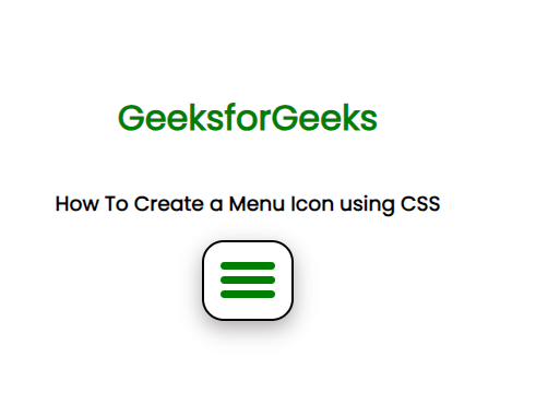
Example: The code example displays that the animation is paused and is played when the hover event occurs.
HTML
<!DOCTYPE html>
<html lang="en">

<head>
    <meta charset="UTF-8">
    <meta name="viewport" content="width=device-width,
                                   initial-scale=1.0">
    <title>Prevent a CSS keyframe animation
           from running on page load
    </title>
    <style>
        .bouncy-button {
            margin: 100px;
            width: 200px;
            height: 100px;
            font-size: 2rem;
            background-color: rgb(93, 219, 93);
            animation: bounce 1s ease-in-out infinite;
            animation-play-state: paused;
        }

        h1 {
            color: green;
        }

        p {
            font-size: 20px;
            text-align: center;
        }

        .box {
            display: flex;
            justify-content: center;
            align-items: center;
            flex-direction: column;
            height: 100vh;
        }

        @keyframes bounce {
            0% {
                transform: translateY(0px);
            }

            50% {
                transform: translateY(-50px);
            }

            100% {
                transform: translateY(0px);
            }
        }

        .bouncy-button:hover {
            animation-play-state: running;
        }
    </style>
</head>

<body>
    <div class="box">
        <h1>GeeksforGeeks</h1>
        <p>How to prevent a CSS keyframe
           animation from running on page?
        </p>
        <button class="bouncy-button">
            Click me!
        </button>
    </div>
</body>

</html>
Output:
Animation of opacity to the parent container- In the HTML file create a container and but the element inside that you want to animate.
- The put the animation to elements under the container according to your need.
- Add an animation to the container itself according to the syntax so that the down animation is same as its container opacity.
- This container animation will reveal the container after the down animation this hiding the page load animation.
Example: The code applying animation of opacity to the parent container the prevent animation on page load.
HTML
<!DOCTYPE html>
<html lang="en">

<head>
    <meta charset="UTF-8">
    <meta name="viewport" content="width=device-width,
                                   initial-scale=1.0">
    <title>
        Applying animation of
        opacity to the parent container
    </title>

    <style>
        h1 {
            color: green;
        }

        .main {
            display: flex;
            align-items: center;
            flex-direction: column;
        }

        .container {
            position: relative;
            width: 100px;
            height: 100px;
            border: 2px solid green;
            border-radius: 50%;
            animation: containerAnimation 1s forwards;
            cursor: pointer;
        }

        .circle {
            opacity: 0;
            animation: circleDown 1s ease;
            position: absolute;
            top: 100px;
            width: 100%;
            height: 100%;
            border-radius: 50%;
            background-color: rgb(98, 208, 218);
        }

        .container:hover .circle {
            animation: circleUp 1s ease;
            animation-fill-mode: forwards;
        }

        @keyframes containerAnimation {
            0% {
                opacity: 0;
            }

            99% {
                opacity: 0;
            }

            100% {
                opacity: 1;
            }
        }

        @keyframes circleUp {
            0% {
                transform: translateY(0);
                opacity: 0;
            }

            100% {
                transform: translateY(-100%);
                visibility: visible;
                opacity: 1;
            }
        }

        @keyframes circleDown {
            0% {
                transform: translateY(-100%);
                opacity: 1;
            }

            100% {
                transform: translateY(0);
                opacity: 0;
            }
        }
    </style>
</head>

<body>
    <div class="main">
        <h1>GeeksforGeeks</h1>
        <h3>Applying animation of opacity
            to the parent container
        </h3>
        <div class="container">
            <div class="circle">
            </div>
        </div>
    </div>
</body>

</html>
Output:
|
