|
|
Time series data is one of the most challenging tasks in machine learning as well as the real-world problems related to data because the data entities not only depend on the physical factors but mostly on the chronological order in which they have occurred. We can forecast a target value in the time series based on a single feature that is univariate, and two features that are bivariate or multivariate but in this article, we will learn how to perform univariate forecasts on the Rainfall dataset that has been taken from Kaggle. What is Univariate Forecasting?Univariate forecasting is commonly used when you want to make prediction values of a single variable, especially when there are historical data points available for that variable. It’s a fundamental and widely applicable technique in fields like economics, finance, weather forecasting, and demand forecasting in supply chain management. For more complex forecasting tasks where multiple variables or external factors may have an impact, multivariate forecasting techniques are used. These models take into account multiple variables and their interactions for making predictions. Key Concepts of Univariate Forecasting
Techniques of Univariate ForecastingSeveral methods are used in univariate time series analysis to comprehend, model, and predict the behavior of a single variable over time. In univariate time series analysis, the following methods are frequently employed:
Implementation of Univariate ForecastingImporting LibrariesPython3
Python libraries make it very easy for us to handle the data and perform typical and complex tasks with a single line of code.
Loading DatasetPython3
Output: Year Month Day Specific Humidity Relative Humidity Temperature \ Here, in this code we are loading the dataset into the pandas data frame so, that we can explore the different aspects of the dataset. Shape of the dataframePython3
Output: (252, 7)
The DataFrame “df”‘s row and column counts are returned by this code. Data InformationPython3
Output: <class 'pandas.core.frame.DataFrame'> By using the df.info() function we can see the content of each column and the data types present in it along with the number of null values present in each column. Describing the dataPython3
Output: count mean std min 25% \ The DataFrame df is described statistically via the df. describe() function. To provide a preliminary understanding of the data’s central tendencies and distribution, it includes important statistics such as count, mean, standard deviation, and minimum, and maximum values for each numerical column. Exploratory Data AnalysisEDA is an approach to analyzing the data using visual techniques. It is used to discover trends, and patterns, or to check assumptions with the help of statistical summaries and graphical representations. While performing the EDA of this dataset we will try to look at what is the relation between the independent features that is how one affects the other. Python3
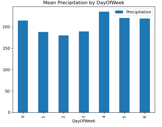
Output: DAY Interpretation:
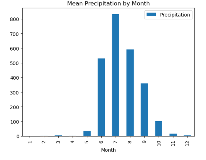 MONTH Interpretation:
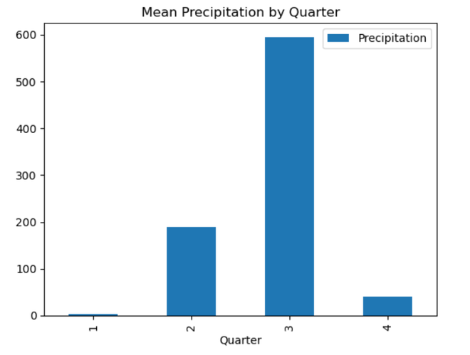 QUARTER Interpretation:
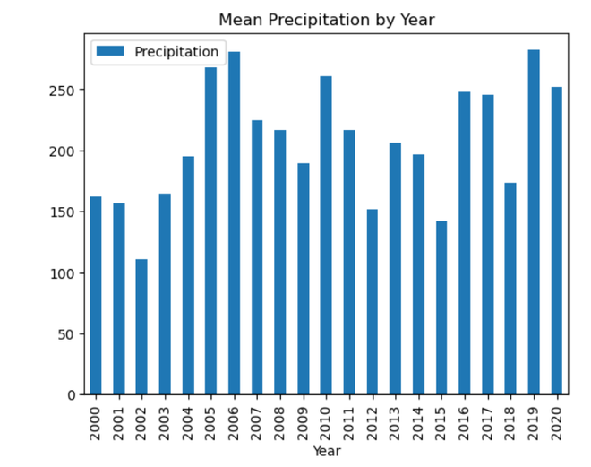 YEAR Interpretation:
Using a time series dataset with rainfall data, this code does feature engineering. It takes data from the ‘Date’ column and adds additional temporal elements like ‘DayOfWeek,’ ‘Month,’ ‘Quarter,’ and ‘Year’. Exploratory data analysis (EDA) is then carried out, with an emphasis on the mean precipitation for every unique value of the newly-engineered temporal features. To visually evaluate the average precipitation patterns over the course of a week, month, quarter, and year, the code iterates through the designated categories columns and creates bar charts. By assisting in the discovery of possible temporal trends and patterns in the rainfall data, these visualizations enable additional understanding of the temporal features of the dataset. Seasonal DecompositionA statistical technique used in time series analysis to separate the constituent parts of a dataset is called seasonal decomposition. Three fundamental components of the time series are identified: trend, seasonality, and residuals. The long-term movement or direction is represented by the trend, repeating patterns at regular intervals are captured by seasonality, and random fluctuations are captured by residuals. By separating the effects of seasonality from broader trends and anomalies, decomposing a time series helps to comprehend the specific contributions of various components, enabling more accurate analysis and predictions. Python3
Output: 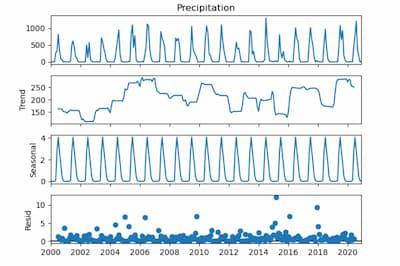 Seasonal Decomposition For Seasonal Component:
For Trend Component:
For Residual Component:
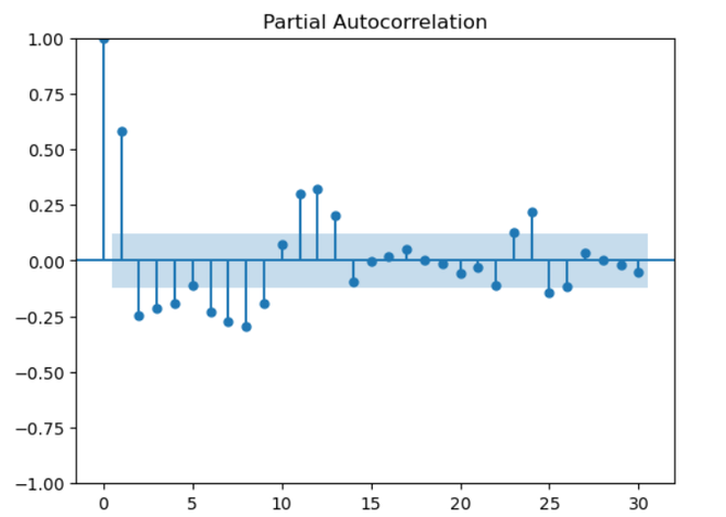
Using a time series (‘ts’) that represents precipitation data, the function performs seasonal decomposition. A little constant is added to account for possible problems with zero or negative values. The code consists of three parts: trend, seasonality, and residuals, and it uses a multiplicative model with a 12-month seasonal period. The resulting graphic helps identify long-term trends and recurrent patterns in the precipitation data by providing a visual representation of these elements. Autocorrelation and Partial Autocorrelation PlotsAutocorrelation: A time series’ association with its lag values is measured by autocorrelation. Every lag is correlated, and peaks in an autocorrelation diagram show high correlation at particular delays. By revealing recurring patterns or seasonality in the time series data, this aids in understanding its temporal structure and supports the choice of suitable model parameters for time series analysis. Partial Autocorrelation: When measuring a variable’s direct correlation with its lags, partial autocorrelation eliminates the impact of intermediate delays. Significant peaks in a Partial Autocorrelation Function (PACF) plot indicate that a particular lag has a direct impact on the current observation. It helps to capture the distinct contribution of each lag by assisting in the appropriate ordering of autoregressive components in time series modeling. Python3
Output: 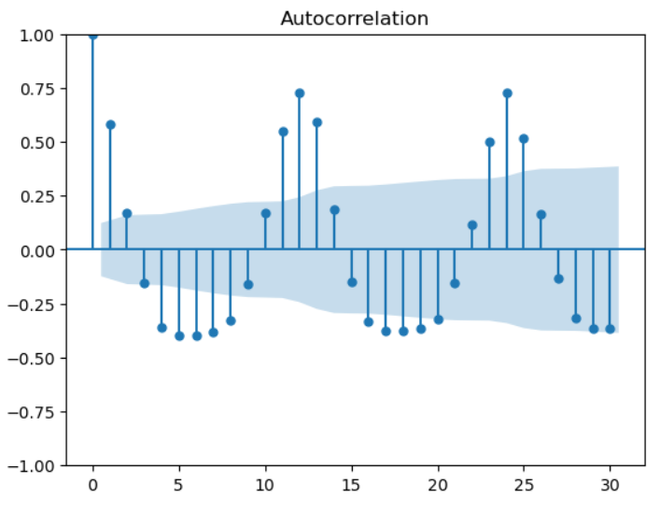 Autocorrelation Interpretation:
 Partial Autocorrelation Interpretation:
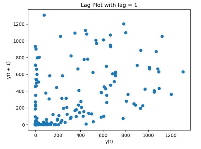
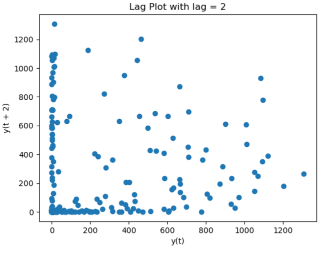
For a time series, “ts,” which represents precipitation data, the provided code creates plots of the Autocorrelation Function (ACF) and Partial Autocorrelation Function (PACF). The correlation between the time series and its lag values is displayed in these charts, which are restricted to 30 lags. The ACF plot’s peaks suggest strong connections at particular lags that may be seasonal. Finding appropriate autoregressive terms for time series modeling is made easier by the PACF plot, which illustrates the direct impact of each lag on the current observation. These plots serve as a general reference for selecting model parameters and identifying temporal patterns. Lag PlotIn time series analysis, a lag plot is a graphical tool that shows the relationship between a variable and its lagged values. It helps find patterns, trends, or unpredictability in the data by comparing each data point to its prior observation. The plot may show the presence of autocorrelation if there is a substantial correlation between a point and its lag. This can help with understanding the temporal dependencies and direct the selection of the best model for time series analysis. Python3
Output:
Interpretation:
Interpretation:
With lags set to 1 and 2, the code creates Lag Plots for the time series “ts.” The association between each data point and its antecedent observation at the designated latency is plotted in each iteration. By shedding light on the autocorrelation patterns, these representations make it easier to spot possible trends and temporal relationships in the data. In order to make each Lag Plot easier to understand and evaluate the strength of the autocorrelation, the titles provide the lag values. Stationarity CheckIn order to make sure that a dataset’s statistical characteristics do not change over time, a stationarity check is an essential step in time series analysis. Model predictions are made easier when a time series is stationary since its mean, variance, and autocorrelation remain constant. Visual inspections, such rolling statistics graphs, and formal statistical tests, like the Augmented Dickey-Fuller test, are common approaches. By reducing the influence of non-constant patterns, stationarity assures dependable modeling and facilitates more precise forecasting and trend analysis of time series data. Python3
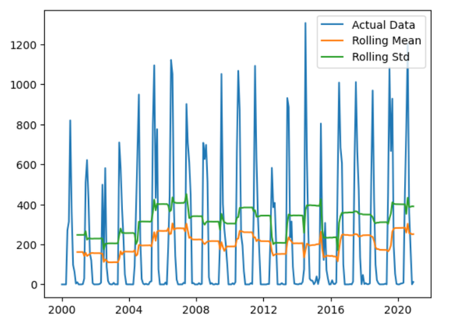
Output: ADF Statistic: -2.46632490177327 The code uses the Augmented Dickey-Fuller test to verify for stationarity on the time series ‘ts’. The p-value and ADF Statistic are displayed. The p-value denotes the importance of the ADF Statistic’s estimate of the time series’ presence of a unit root. For a more stationary time series, a low p-value and a more negative ADF Statistic point to more evidence against stationarity, which helps determine whether differencing is necessary. Rolling and AggregationsRolling: Rolling is a statistical method for time series analysis that computes summary statistics, such as moving averages, over successive subsets of a dataset. A fixed-size window traverses the data in the context of rolling statistics, and a new value is computed based on the observations within that window at each step. This facilitates the visualization and comprehension of underlying dynamics by reducing volatility and highlighting trends or patterns in the time series. Aggregation: Aggregations are a common technique in time series analysis to identify broad trends. They entail merging and summarizing several data points into a single value. In this sense, calculating statistical measures within particular time intervals, such as mean or total, might be considered aggregating data. Aggregations streamline the process of interpreting complicated time series data by combining related information. This makes it easier for analysts to spot trends, patterns, or anomalies and promotes more efficient forecasting and decision-making. Python3
Output:
Interpretation: The blue line represents the original time series data. Rolling Mean:
Rolling Standard Deviation:
The code computes the rolling mean and rolling standard deviation with a window size of 12, performing rolling statistics on the time series ‘ts’. The rolling mean, rolling standard deviation, and actual data are superimposed on the generated graphs to help visualize patterns and variability. This method aids in noise reduction, enhancing the visibility of underlying patterns and offering insights into the temporal properties of the data. For easier understanding, the legend separates the rolling mean, rolling standard deviation, and the original data. Model DevelopmentWe will train a SARIMA model for the univariate forecast by using the date column as the feature for the predictions. But for that first, we will have to create a date column in the dataset that too in the pd. DateTime format so, for that, we will be using the pd.to_datetime function that is available in the pandas dataframe. Python3
Output: Year Month Day Specific Humidity Relative Humidity Temperature \ Now let’s set the index to the date column and the target column is the precipitation column let’s separate it from the complete dataset. Python3
Output: Date Training the SARIMA ModelNow let’s train a SARIMA model on the dataset at hand. Python3
As the model has been trained we can use this model to predict the rain for the next year and plot it along with the original data to get a feel for whether the predictions are following the previous trend or not. This code fits the time series ts to a SARIMA model. The model’s order is defined by the order=(p, d, q) argument, where p denotes the number of autoregressive terms, d denotes the degree of differencing, and q denotes the number of moving average terms. The order of the seasonal component of the model is specified by the seasonal_order=(P, D, Q, S) argument, where P denotes the number of seasonal autoregressive terms, D the degree of seasonal differencing, Q the number of seasonal moving average terms, and S the duration of the seasonality period. A SARIMA model object is created by the code line model = sm.tsa.SARIMAX(ts, order=(p, d, q), seasonal_order=(P, D, Q, S)). The time series that needs to be modeled is the ts argument. The model’s order and seasonal order are specified by the order=(p, d, q) and seasonal_order=(P, D, Q, S) arguments, respectively. PredictionsPython3
Output:
This code plots the actual data and the forecast and makes predictions using the fitted SARIMA model. Initially, a forecast object containing the anticipated values for the upcoming 12 periods is created using the get_forecast() function. To get the predicted mean values, the forecast object’s predicted_mean attribute is then extracted.Next, a figure is made, and the plot() function is used to plot the forecast and the actual data. Each line now has a label, and a legend is shown. |
.jpg)
Reffered: https://www.geeksforgeeks.org
| AI ML DS |
Type: | Geek |
Category: | Coding |
Sub Category: | Tutorial |
Uploaded by: | Admin |
Views: | 13 |