|
A responsive sidebar is a valuable component for web applications and admin panels that allows for efficient navigation while adapting to different screen sizes. To create a responsive sidebar in Bootstrap, use the navbar-expand-* classes along with Bootstrap’s grid system to design a collapsible sidebar. Incorporate toggler buttons for smaller screens, ensuring seamless navigation across devices.
Preview Responsive Sidebar in Bootstrap Approach- Bootstrap’s grid system (container, row, and col) is utilized to create a flexible and responsive layout for the main content area. Bootstrap’s breadcrumb component (“breadcrumb”) is used to present hierarchical navigation.
- Bootstrap’s utility classes such as “p-0”, “d-flex”, “bg-success”, “text-white”, “d-md-none”, etc., are applied to manage padding, flexbox, background colors, text colors, and responsiveness.
- The offcanvas `component` is utilized for the sidebar, enabling its collapsible behavior on smaller screens. It’s triggered by a button with data-bs-toggle=”offcanvas”.
- Sidebar navigation is structured using Bootstrap classes like “nav”, “nav-item”, “nav-pills”, “nav-column”, etc., for arranging and styling the navigation items. Bootstrap’s responsive classes like “d-md-none” and “d-flex” are used to manage the visibility of certain elements based on different screen sizes.
Example: This example illustrates the creation of a Responsive Sidebar in Bootstrap 5.
HTML
<!DOCTYPE html>
<html lang="en">

<head>
    <meta charset="UTF-8">
    <meta name="viewport"
          content="width=device-width,
                   initial-scale=1.0">
    <title>Bootstrap5 Sidebar</title>
    <link href=
"https://cdn.jsdelivr.net/npm/[email protected]/dist/css/bootstrap.min.css"
          rel="stylesheet"
        integrity=
"sha384-KK94CHFLLe+nY2dmCWGMq91rCGa5gtU4mk92HdvYe+M/SXH301p5ILy+dN9+nJOZ"
          crossorigin="anonymous">
    <link rel="stylesheet"
          href="style.css">
    <link rel="stylesheet" href=
"https://cdnjs.cloudflare.com/ajax/libs/font-awesome/6.4.0/css/all.min.css"
        integrity=
"sha512-iecdLmaskl7CVkqkXNQ/ZH/XLlvWZOJyj7Yy7tcenmpD1ypASozpmT/E0iPtmFIB46ZmdtAc9eNBvH0H/ZpiBw=="
        crossorigin="anonymous"
        referrerpolicy="no-referrer" />
</head>

<body>

    <div class="container-fluid p-0 d-flex h-100">
        <div id="bdSidebar"
             class="d-flex flex-column
                    flex-shrink-0
                    p-3 bg-success
                    text-white offcanvas-md offcanvas-start">
            <a href="#"
               class="navbar-brand">
            </a><hr>
            <ul class="mynav nav nav-pills flex-column mb-auto">
                <li class="nav-item mb-1">
                    <a href="#">
                        <i class="fa-regular fa-user"></i>
                        Profile
                    </a>
                </li>

                <li class="nav-item mb-1">
                    <a href="#">
                        <i class="fa-regular fa-bookmark"></i>
                        Saved Articles
                        <span class="notification-badge">5</span>
                    </a>
                </li>
                <li class="nav-item mb-1">
                    <a href="#">
                        <i class="fa-regular fa-newspaper"></i>
                        Articles
                    </a>
                </li>
                <li class="nav-item mb-1">
                    <a href="#">
                        <i class="fa-solid fa-archway"></i>
                        Institutions
                    </a>
                </li>
                <li class="nav-item mb-1">
                    <a href="#">
                        <i class="fa-solid fa-graduation-cap"></i>
                        Organizations
                    </a>
                </li>

                <li class="sidebar-item  nav-item mb-1">
                    <a href="#"
                       class="sidebar-link collapsed"
                       data-bs-toggle="collapse"
                       data-bs-target="#settings"
                       aria-expanded="false"
                       aria-controls="settings">
                        <i class="fas fa-cog pe-2"></i>
                        <span class="topic">Settings </span>
                    </a>
                    <ul id="settings"
                        class="sidebar-dropdown list-unstyled collapse"
                        data-bs-parent="#sidebar">
                        <li class="sidebar-item">
                            <a href="#" class="sidebar-link">
                                <i class="fas fa-sign-in-alt pe-2"></i>
                                <span class="topic"> Login</span>
                            </a>
                        </li>
                        <li class="sidebar-item">
                            <a href="#" class="sidebar-link">
                                <i class="fas fa-user-plus pe-2"></i>
                                <span class="topic">Register</span>
                            </a>
                        </li>
                        <li class="sidebar-item">
                            <a href="#" class="sidebar-link">
                                <i class="fas fa-sign-out-alt pe-2"></i>
                                <span class="topic">Log Out</span>
                            </a>
                        </li>
                    </ul>
                </li>
            </ul>
            <hr>
            <div class="d-flex">

                <i class="fa-solid fa-book  me-2"></i>
                <span>
                    <h6 class="mt-1 mb-0">
                          Geeks for Geeks Learning Portal
                      </h6>
                </span>
            </div>
        </div>

        <div class="bg-light flex-fill">
            <div class="p-2 d-md-none d-flex text-white bg-success">
                <a href="#" class="text-white"
                   data-bs-toggle="offcanvas"
                   data-bs-target="#bdSidebar">
                    <i class="fa-solid fa-bars"></i>
                </a>
                <span class="ms-3">GFG Portal</span>
            </div>
            <div class="p-4">
                <nav style="--bs-breadcrumb-divider:'>';font-size:14px">
                    <ol class="breadcrumb">
                        <li class="breadcrumb-item">
                            <i class="fa-solid fa-house"></i>
                        </li>
                        <li class="breadcrumb-item">Learning Content</li>
                        <li class="breadcrumb-item">Next Page</li>
                    </ol>
                </nav>

                <hr>
                <div class="row">
                    <div class="col">
                        <p>Page content goes here</p>
                    </div>
                </div>
            </div>

        </div>
    </div>
</body>

</html>
html, body {
    height: 100%;
    font-family: 'Ubuntu', sans-serif;
}

.gfg {
    height: 50px;
    width: 50px;

}

.mynav {
    color: #fff;
}

.mynav li a {
    color: #fff;
    text-decoration: none;
    width: 100%;
    display: block;
    border-radius: 5px;
    padding: 8px 5px;
}

.mynav li a.active {
    background: rgba(255, 255, 255, 0.2);
}

.mynav li a:hover {
    background: rgba(255, 255, 255, 0.2);
}

.mynav li a i {
    width: 25px;
    text-align: center;
}

.notification-badge {
    background-color: rgba(255, 255, 255, 0.7);
    float: right;
    color: #222;
    font-size: 14px;
    padding: 0px 8px;
    border-radius: 2px;
}
Output:
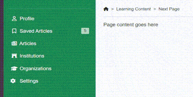 output: Responsive sidebar in bootstrap
|