|
|
In this article, we are going to walk through the process of creating a 3D multiple regression graph using the rgl package in R programming language in detail. What is Multiple Regression?Regression analysis is a powerful statistical tool for understanding the relationship between variables. One of the well-known regression techniques is Linear Regression, which deals with predicting a dependent variable using only one independent variable. Multiple Linear Regression also known as Multiple Regression, is the prediction of the dependent variable using more than one independent variable. In simple words, it is a statistical technique used to analyze the relationship between a single dependent variable and multiple independent variables. The equation of multiple regression is:
Where,
RGL PackageThe rgl package in R is a great tool for creating interactive 3D visualizations, which makes it ideal for representing complex relationships in multiple regression models. It enables users to explore data interactively, visualize regression planes, and customize plots, thereby enhancing the understanding of the relationships between multiple dependent and independent variables. Steps in Creating 3D PlotLet us see step by step, how we can create a 3D multiple regression graph in R using the rgl package. Install and load the rgl packageFirst, we install and then load the RGL package in our R script. R
The rgl Package in R provides us with various functionalities to customize our 3D plots. Preparing DataWe’ll start by generating some sample data for demonstration purposes. Here we’ll create two independent variables, x1 and x2, and one dependent variable, y. Replace this sample data with your own dataset when working on your specific analysis. R
rnorm is the R function that simulates random variates having a specified normal distribution. Fitting the Multiple Linear Regression ModelNext, we fit a multiple linear regression model to our data using the ‘lm’ function. This model will help us understand how x1 and x2 collectively influence the dependent variable y. lm() function which stands for linear model. This function can be used to create a simple regression model. The same function can be used to generate linear regression model, with change of parameters. R
The model is specified using the formula y ~ x1 + x2, where the dependent variable y is being estimated using two independent variables, x1 and x2, in a multiple linear regression analysis. Creating the 3D PlotNow, let’s create an interactive 3D plot using the rgl package. We’ll start by initializing an empty 3D plot, adding data points, and then visualizing the regression plane.
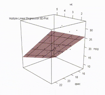
Examples of Creating 3D Multiple Regression GraphNow let us see an example to understand the concept. The code follows the same procedure as given in the above steps. A 3D Plot for Multiple Linear Regression without Squared VariableR
Output: 3D Multiple Regression Graph with rgl package in R The outputs for this code will appear in a new small window because of the function ‘open_3d’ and not the console of R studio. It looks like this: -1024.png) Output in R- studio
A 3D Plot for Multiple Linear Regression with Squared VariableR
Output: .gif) 3D Multiple Regression Graph with rgl package in R In the above code, we used the same dataset of mtcars. The output looks like this in the R studio: 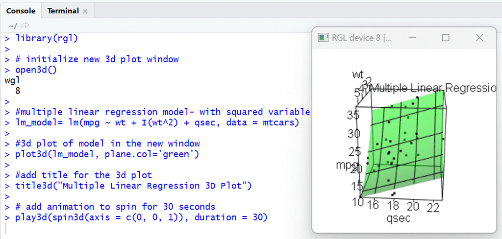 Output in R studio
Visualizing Multiple Linear Regression in 3D with RWe are going to create our own dataset to use for the multiple regression by using vectors concept in R and create a graph. The data we are going to use has two independent variables – age and experience and the dependent variable is income. Here the procedure same as the above codes. Loading PackagesR
Building Linear Regression ModelR
Output: Call: Visualizing Regression GraphR
Output: .gif) 3D Multiple Regression Graph with rgl package in R The output shown here helps us to predict the income when the experience and income is given. We can also observe that the dataset had an outlier, which may cause the model performance to decrease. The output in R-studio looks like this: -(1).png) Output in R studio ConclusionBy following the steps outlined in this article, you can effectively generate interactive 3D plots that help you gain insights into your regression models. |
Reffered: https://www.geeksforgeeks.org
| AI ML DS |

Type: | Geek |
Category: | Coding |
Sub Category: | Tutorial |
Uploaded by: | Admin |
Views: | 12 |