|
|
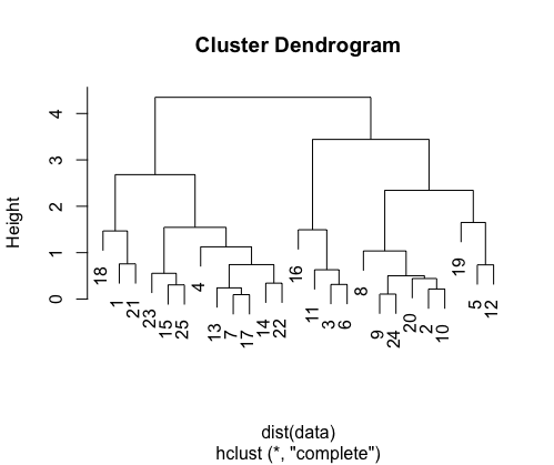
R’s cluster graph functionality can be a useful tool for visualizing data and seeing patterns within it. In disciplines including biology, the social sciences, and data analysis, cluster graphs are frequently used to group together related data points. In this article, we’ll demonstrate how to display a cluster graph in R by combining the ggplot2 package for data analysis and visualization with the ggraph tool for graph visualization. Cluster AnalysisCluster analysis is a technique used in data science and statistics to group similar data points together. It is commonly applied in various fields such as biology, marketing, and social sciences for tasks like customer segmentation, species classification, and identifying patterns in data. Cluster analysis algorithms aim to find meaningful clusters in your data based on similarity or dissimilarity measures. Hierarchical ClusteringA bottom-up method of clustering is hierarchical clustering. By gradually merging or separating clusters, it builds a hierarchy of clusters. A dendrogram, a structure like a tree, is frequently used to represent the outcome. The dendrogram can be clipped at a given height to produce the required number of clusters. DendrogramA cluster graph, also known as a dendrogram or a tree diagram, is a graphical representation of the clustering results. It shows how data points or clusters are grouped together and can provide insights into the hierarchical structure of your data. Two popular methods for creating cluster graphs are hierarchical clustering and k-means clustering. Hierarchical Clustering in RR
Output:
In this example, we first generate random data and then perform hierarchical clustering using the hclust function. We use the Euclidean distance (dist) as the dissimilarity measure. and generates a dendrogram visualization of the hierarchical clustering results. You can cut the dendrogram at a specific height to obtain clusters. K-Means ClusteringAn unsupervised non-linear approach called K Means Clustering in R programming organises data based on similarity or similar groups. Specifically, it aims to divide the observations into a predetermined number of clusters. Data is segmented in order to group each training example into a segment known as a cluster. In the unsupervised method, a lot of emphasis is placed on providing raw data while also spending a lot of money on manual review to determine relevance. It is utilised in a number of industries, including banking, healthcare, retail, and media. K-Means Clustering in RK-means clustering is a partitioning method that aims to divide data into a pre-specified number of clusters, denoted as “k.” Each data point belongs to the cluster with the nearest mean (centroid). R
Output: mpg cyl disp hp drat wt qsec vs am gear carb Plot the clusteringR
Output: 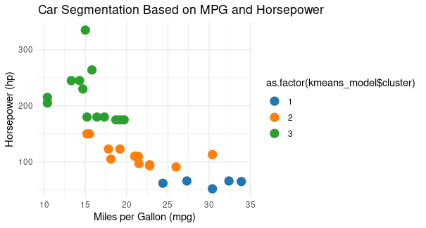 KMeans Clustering using R We use ggplot2 to create a scatterplot.
This code will create an attractive scatterplot visualizing customer segments based on annual income and spending score. Cluster graph on USArrest datasetWe use the “USArrests” dataset, which contains crime statistics for different U.S. states. We’ll perform k-means clustering with k=3 clusters and visualize the results using the “factoextra” and “factoMineR” libraries. Install and load the required libraries. If not already installed, run:install.packages("factoextra") Load the package and datasetR
Explore the datasetWe use functions like head(USArrests) to check the structure of the dataset. R
Output: Murder Assault UrbanPop Rape Perform K-Means ClusteringR
Output: .png) Display Custer Graph We perform k-means clustering on the “USArrests” dataset. Specifically, you are creating a k-means model with three clusters (centers = 3). The result, kmeans_model, will contain information about the clusters, including cluster assignments for each data point and the cluster centers.
The resulting plot will show the data points colored according to their assigned clusters, and it will also display the cluster centers. This visualization allows you to see how the data has been segmented into clusters by the k-means algorithm. ConclusionThe use of cluster graphs can help you comprehend the structure of your data and spot trends or groups within it. R offers robust utilities like hclust and kmeans along with visualisation tools like ggplot2 to help you construct interesting cluster graphs whether you use hierarchical clustering or k-means clustering. To get deeper insights from your data, experiment with various clustering methods, dissimilarity metrics, and visualization options. |
Reffered: https://www.geeksforgeeks.org
| AI ML DS |
| Related |
|---|
| |
| |
| |
| |
| |
Type: | Geek |
Category: | Coding |
Sub Category: | Tutorial |
Uploaded by: | Admin |
Views: | 12 |