.png)
|
|
In R Programming Language Pairplot is a matrix of plots that are used to show the relationship between each of the pairs of variables in a given dataset. pairs(dataset)
where Pairplots can be used to get a sense of the distribution of different variables of the dataset and helps us to identify any potential problems or patterns in a given dataset. Pair Plot Using Tidyverse in RTidyverse package in R is a collection of R packages designed for Exploratory data analysis, visualization, and manipulation in R. It contains R packages namely ggplot2, dplyr, tidyr, readr, purrr, tibble, stringr, forcats and many others. The complete list can be obtained as shown in the below code.
R
Output: [1] "broom" "conflicted" "cli" "dbplyr" "dplyr"
[6] "dtplyr" "forcats" "ggplot2" "googledrive" "googlesheets4"
[11] "haven" "hms" "httr" "jsonlite" "lubridate"
[16] "magrittr" "modelr" "pillar" "purrr" "ragg"
[21] "readr" "readxl" "reprex" "rlang" "rstudioapi"
[26] "rvest" "stringr" "tibble" "tidyr" "xml2"
[31] "tidyverse"
So tidyverse package actually initializes all the needed packages at once instead of having to initialize them in our code one by one which is time taking and inefficient. Let’s assume a preloaded dataset in R, the chickwts dataset preloaded in R which contains the weight of chickens according to their feeding habit. R
Output : [1] "weight" "feed"
[1] "Total no. of columns : 2"
Hence total no. of pair plots created will be 2 if we perform a simple pair-plot using the simple pairs() function in R. R
Output: Simple scatter pair-plot Now we will try to perform the same using the tidyverse packages to get a more clean look to the plot. Step 1: Preparing the DatasetFirst, we need to clean our dataset of NA(Not Available) values by removing the rows containing NA in any of the columns. We will use the drop_na() of the tidy package to achieve the same. R
Output: [1] "No NA values found."
The is. na() function produces a matrix consisting of logical values (TRUE or FALSE), where TRUE indicates a missing value in a particular dataset column. The sum() function is used to take a sum of all those logical values and since TRUE corresponds to 1 any missing value will result in a sum > 0. We finally used the drop_na() function to clean our dataset. `%>%` is the pipe operator of dplyr package included in tidyverse to pipe two or more operations together. Step 2: Create the pair plotWe will use the R
Output: 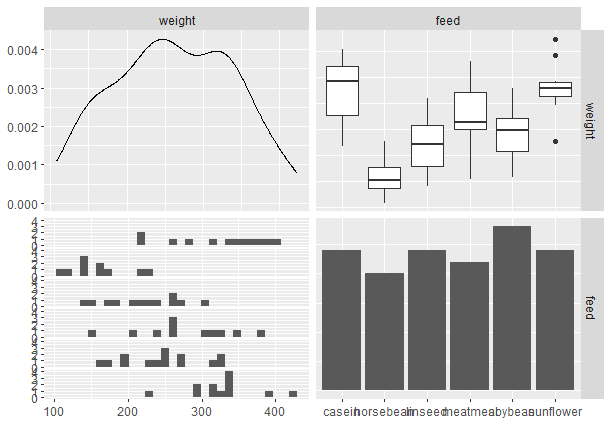 Pair plot from scratch with tidyverse Here inside ggpairs() function we specify the dataset we want to create a pair plot of and the columns to be used in the pair-plot. It has generated 4 plots namely scatter plot(top left), box plot (top-right), density plot(bottom-left), and histogram(bottom-right). Now let’s improve the looks R
Output : -660.jpg) Pair Plot from scratch with tidyverse Now finally we will add a legend to our plot and set a theme to the plot. R
Output: 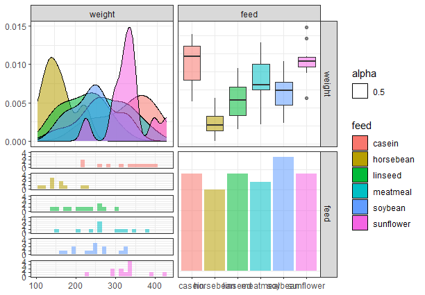 Pair Plot from scratch with tidyverse Example 2:Now that we have created a basic pairplot using tidyverse, let’s try to plot another dataset. We will use the preloaded dataset in R `air quality` containing New York’s Air quality measurements. We are viewing the dataset and checking for NA values in the dataset. R
Output : Total number of rows in the dataset : 153
Column names : Ozone, Solar.R, Wind, Temp, Month, Day
Number of rows containing NA values : 42
In the above head() function we have displayed NA values and even some rows contain NA values in multiple columns, which has been confirmed by counting such later. Step 2:- Cleaning the dataset by removing rows containing NA values using the drop_na() function of tidyr package. R
Output : Total number of rows in the dataset after cleaning : 111
Number of rows containing NA values now : 0
The output indeed matches our normal math calculations(i.e. 153 – 42 = 111). Hence we have completely cleaned our dataframe. Now we need to plot the cleaned data frame. We will assume all columns except the Day column. Method 1: Using simple pairs() functionR
Output: -660.jpg) scatter pair-plot of air quality dataframe In the above code, in the first parameter of the pairs() function, we have selected all rows of cleaned airquality dataframe with only 5 columns mentioning them in the air-quality array. The col parameter is used to set colors to the plot, here we have set it the Month’s value. `pch` stands for the plot character, by default it’s an empty circle(i.e. value = 1), we set it to 20 which means a bullet (smaller filled circle). oma parameter sets the outer margins of a plot(bottom, left, top, and right respectively) and will help us in making space for our legend on the right. The function par() containing `xpd = TRUE` ensures that legend is plotted outside the default plotting area avoiding overlapping the legend on the plot. In the legend() function, we curate the looks and aesthetics of our legend. It is positioned to the right side of our plot, and will contain unique Month values(passed to the legend parameter), colors for each such value will be according to unique values of Month(passed to the col parameter), set the marker as bullets using pch parameter and setting the title of our legend to “Month”. Method 2: Using ggpairs() functionNow we will try to perform a similar plot with the more advanced function ggpairs() and see the results. R
Output: 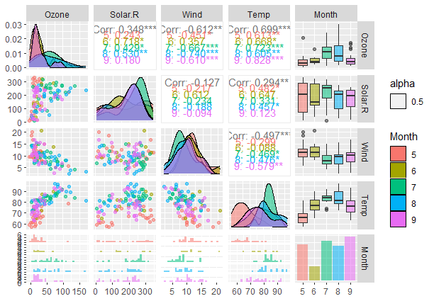 Pair Plot from scratch with tidyverse Similar to the pairs() function implementation we pass the cleaned air quality dataframe in the same format. In the mapping parameter, we set the color to vary with the Months column and set alpha to 0.5 meaning that colors will be semi-transparent so as to view overlapping layers. Finally, we set the legend to be visible in the plot. |
Reffered: https://www.geeksforgeeks.org
| R Language |
Type: | Geek |
Category: | Coding |
Sub Category: | Tutorial |
Uploaded by: | Admin |
Views: | 13 |