
|
|
Formatting is a technique to enhance the looks of the charts by giving a cosmetic appearance to the chart title and chart legend. Titles are given to the X and Y axis to add clarity for the user. Formatting commands are applied to a chart for the identical reason they’re applied to a worksheet: they create the chart easier to read. However, formatting techniques also facilitate chart quality and explain the data in a chart. Dataset UsedA Stacked Column Chart is drawn using the sample excel sheet below. Below is the dataset mentioned and the link to the dataset is here.
The stacked column chart can be drawn for the dataset given above, in order to obtain the chart, you simply require to select the type of chart (stacked column chart in this case) you want, and then you may start customizing/formatting the chart. 
Format Stacked Column ChartBelow are the steps that can be followed in order to format a stacked column chart in power BI, Step 1: Click on the format icon under Visualization to format the chart. 
Step 2: To format the x-axis ‘values’ click on the drop-down of the X-axis. 
The following results are obtained due to the modifications done:
Step 3: To Format the x-axis ‘Title’ click on the drop-down of the X-axis. 
The following results are obtained due to the modifications done:
Step 4: To Format the y-axis ‘Value’ click on the drop-down of the Y-axis. 
The following results are obtained due to the modifications done:
Step 5: To Format the y-axis ‘Title’ click on the drop-down of the y-axis. 
The following results are obtained due to the modifications done:
Step 6: To change the Legend of the Column chart. 
The following results are obtained due to the modifications done:
Step 7: To add gridlines on the Chart, click on the dropdown Gridlines under Visuals. 
The following results are obtained due to the modifications done:
Step 8: To get Slider on Values ‘ON’ Zoom Slider. 
The following results are obtained due to the modifications done:
Step 9: To change the Column Color or stack click on the column bar under the visualization. 
The following results are obtained due to the modifications done:
Step 10: To change the Space between the columns click on Spacing. 
The following results are obtained due to the modifications done:
Step 11: To Show, the Values of each type on bars click on Data Labels. 
The following results are obtained due to the modifications done:
Step 12: To change the font and color of the data label click on ‘Values’. 
The following results are obtained due to the modifications done:
Step 13: To show totals of Each Column ‘on’ Total Labels. 
The following results are obtained due to the modifications done:
Step 14: To Format Table Position, Table Table Title, and Table Effect Click on ‘General’ under visualization. 
Step 15: To manage the Size and Position of the table Click on the drop-down of Properties. 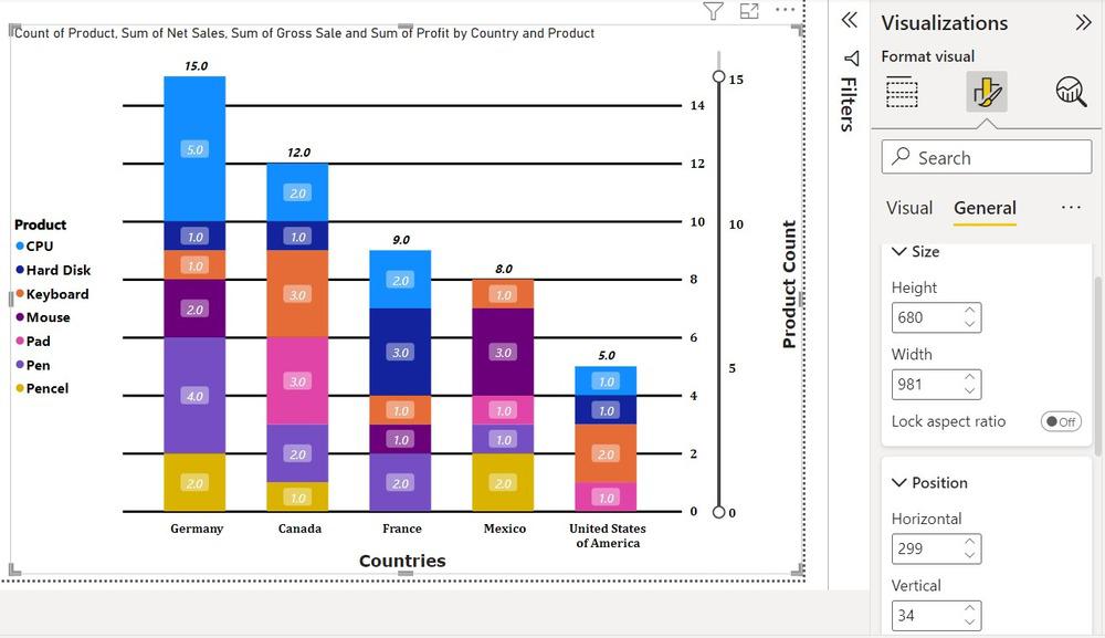
The following results are obtained due to the modifications done:
Step 16: To change the Title of the Table click on the drop-down of the Title. 
The following results are obtained due to the modifications done:
Step 17: To give color effect to the chart click to affect under General. 
The following results are obtained due to the modifications done:
Step 18: To change the color of the Icon on the Top click on the Header Icon. 
The following results are obtained due to the modifications done:
These are a number of the most frequent formatting done on Stacked Column Charts. Power BI provides us with dynamic options to format a chart and it is often explored with some self-research easily. |
Reffered: https://www.geeksforgeeks.org
| Technical Scripter |
| Related |
|---|
| |
| |
| |
| |
| |
Type: | Geek |
Category: | Coding |
Sub Category: | Tutorial |
Uploaded by: | Admin |
Views: | 16 |