|
Angular PrimeNG is an open-source framework with a rich set of native Angular UI components that are used for great styling and this framework is used to make responsive websites with very much ease. In this article, we will see the Angular PrimeNG Steps Styling.
The Steps Component guides users through the steps of a task, i.e. it is used to indicate the step for completion of any specific task. There are different list of structural style classes provided by the Angular PrimeNG, which can be utilized to enhance the user experience. The different styling classes with their basic usage are described below.
Angular PrimeNG Steps Styling:
- p-steps: This class is used for the container element.
- p-steps-item: This class is used creating items of the steps.
- p-steps-number: This class is used for depicting number of steps.
- p-steps-title: This class is used labelling menu item.
Syntax:
<p-steps [model]="items of the steps">
    ...
</p-steps>
Creating Angular application & Module Installation:
Step 1: Create an Angular application using the following command.
ng new appname
Step 2: After creating your project folder i.e. appname, move to it using the following command.
cd appname
Step 3: Install PrimeNG in your given directory.
npm install primeng --save
npm install primeicons --save
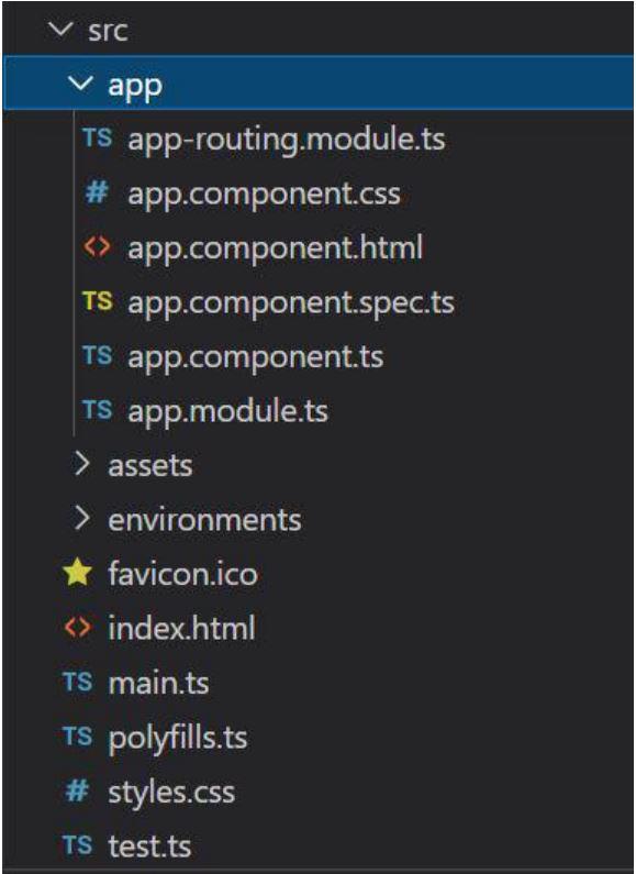
Project Structure: It will look like the following:
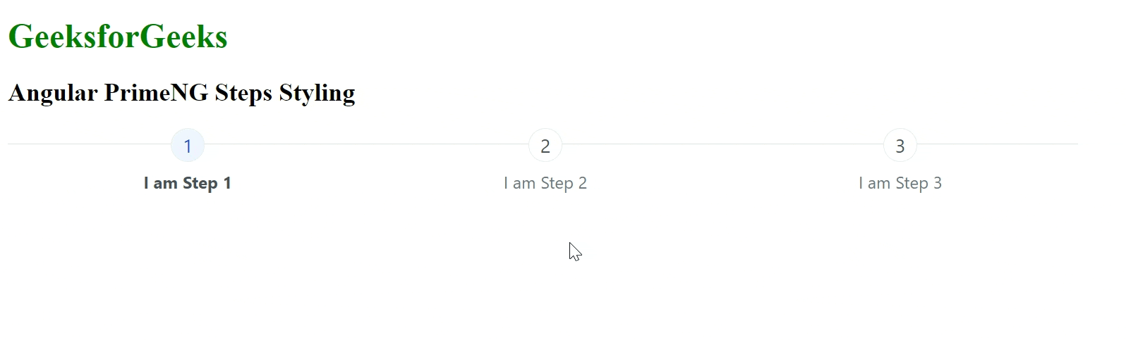
Example 1: This example describes the basic usage of the Steps Styling in Angular PrimeNG.
HTML
<div id="GFG">
<h1 style="color:green">
GeeksforGeeks
</h1>
<h2>Angular PrimeNG Steps Styling </h2>
<div style="width:80%;">
<p-steps [model]="data"
[activeIndex]="activeIndex"
[readonly]="false">
</p-steps>
</div>
</div>
|
Javascript
import { Component } from '@angular/core';
import { MenuItem } from 'primeng/api';
@Component({
selector: 'app-root',
templateUrl: './app.component.html',
styleUrls: ['./app.component.css']
})
export class AppComponent {
title = 'GFG';
activeIndex: number = 0;
data = [
{ label: 'I am Step 1' },
{ label: 'I am Step 2' },
{ label: 'I am Step 3' }
]
}
|
Javascript
import { NgModule } from '@angular/core';
import { BrowserModule }
from '@angular/platform-browser';
import { AppComponent } from './app.component';
import { StepsModule } from 'primeng/steps';
import { RouterTestingModule }
from "@angular/router/testing";
import { ButtonModule } from 'primeng/button';
@NgModule({
declarations: [
AppComponent,
],
imports: [
BrowserModule,
StepsModule,
RouterTestingModule,
ButtonModule
],
providers: [],
bootstrap: [AppComponent]
})
export class AppModule { }
|
Output:
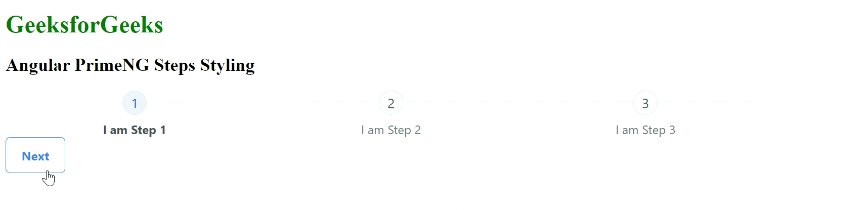
Example 2: In this example, we will use a button with p-steps to toggle the step items in Angular PrimeNG.
HTML
<div id="GFG">
<h1 style="color:green">
GeeksforGeeks
</h1>
<h2>Angular PrimeNG Steps Styling </h2>
<div style="width:80%;">
<p-steps [model]="data"
[activeIndex]="activeIndex"
[readonly]="false">
</p-steps>
<button pButton type="button"
label="Next"
class="p-button-outlined"
(click)="next()">
</button>
</div>
</div>
|
Javascript
import { Component } from '@angular/core';
import { ButtonModule } from 'primeng/button';
@Component({
selector: 'app-root',
templateUrl: './app.component.html',
styleUrls: ['./app.component.css']
})
export class AppComponent {
title = 'GFG';
activeIndex: number = 0;
data = [
{ label: 'I am Step 1' },
{ label: 'I am Step 2' },
{ label: 'I am Step 3' }
]
next() {
this.activeIndex += 1;
}
}
|
Javascript
import { NgModule } from '@angular/core';
import { BrowserModule }
from '@angular/platform-browser';
import { AppComponent } from './app.component';
import { StepsModule } from 'primeng/steps';
import { RouterTestingModule }
from "@angular/router/testing";
import { ButtonModule } from 'primeng/button';
@NgModule({
declarations: [
AppComponent,
],
imports: [
BrowserModule,
StepsModule,
RouterTestingModule,
ButtonModule
],
providers: [],
bootstrap: [AppComponent]
})
export class AppModule { }
|
Output:
Reference: http://primefaces.org/primeng/steps/personal
|