Horje
Primer CSS Em-based Spacing

Primer CSS Spacing contains Em-based Spacing which is mainly used to provide the spacing between the components, having the values in em, for which the value combined with typography, line height, or the total height becomes sensible numbers.

GitHub’s body font size is 14px which is difficult to work with, so we sometimes can’t achieve a whole number. Variables listed below are preferred for use within components and custom CSS.

Variables Fraction Y Padding (em) Total height at 14px Total height at 16px
$em-spacer-1 1/16 .0625 22.75 26
$em-spacer-2 1/8 .125 24.5 28
$em-spacer-3 1/4 .25 28 32
$em-spacer-4 3/8 .375 31.5 36
$em-spacer-5 1/2 .5 35 40
$em-spacer-6 3/4 .75 42 48

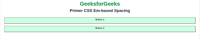
Syntax:

$name-of-the-variable: value;

Below examples illustrate the Primer CSS Em-based Spacing

Example 1: In this example, we will render two buttons, by creating our own variable $em-spacer-12 that will hold the value of 1em.

HTML

<!DOCTYPE html>
<html lang="en">
  
<head>
    <meta charset="UTF-8">
    <meta http-equiv="X-UA-Compatible" content="IE=edge">
    <meta name="viewport" content="width=device-width, initial-scale=1.0">
    <link href=
"https://unpkg.com/@primer/css@^20.2.4/dist/primer.css" rel="stylesheet" />
  
</head>
  
<body>
    <div class="text-center">
        <h1 class="color-fg-success">
            GeeksforGeeks
        </h1>
        <h2>Primer CSS Em-based Spacing</h2>
        <br>
        <div class="gap mx-4">
            <button class="color-bg-success">
                <p>Button 1</p>
            </button>
            <button class="color-bg-success">
                <p>Button 2</p>
            </button>
        </div>
    </div>
</body>
  
</html>

SCSS:

$em-spacer-12: 1em;
.gap {
      gap:$em-spacer-12;
}

CSS:

.gap{
    gap: 1em;
      }

Output:


Example 2: In this example, we will use spacing inside of the button element as padding.

HTML

<!DOCTYPE html>
<html lang="en">
  
<head>
    <meta charset="UTF-8">
    <meta http-equiv="X-UA-Compatible" content="IE=edge">
    <meta name="viewport" content="width=device-width, initial-scale=1.0">
    <link href=
"https://unpkg.com/@primer/css@^20.2.4/dist/primer.css" rel="stylesheet" />
</head>
  
<body>
    <div class="text-center">
        <h1 class="color-fg-success">
            GeeksforGeeks
        </h1>
        <h2>Primer CSS Em-based Spacing</h2>
        <br>
        <div class="mx-4">
            <button class="color-bg-success">
                <p class="left">Button 1</p>
            </button>
        </div>
    </div>
</body>
  
</html>

SCSS:

$em-spacer-12: 1em;
.left {
      padding:$em-spacer-12;
}

CSS:

.left{
    padding: 1em;
      }

Output:


References: https://primer.style/css/support/spacing


Reffered: https://www.geeksforgeeks.org


CSS

Related
Primer CSS Utilities Primer CSS Utilities
How to Build a Card component using Tailwind CSS ? How to Build a Card component using Tailwind CSS ?
File splitting in SASS File splitting in SASS
Pure CSS Grids Units Sizes Pure CSS Grids Units Sizes
Primer CSS Theming Set Theme Primer CSS Theming Set Theme

Type:
Geek
Category:
Coding
Sub Category:
Tutorial
Uploaded by:
Admin
Views:
14