Horje
Angular PrimeNG Badge Directive

Angular PrimeNG is a UI component library for Angular Applications. It offers many pre-built themes and UI components for a variety of tasks like inputs, menus, charts, Buttons, etc. In this article, we will see Angular PrimeNG Badge Directive.

The Badge Component is used as an indicator for other elements like icons and avatars. It is generally used in combination with other elements to display the notification count and status info. The Badge directive can be used to apply the badge to other elements.

Syntax:

<i pBadge class="..." value="2"></i>


Creating Angular Application and Installing the Module:

Step 1: Create an Angular application using the following command.

ng new appname

Step 2: After creating your project folder i.e. appname, move to it using the following command.

cd appname

Step 3: Finally, Install PrimeNG in your given directory.

npm install primeng --save
npm install primeicons --save

Project Structure: The project Structure will look like this after following the above steps:

Project Structure

Example 1: In this example, we used the pBadge directive to apply badges to icons.

app.component.html

<h1 style="color:green">GeeksforGeeks</h1>
<h3>Angular PrimeNG pBadge Directive</h3>
  
<i 
    class="pi pi-bell" 
    pBadge 
    value="10" 
    style="font-size: 20px; 
    margin-right: 20px;" >
</i>
  
<i 
    class="pi pi-user" 
    pBadge 
    value="7" 
    style="font-size: 20px; 
    margin-right: 20px;">
</i>
<i 
    class="pi pi-hashtag" 
    pBadge 
    value="4" 
    style="font-size: 20px; 
    margin-right: 20px;">
</i>

app.component.ts

import { Component } from '@angular/core';
  
@Component({
    selector: 'app-root',
    templateUrl: './app.component.html',
    styles: []
})
export class AppComponent {
      
}

app.module.ts

import { NgModule } from '@angular/core';
import { BrowserModule } from '@angular/platform-browser';
import { AppComponent } from './app.component';
  
import { BadgeModule } from 'primeng/badge';
  
@NgModule({
    declarations: [
        AppComponent,
    ],
    imports: [
        BrowserModule,
        BadgeModule,
    ],
    providers: [],
    bootstrap: [AppComponent]
})
export class AppModule { }

Output:


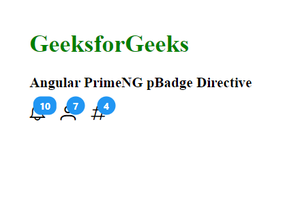
Example 2: In this example, we used the pBadge directive to apply badges to avatars.

app.component.html

<h1 style="color:green">GeeksforGeeks</h1>
<h3>Angular PrimeNG pBadge Directive</h3>
  
<p-avatar 
    label="G" 
    pBadge 
    value="19" 
    severity="danger"
    class="mr-3">
</p-avatar>
<p-avatar 
    label="F" 
    pBadge 
    value="11"
    severity="warning" 
    class="mr-3">
</p-avatar>
<p-avatar 
    label="G" 
    pBadge 
    value="5">
</p-avatar>

app.component.ts

import { Component } from '@angular/core';
  
@Component({
    selector: 'app-root',
    templateUrl: './app.component.html',
    styles: []
})
export class AppComponent {
      
}

app.module.ts

import { NgModule } from '@angular/core';
import { BrowserModule } from '@angular/platform-browser';
import { AppComponent } from './app.component';
  
import { BadgeModule } from 'primeng/badge';
import { AvatarModule } from 'primeng/avatar';
  
@NgModule({
    declarations: [
        AppComponent,
    ],
    imports: [
        BrowserModule,
        BadgeModule,
        AvatarModule
    ],
    providers: [],
    bootstrap: [AppComponent]
})
export class AppModule { }

Output:


Reference: http://primefaces.org/primeng/badge


Reffered: https://www.geeksforgeeks.org


Web Technologies

Related
Angular PrimeNG Table Full Page Scroll Angular PrimeNG Table Full Page Scroll
Angular PrimeNG Inplace Templates Angular PrimeNG Inplace Templates
Angular PrimeNG Table Flexscroll Angular PrimeNG Table Flexscroll
Angular PrimeNG Table Sort Angular PrimeNG Table Sort
Angular PrimeNG ScrollTop Properties Angular PrimeNG ScrollTop Properties

Type:
Geek
Category:
Coding
Sub Category:
Tutorial
Uploaded by:
Admin
Views:
11