Horje
React Suite DatePicker ts:Ranges Props

React suite is a library of React components, sensible UI design, and a friendly development experience. It is supported in all major browsers. It provides pre-built components of React which can be used easily in any web application.

In this article, we’ll learn about React suite DatePicker ts:Ranges Prop. The DatePicker Component is used to choose a time or date from the picker. To add multiple custom DatePicker options like label, values, or closeOverlay, we can create an interface using ts:Ranges prop.

DatePicker Ranges Props:

  • label: It is used to add the range label of datepicker component.
  • value: It defines the range value that is defined by the user.
  • closeOverlay: It closes the picker component after selecting the date range.

Syntax:

Function App() {
return (
 <DatePicker
  ranges={[
    {
      label: "...",
      value: addDays(new Date(), -1),
      closeOverlay: boolean
    },
    {
      label: "...",
      value: new Date(),
      closeOverlay: boolean
    }
  ]}
/>
}

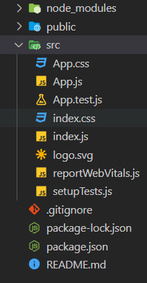
Creating React Application And Installing Module:

Step 1: Create a React application using the given command:

npm create-react-app projectname

Step 2: After creating your project, move to it using the given command:

cd projectname

Step 3: Now Install the rsuite node package using the given command:

npm install rsuite

Project Structure: Now your project structure should look like the following:


Example 1: Below example demonstrates the ts:Ranges prop of datepicker component.

Javascript

import "rsuite/dist/rsuite.min.css";
import { DatePicker } from "rsuite";
import addDays from "date-fns/addDays";
import subDays from "date-fns/subDays";
  
export default function App() {
    return (
        <div>
            <div style={{ textAlign: "center" }}>
                <h2>GeeksforGeeks</h2>
                <h4 style={{ color: "green" }}>
                    React Suite DatePicker ts:Ranges Prop
                </h4>
            </div>
            <div style={{ padding: 20, textAlign: "center" }}>
                <div>
                    <DatePicker
                        ranges={[
                            {
                                label: "Prev",
                                value: addDays(new Date(), -1),
                            },
                            {
                                label: "Today",
                                value: new Date(),
                            },
                            {
                                label: "Next",
                                value: addDays(new Date(), 1),
                            },
                        ]}
                    />
                </div>
            </div>
        </div>
    );
}

Output:


Example 2: Below example demonstrates the ts:Ranges prop using closeOverlay in a datepicker component.

Javascript

import "rsuite/dist/rsuite.min.css";
import { DatePicker } from "rsuite";
import addDays from "date-fns/addDays";
  
export default function App() {
    return (
        <div>
            <div style={{ textAlign: "center" }}>
                <h2>GeeksforGeeks</h2>
                <h4 style={{ color: "green" }}>
                    React Suite DatePicker ts:Ranges Prop
                </h4>
            </div>
            <div style={{ padding: 20, textAlign: "center" }}>
                <div>
                    <DatePicker
                        ranges={[
                            {
                                label: "Prev",
                                value: addDays(new Date(), -1),
                            },
                            {
                                label: "Today",
                                value: new Date(),
                                closeOverlay: true,
                            },
                            {
                                label: "Next",
                                value: addDays(new Date(), 1),
                            },
                        ]}
                    />
                </div>
            </div>
        </div>
    );
}

Output:


Note: In the above output, the overlay closes after selecting today as a date.

Reference: https://rsuitejs.com/components/date-picker/#code-ts-ranges-code


Reffered: https://www.geeksforgeeks.org


ReactJS

Related
React Suite Checkbox ts:ValueType Prop React Suite Checkbox ts:ValueType Prop
React.js Blueprint Button group CSS Component React.js Blueprint Button group CSS Component
React.js Blueprint Editable text Component Props React.js Blueprint Editable text Component Props
React.js BluePrint Card CSS Component React.js BluePrint Card CSS Component
React.js Blueprint Menu Component CSS React.js Blueprint Menu Component CSS

Type:
Geek
Category:
Coding
Sub Category:
Tutorial
Uploaded by:
Admin
Views:
11