Horje
React Suite FlexboxGrid Responsive

React Suite is a front-end library designed for the middle platform and back-end products. React Suite FlexboxGrid component allows the user to use 24 grids as it is a grid layout component. The FlexboxGrid Responsive can be created by combining with the <Col> component.

Note: We are passing Col as props value of FlexboxGrid.Item so that it derived the characters of Col component which takes these props xxl, xl, lg, md, sm, and xs.

For responsiveness we pass the following props:

  • xxl: It takes a number as a value. The number of columns one wish to occupy for Extra large devices Desktops (≥ 1400px).
  • xl: It takes a number as a value. The number of columns one wish to occupy for Extra large devices Desktops (≥ 1200px).
  • lg: It takes a number as a value. The number of columns one wish to occupy for Large devices Desktops (≥ 992px).
  • md: It takes a number as a value. The number of columns one wish to occupy for Medium devices Desktops (≥ 768px).
  • sm: It takes a number as a value. The number of columns one wish to occupy for Small devices Tablets (≥ 576px).
  • xs: It takes a number as a value. The number of columns one wish to occupy for Extra small devices Phones (< 576px)

Syntax:

<FlexboxGrid>
    <FlexboxGrid.Item as={Col} xs={ } sm={ } md={ } 
        lg={ } xl={ } xxl={ } > </FlexboxGrid.Item>
</FlexboxGrid>

Prerequisite: 

Creating React Application and Module installation:

Step 1: Create the react project folder, for that open the terminal, and write the command npm create-react-app folder name, if you have already installed create-react-app globally. If you haven’t then install create-react-app globally by using the command npm -g create-react-app or can install locally by npm i create-react-app.

npm create-react-app project

Step 2: After creating your project folder(i.e. project), move to it by using the following command.

cd project

Step 3:  now install the dependency by using the following command:

npm install rsuite

Project Structure: It will look like this:


Example 1: We are importing the FlexboxGrid and Col Components from “rsuite”, and to apply the default styles of the components we are importing “rsuite/dist/rsuite.min.css”.

We are adding the FlexboxGrid Components, within it, we are adding <FlexboxGrid.Item> with te as a prop as Col Component and we are passing different values to the xs, sm, and md.

App.js

import { FlexboxGrid, Col } from "rsuite";
import "rsuite/dist/rsuite.min.css";
  
function App() {
    const style = {
        border: "2px solid green",
        textAlign: "center",
    };
    return (
        <div className="App">
            <h4>React Suite FlexboxGrid Responsive</h4>
            <FlexboxGrid>
                <FlexboxGrid.Item as={Col} xs={8} 
                    sm={12} md={8} style={style}>
                    1
                </FlexboxGrid.Item>
                <FlexboxGrid.Item as={Col} xs={8} 
                    sm={12} md={8} style={style}>
                    2
                </FlexboxGrid.Item>
                <FlexboxGrid.Item as={Col} xs={8} 
                    sm={12} md={8} style={style}>
                    3
                </FlexboxGrid.Item>
            </FlexboxGrid>
        </div>
    );
}
  
export default App;

Step to Run Application: Run the application using the following command from the project’s root directory.

npm start

Output:


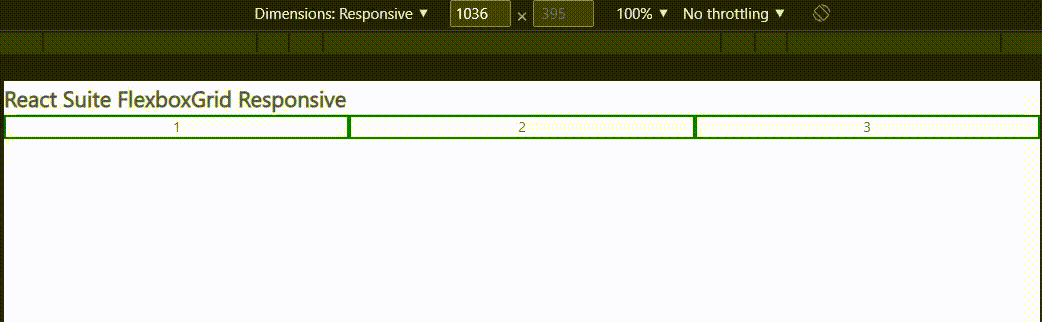
Example 2: We are importing the FlexboxGrid and Col Components from “rsuite”, and to apply the default styles of the components we are importing “rsuite/dist/rsuite.min.css”.

We are adding two  FlexboxGrid Components. Within it, we are adding <FlexboxGrid.Item> with as prop equals to Col Component and we are passing different values to the xs, sm, md, and lg.

App.js

import { FlexboxGrid, Col } from "rsuite";
import "rsuite/dist/rsuite.min.css";
  
function App() {
    return (
        <div className="App">
            <h4>React Suite FlexboxGrid Responsive</h4>
            <h5 style={{ textAlign: "center" }}>Row -1</h5>
            <FlexboxGrid>
                <FlexboxGrid.Item
                    xs={24}
                    sm={12}
                    md={3}
                    lg={12}
                    style={{ backgroundColor: "#A0F962" }}
                    as={Col}
                >
                    1
                </FlexboxGrid.Item>
                <FlexboxGrid.Item
                    xs={24}
                    sm={12}
                    md={3}
                    lg={4}
                    style={{ backgroundColor: "#D97BFC" }}
                    as={Col}
                >
                    2
                </FlexboxGrid.Item>
                <FlexboxGrid.Item
                    xs={24}
                    sm={12}
                    md={3}
                    lg={4}
                    style={{ backgroundColor: "#96FEF2" }}
                    as={Col}
                >
                    3
                </FlexboxGrid.Item>
                <FlexboxGrid.Item
                    xs={24}
                    sm={12}
                    md={3}
                    lg={4}
                    style={{ backgroundColor: "#FC7B96" }}
                    as={Col}
                >
                    4
                </FlexboxGrid.Item>
            </FlexboxGrid>
            <h5 style={{ textAlign: "center" }}>Row -2</h5>
  
            <FlexboxGrid>
                <FlexboxGrid.Item
                    xs={24}
                    sm={6}
                    md={6}
                    lg={12}
                    style={{ backgroundColor: "#FEAF96" }}
                    as={Col}
                >
                    1
                </FlexboxGrid.Item>
                <FlexboxGrid.Item
                    xs={24}
                    sm={6}
                    md={6}
                    lg={12}
                    style={{ backgroundColor: "#CAFF83" }}
                    as={Col}
                >
                    2
                </FlexboxGrid.Item>
                <FlexboxGrid.Item
                    xs={24}
                    sm={6}
                    md={6}
                    lg={12}
                    style={{ backgroundColor: "#FEED96 " }}
                    as={Col}
                >
                    3
                </FlexboxGrid.Item>
                <FlexboxGrid.Item
                    xs={24}
                    sm={6}
                    md={6}
                    lg={12}
                    as={Col}
                    style={{ backgroundColor: "#D6D8FF" }}
                >
                    4
                </FlexboxGrid.Item>
            </FlexboxGrid>
        </div>
    );
}
  
export default App;

Step to Run Application: Run the application using the following command from the project’s root directory.

npm start

Output:


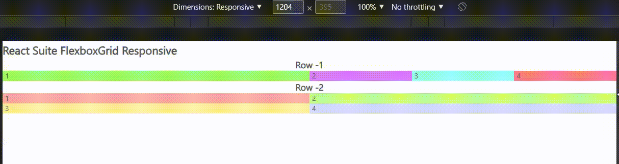
Reference: https://rsuitejs.com/components/flexbox-grid/#responsive


Reffered: https://www.geeksforgeeks.org


ReactJS

Related
React Suite Grid Nesting React Suite Grid Nesting
React Suite Modal Accessibility Keyboard Interaction React Suite Modal Accessibility Keyboard Interaction
React MUI StepButton API React MUI StepButton API
React Suite Grid Offset React Suite Grid Offset
React Suite Placeholder Graph React Suite Placeholder Graph

Type:
Geek
Category:
Coding
Sub Category:
Tutorial
Uploaded by:
Admin
Views:
12