|
|
Charts are used to represent the data into graphical elements, which makes it very to easy to interpret the data; it becomes very useful if our data is very large. Excel provides various charts to represent the excel data and makes it very easy to understand and analyze the data compare to the excel cells data analysis. There are various charts available in excel. Namely, they are,
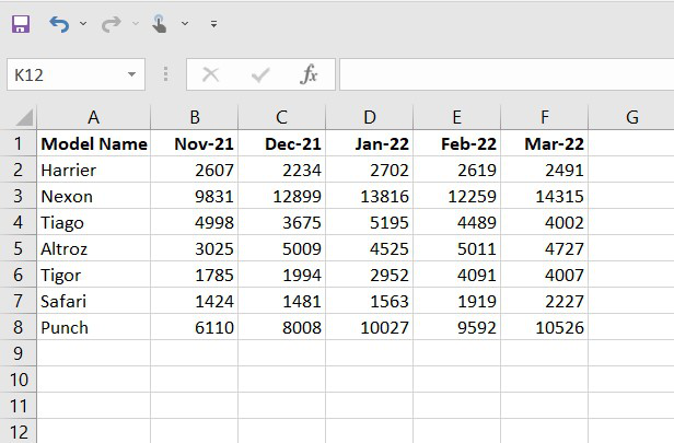
In this example, we will be using random car sales data, including model name and the number of cars sold, as the dataset and represent it in the various graphs. Create datasetIn this step, we will be inserting random financial sales data into our excel sheet. Below is the screenshot of the random data we will use for our various graphs. Fig. 1 – Dataset Line ChartLine charts are most helpful in representing the trends. This can be very useful to analyze the ups and downs in a range of data over a particular time span. The data points in the chart are connected with the lines. Note: To insert the graph, we need to select our dataset(or data table) and go to insert and then in the chart section and insert whatever graph we want.  Fig. 2 – Line Chart Bar ChartBar charts are used to represent the categorical data using the rectangular horizontal bars with their height and length proportional to the data values it is used to represent.  Fig. 3 – Bar Chart Column ChartColumn charts are used to represent the data in a vertical chart using the vertical bars. These graphs are mostly used for comparing the data points in the data. Column chart  Fig. 4 – Column Chart Area ChartArea charts are used to display graphically quantitative data. It is similar to the line chart and based on it. The area between the lines is filled with color, and they are easy to analyze as they are similar to the line chart showing ups and downs in the data.  Fig5 – Area Chart Pie ChartPie charts are circular statistical graphs that are divided into slices of pie in the proportion to data values to represent the data. They are commonly used to analyze the percentage allocation of data points incomplete dataset.  Fig6 – Pie Chart Surface ChartSurface charts are 3-dimensional charts that are used to represent the data in a 3-dimensional landscape. They are mainly used to represent the large dataset. They display a variety of data at the same time.  Fig. 7 – Surface Chart |
Reffered: https://www.geeksforgeeks.org
| Excel |
| Related |
|---|
| |
| |
| |
| |
| |
Type: | Geek |
Category: | Coding |
Sub Category: | Tutorial |
Uploaded by: | Admin |
Views: | 12 |