|
|
Angular Material is a UI component library which is developed by Google so that Angular developers can develop modern applications in a structured and responsive way. By making use of this library, we can greatly increase the user experience of an end-user thereby gaining popularity for our application. This library contains modern ready-to-use elements which can be directly used with minimum or no extra code. The Button Toggle Component in the Angular material allows the user to change between on and off states for performing specific actions. The <mat-button-toggle> is a directive in angular material. To create a toggle button or on/off button with angular material design and animations, the Angular <mat-button-toggle> directive is used. These buttons can be configured to behave like either radio buttons or checkboxes so that a single selection or multiple selections can be done on the buttons. Syntax: <mat-button-toggle>Toggle Button</mat-button-toggle> The <mat-button-toggle-group> is an Angular directive used to group <mat-button-toggle> items for performing certain actions. Syntax: <mat-button-toggle-group #nameOfToggleGroup="matButtonToggleGroup">
<mat-button-toggle value="Toggle Button 1">
Toggle Button 1
</mat-button-toggle>
<mat-button-toggle value="Toggle Button 2">
Toggle Button 2
</mat-button-toggle>
...
</mat-button-toggle-group>
Installation Syntax: The basic pre-requisite is that we must have Angular CLI installed on the system in order to add and configure the Angular material library. The following command is executed on the Angular CLI to install the angular material library: ng add @angular/material Make sure the path should be opened in the terminal before executing the above command. Please refer to the Adding Angular Material Component to Angular Application article for the detailed installation procedure. Adding Button Toggle Component: To use the Button Toggle Component, we need to import it into the app.module.ts file: import {MatButtonToggleModule} from '@angular/material/button-toggle';
To use the toggle button component in our code we have to import MatButtonToggleModule into the imports array. Project Structure: After successful installation, the project structure will look like the following image: Project Structure Example 1: The below example illustrates the implementation of the Angular Material Button Toggle. app.component.html
app.component.ts
app.module.ts
Output: 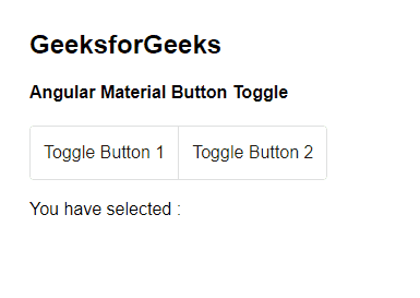 Angular Material Button Toggle Button toggle selection mode: There are 2 selection modes Angular Toggle Button:
It allows only one item to be selected within the toggle group. To create a single selection toggle button,<mat-button-toggle> derivative is nested under <mat-button-toggle-group>. <mat-button-toggle-group> behaves like a radio-button group, by default, allowing only one item to be selected. When a single selection is made by the user, the value of the selected item is displayed on the UI screen.
It allows more than one item to be selected within the toggle group. To create a multiple selection toggle button,<mat-button-toggle> derivative is nested under <mat-button-toggle-group> and an attribute named as multiple, is used. Numerous items can be selected when multiple attributes are added (checkbox behavior). For multiple selections, the attribute multiple is added to the <mat-button-toggle-group> directive. When multiple selections are made by the user, the multiple values are selected and displayed, as comma-separated-values when values are viewed on the UI screen. Example 2: The below example illustrates the implementation of the Button Toggle, by specifying the different selection modes in Angular Material. app.component.html
app.component.ts
app.module.ts
Output: 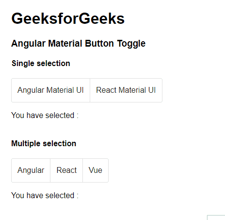 Button toggle selection mode Reference: https://material.angular.io/components/button-toggle/overview |
Reffered: https://www.geeksforgeeks.org
| Web Technologies |
Type: | Geek |
Category: | Coding |
Sub Category: | Tutorial |
Uploaded by: | Admin |
Views: | 13 |