|
React Suite is a popular front-end library with a set of React components that are designed for the middle platform and back-end products. Button Component allows the user to take actions, and make choices, with a single tap. We can use the following approach in ReactJS to use the React Suite Button Component.
Button Props:
- active: It is used to change the button state to active.
- appearance: It is used to denote the appearance of the button.
- block: It is used to span the full width of the Button parent.
- children: It is used to denote the primary content.
- classPrefix: It is used to denote the prefix of the component CSS class.
- color: It is used to denote the color of the button.
- componentClass: It is used to pass a custom element for this component.
- disabled: It is used to change the button state to disable.
- href: It is used for providing a href attribute.
- loading: It is used to show a loading indicator.
- size: It is used to denote the size of the button.
IconButton Props:
- circle: It is used to set the circle button.
- classPrefix: It is used to denote the prefix of the component CSS class.
- icon: It is used to set the icon of the button.
- placement: It is used for the placement of icon.
ButtonGroup Props:
- block: It is used to display block button groups.
- classPrefix: It is used to denote the prefix of the component CSS class.
- justified: It is used for the horizontal constant width layout
- size: It is used to denote the size of the button.
- vertical: It is used for the vertical layouts of button
Creating React Application And Installing Module:
Step 1: Create a React application using the following command:
npx create-react-app foldername
Step 2: After creating your project folder i.e. foldername, move to it using the following command:
cd foldername
Step 3: After creating the ReactJS application, Install the required module using the following command: npm install rsuite
Project Structure: It will look like the following.
 Project Structure Example: Now write down the following code in the App.js file. Here, App is our default component where we have written our code.
Filename: App.js
javascript
import React from 'react'
import 'rsuite/dist/styles/rsuite-default.css';
import { Button } from 'rsuite'
export default function App() {
return (
<div style={{
display: 'block', width: 700, paddingLeft: 30
}}>
<h4>React Suite Button Component</h4>
<Button appearance="primary">Primary Button</Button> <br></br>
<Button appearance="link">Link Button</Button> <br></br>
<Button appearance="default">Default Button</Button> <br></br>
<Button appearance="ghost">Ghost Button</Button> <br></br>
<Button appearance="subtle">Subtle Button</Button>
</div>
);
}
|
Step to Run Application: Run the application using the following command from the root directory of the project:
npm start
Output: Now open your browser and go to http://localhost:3000/, you will see the following output:

Example 2
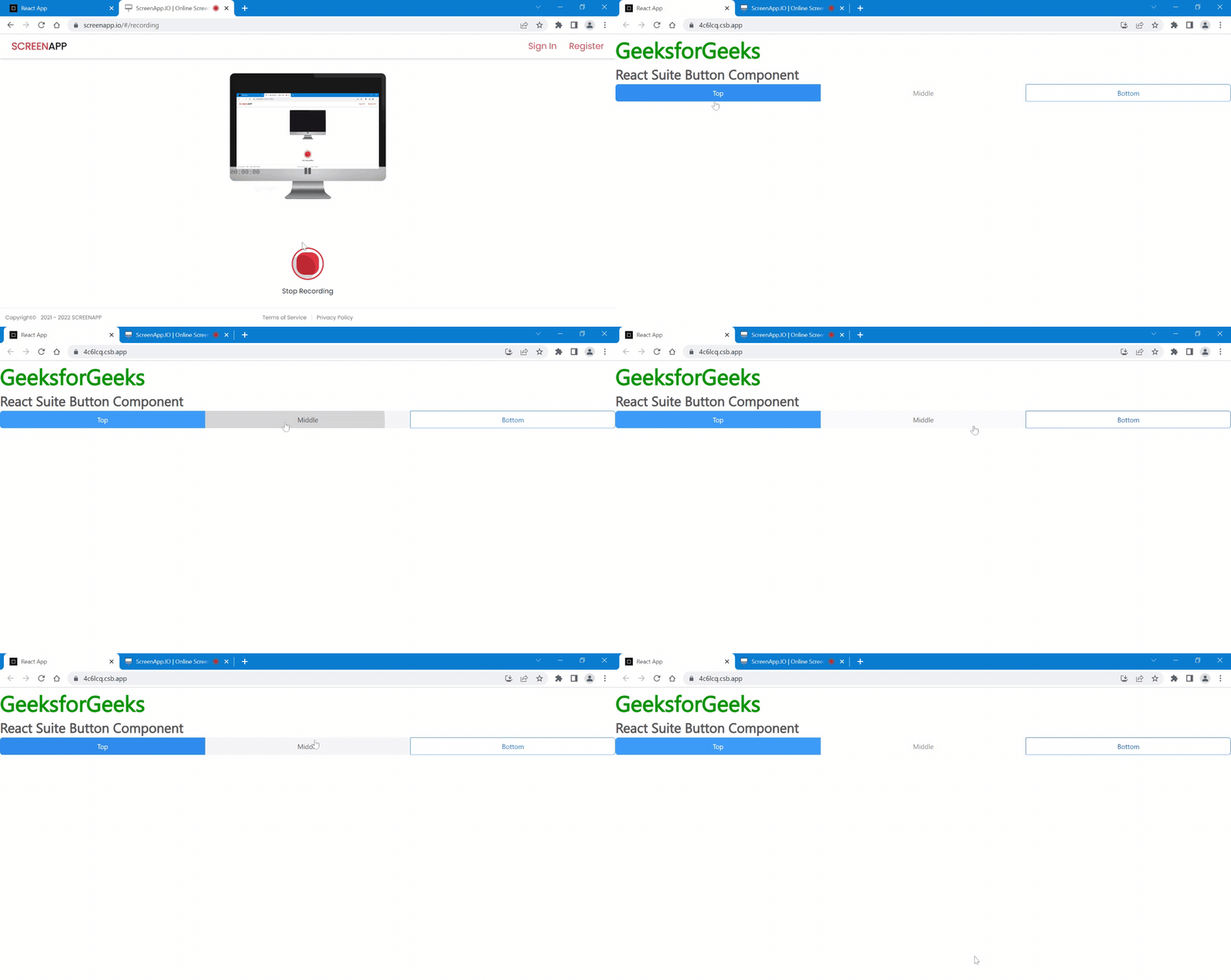
In this example, we will learn how can we make equal width buttons . This can be achieved by making justified buttons.
Javascript
import React from 'react'
import { Button } from 'rsuite'
import ButtonGroup from 'rsuite/ButtonGroup';
import ButtonToolbar from 'rsuite/ButtonToolbar';
import "rsuite/dist/rsuite.min.css";
export default function App() {
return (
<div >
<h1 style={{color:'green'}}>GeeksforGeeks</h1>
<h3>React Suite Button Component</h3>
<ButtonGroup justified>
<Button appearance="primary">Top</Button>
<Button appearance="subtle">Middle</Button>
<Button appearance="ghost">Bottom</Button>
</ButtonGroup>
</div>
);
}
|
OUTPUT
Reference: https://rsuitejs.com/components/button/
|


