Horje
React Suite Modal Component

React Suite is a popular front-end library with a set of React components that are designed for the middle platform and back-end products. Modal component allows the user to provide a solid foundation for creating dialogs, lightboxes, popovers, etc. We can use the following approach in ReactJS to use the React Suite Modal Component.

Modal Props:

  • autoFocus: The Modal is opened and is automatically focused on its own when this is set to true.
  • backdrop: The Modal will display the background in its opened state when this is set to true.
  • backdropClassName: It is used to add an optional extra class name to .modal-backdrop.
  • classPrefix: It is used to denote the prefix of the component CSS class.
  • dialogClassName: It is used for the CSS class applied to Dialog DOM nodes.
  • dialogComponentClass: It can be used for the custom element type for Dialog.
  • enforceFocus: The Modal will prevent the focus from leaving when opened when this is set to true.
  • full: It is used for the full screen.
  • keyboard: Close Modal when the ESC key is pressed.
  • onEnter: It is a callback function that is triggered before the Modal transitions in.
  • onEntered: It is a callback function that is triggered after the Modal finishes transitioning in.
  • onEntering: It is a callback function that is triggered as the Modal begins to transition in.
  • onExit: It is a callback function that is triggered right before the Modal transitions out.
  • onExited: It is a callback function that is triggered after the Modal finishes transitioning out.
  • onExiting: It is a callback function that is triggered as the Modal begins to transition out.
  • onHide: It is a callback function that is triggered when Modal hides.
  • onShow: It is a callback function that is triggered when Modal displays.
  • overflow: Automatically sets the height when the body content is too long.
  • show: It is used to show the Modal.
  • size: It is used to set the Modal size.

Modal.Header Props:

  • classPrefix: It is used to denote the prefix of the component CSS class.
  • closeButton: It is used to display the close button.
  • onHide: It is a callback function that is triggered when Modal is hidden.

Modal.Title Props:

  • classPrefix: It is used to denote the prefix of the component CSS class.


Modal.Footer Props:

  • classPrefix: It is used to denote the prefix of the component CSS class.

Modal.Body Props:

  • classPrefix: It is used to denote the prefix of the component CSS class.

Creating React Application And Installing Module:

  • Step 1: Create a React application using the following command:

    npx create-react-app foldername
  • Step 2: After creating your project folder i.e. foldername, move to it using the following command:

    cd foldername
  • Step 3: After creating the ReactJS application, Install the required module using the following command:

    npm install rsuite
  • Project Structure: It will look like the following.

    Project Structure

    Example: Now write down the following code in the App.js file. Here, App is our default component where we have written our code.

    App.js

    import React from 'react'
    import 'rsuite/dist/styles/rsuite-default.css';
    import { Button, Modal } from 'rsuite';
      
    export default function App() {
      
      const [show, setShow] = React.useState(false)
      
      // Function to open Modal
      const close = () => {
        setShow(false);
      }
      
      // Function to close Modal
      const open = () => {
        setShow(true);
      }
      
      return (
        <div style={{
          display: 'block', width: 700, paddingLeft: 30
        }}>
          <h4>React Suite Modal Component</h4>
          <Button onClick={open}> Open</Button>
      
          <Modal show={show} onHide={close}>
            <Modal.Header>
              <Modal.Title>Sample Modal Title</Modal.Title>
            </Modal.Header>
            <Modal.Body>
              Greetings from GeeksforGeeks
            </Modal.Body>
            <Modal.Footer>
              <Button onClick={close} appearance="primary">
               Confirm
              </Button>
              <Button onClick={close} appearance="subtle">
               Cancel
              </Button>
            </Modal.Footer>
          </Modal>
        </div>
      );
    }

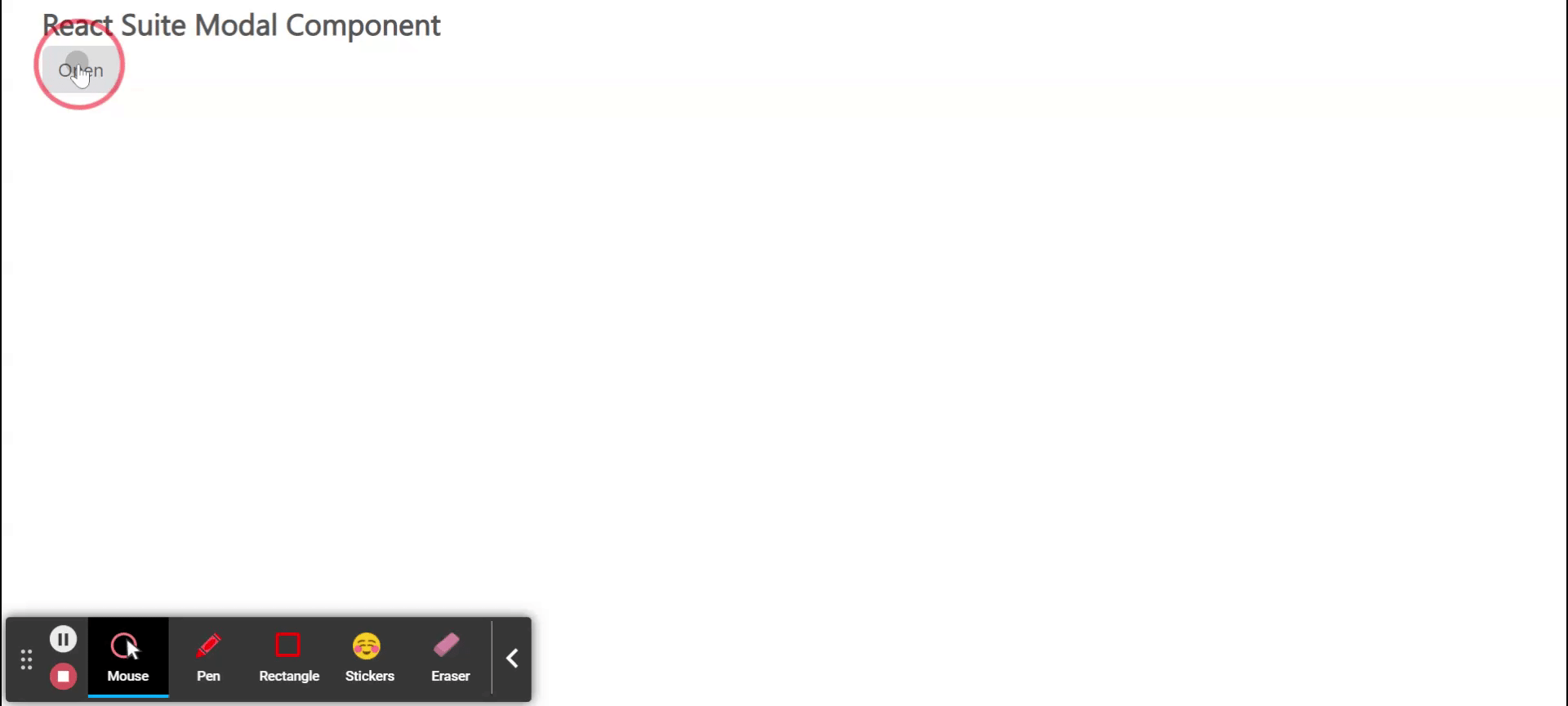
    Step to Run Application: Run the application using the following command from the root directory of the project:

    npm start

    Output: Now open your browser and go to http://localhost:3000/, you will see the following output:

    Reference: https://rsuitejs.com/components/modal/


    Reffered: https://www.geeksforgeeks.org


    JavaScript

    Related
    React Suite FlexboxGrid Component React Suite FlexboxGrid Component
    React Suite Container Component React Suite Container Component
    React Suite Loader Component React Suite Loader Component
    React Suite Message Component React Suite Message Component
    ReactJS Evergreen StatusIndicator Component ReactJS Evergreen StatusIndicator Component

    Type:
    Geek
    Category:
    Coding
    Sub Category:
    Tutorial
    Uploaded by:
    Admin
    Views:
    10